Wednesday, May 31, 2006

PLAYSTATION part 2 page 3


Final page.

So what happened? Well we won.

Got the call and it was a bunch of cash. We jumped up and down lots. It was pretty awesome. It paid for JAn and my trip to Sydney that year. Which (coincidentally) was where we got discovered by Top Cow. So that was super cool how that all came around. We were going to pitch some stuff to Sony and do a regular gig, but the Top Cow stuff was pretty urgent, and waaay more important to us.

I was glad to move onto comics, cos I make a crappy cartoonist. I just don't think my drawing is very funny. (No it's not just humour that differentiates the two. It's much more. Sometime I will go into it.)

So. Some annotations:

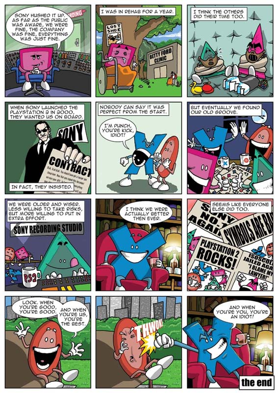
panel 2: The the bouncer from the first one is looking for his lost shoe. That's Michael Jackson and his monkey in the background.

panel 3: There's the lost shoe and everyone's favourite pink triangle. They're both wearing Hannibal Lector masks.

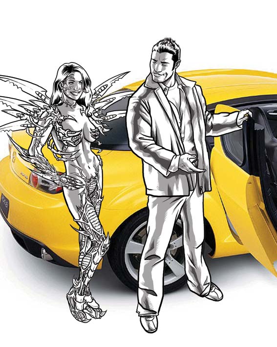
panel 4: Who else should represent SOE but Agent Smith? The contract says something along the lines of, "You should have got a better lawyer you cheapo bum! We now own your cheap ass and everything you have ever and will crap out of it."

panel 5: My favourite line.

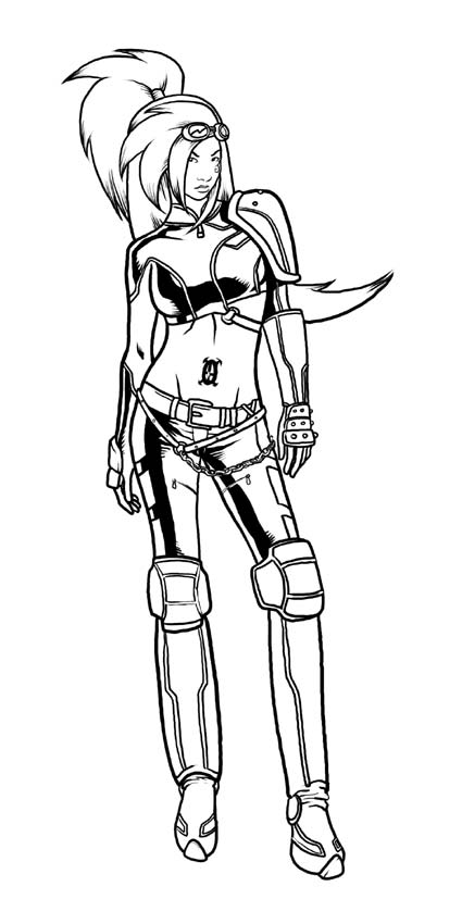
panel 9: Isocoles again... I can't get enough of him. By now JAn was really starting to get worried about me, but he got big laughs in the first one. I'm not sure but I think I might have stuck all that stuff in. I think I got carried away cos I actually drew something funny, so like David Letterman I proceeded to milk it for all it was worth.

Thanks for coming along for the ride. Just got some feedback from Mazda and Top Cow so gotta hit the drawing board, which means more stuff for you guys!

PLAYSTATION part 2 page 2


Righteo, page 2. Here's where I really got to have some fun. It was just injoke, injoke, injoke for me. Ok, so panel by panel:

panel 4: That's Isocoles jailed on the newspaper.

panel 5 & 6: Abbey road pisstake poster.

panel 7: JAn wrote "Triangle punching out a photographer." I drew in the my favourite photographer... Jimmy Olsen.

panel 7 (cont): That's Miss Enneadecagon advertised as a stripper in the background. Looks like after the "Fifth Button Special" she resorted to her other talents.

panel 7 (cont): I don't usually annotate JAn's script, but cos this was pretty contemporary at the time I will. It's a dig at Russell Crowe's best actor poem being cut out of the Academy awards/Oscars (whatever!).

panel 10: Lennon. Continuing the Beatles metaphor.

Stay tune for page 3 where it all wraps up and contains my favourite line!

PLAYSTATION part 2 page 1


So we got the call for three more pages. After many coffees and lunches and phonecalls and emails with many people sometimes including each other we finally struck gold.

JAn came up with the brilliant idea of talking about the twilight of the Playstation and what it meant to the symbols before the introduction of PS2.

It's brilliant, funny and incisive.

I did the best I could under a pretty short deadline, and I'm still really happy with the results.

Monday, May 29, 2006

PLAYSTATION part 1 page 2


So here's part 2 of 2!

So the way the competition was structured was that they would pick the top 3 entries and ask each of those entrants to cough up three more pages. Then the grande finale winner would be selected from the further three pages.

So I got a phone call saying that JAn and I had made the final three! We were pretty pumped, especially considering the other incredible Australian talent that had entered (I'm sure if you look around and ask politely someone will show you some of the stunning entries).

Looking back on it, I don't think we made the final three because of the art. It was a good concept with some good gags. It was accessible and highly marketable.

But three more pages? How the hell do you continue something like this?!!

Stay tuned next time for part 2 page 1

Sunday, May 28, 2006

PLAYSTATION part 1 page 1

JAn (my writer) asked me the other day for a copy of the stuff that we had done together. Pesky writer! How DARE he actually want a copy of the stuff that launched us to infamy and poverty!

Anyway, I went through the stuff and realised that there was a heap of stuff that people probably hadn't seen. It's old, it's a little rough (on my part) but I think it's still fun.

Cos I'm a bastard and not drawing anything at the moment, I'm going to drag this baby out. So expect a page a day kids!

But first, some backstory.

Once upon a time there was a magazine called HQ magazine. It tried to fill the niche of being a little bit more high brow and appeal to both men and women.

It went under.

But just before it did, they were doing a comic art competition with Sony Playstation. The brief was to do a two page comic featuring the Playstation symbols: cross, square, circle and triangle. JAn and I came up with the idea of making it like Australian Idol, auditioning for a fifth symbol.

Here's page one of two.

Saturday, May 27, 2006

Behind the Scenes


So I'm going to show you some of the smaller pics that made up the cover. Here is EARTH. Probably my favourite pic of the Harajuku girls that I did for the cover. A deceptive amount of work went into that cover. Fire and Water are nothing to write home about so you will just have to squint at them or buy the book for a closer look.

Got a real treat for you next post! Some hilarious stuff that JAn and I did ages ago...

Thursday, May 25, 2006

San Diego Here We Come!


Ta daaa!

I'm hoping it's a little different to most of the comic covers you will see. It really has to stand out as this is one of Image's major releases for San Diego. It's been sent off and they've got a really good feeling that it will make the con booklet! (Comicbookresources.com link and San Diego Con booklet - can I bat 2 for 2?!! *crosses fingers*)

Roger was blown away (and I got the impression he cc'd his reply to everyone which was just the coolest). David loved it. Apparently there's some thumbs up over at Top Cow too. I'm one step closer to living my dream of having an army of devoted fanboys lining up lines of coke on the bellies and butts of booth babes while I snort them with a rolled up copy of Detective Comics 27 (first appearance of Batman worth about US$45k).

Hey, whatever crumbles your cookie, you know?

Ok, now the commentary. If you hold it up the sketch you can see there are some changes:

1. Not as much colour on the left: It just became too distracting. It was like this muted rainbow and had too much weight on the eye. Your eye was drawn to the left not the logo nor the figure.

2. Got rid of all the pink/red crap in the background. Did we need a third Ying Yang (one on her skateboard one on the logo)? I didn't think so. The splotches of Japan were unnecessary also. I did like how I turned the circle on the Ying Yang into the Japanese flag but I'm sure I will use that idea in the future if they want another cover out of me.

3. The black scratches became film edges. I just liked this look. Helped break up the organic lines and scratchy whites over everything. It also helped popped the logo forward.

I will try and post the other sketches of the girls. AIR/WIND (last post) is my favourite design, but now that I look at her, not the best picture.

Now, for those who care... Here is what happened.

So I'm done by about 2am last night. I'm showered in my pajams ready to upload this baby and head to bed. I check worldclock.com and it's 9am in LA. Perfect. I start uploading when I realise I've forgotten an integral step to colour work (for me). I ALWAYS print out colour work before I approve it. I've been working with Annette for so long that I'd gotten out of the habit. When you see a hard copy there's so much stuff you notice that you can't see digitally. I upload what I've got and rush out the door.

Cut to me at 2:20am standing outside Kinkos in South Melbourne. I'm reading a sign on the window saying they're closed. It's 8 degrees outside.

Cut again to 2:35am I'm at the Kinkos on Exhibition St. The poor graveyard shift dude is subjected to an onslaught of ignorance from me. 20minutes later I have a print out in hand and smiling. Amazingly, it's all good. But I'm hungry.

3am I'm leaving Stalactites (this is on a freaking wednesday night!) giro in hand. I'm spitting chunks of fat into nearby bins. Out of the entire souvlaki I think I got a portion of meat that made servings in American Psycho look like a buffet table.

330am I'm home and get an email from David. I messed up the credits. One quick fix later and the piece is uploaded. I retire to bed and read about 4000 Preachers before my eyes fall down.

I'm such an idiot.

Wednesday, May 24, 2006

AIR headz


Heh. So a friend of mine (Hi Simbo) sent around the pic of Grace that Annette coloured (cover incoming!). He sent it to a girl we both know and the only reply she got was, "Artists should draw more realistic women."

I looked at the picture and replied, "The only unrealistic about that picture is that a chick is into Xtreme sports AND knows how to use a katana."

I'm not saying she's right. In fact I don't think she is. I will draw realistic women when the story requires it. A character like Grace is not meant to be realistic. She's meant to be symbolic or an idol.

Take the picture of Air to the left. As a model I used a popular supermodel. Won't say which, but there's not a person on the planet who wouldn't deny that this supermodel has extraordinary proportions. The amount of messing about that I had to do to not make her look dumpy is incredible. Her legs are about 25% longer and the head about 10% smaller. That was the only way that I could get her into "heroic" proportions.

Proportions in art are measured by how many of a figure's head will fit end on end into the entire figure. Off the top of my head, I think normal is about 7.5 heads, an idealistic is 9.5, a heroic is about 11. Whether those numbers are correct is irrelevant, the rough ratios are indicative of the sorts of numbers I'm talking about.

And in case women get all upity that they're being singled out by my artistic/stylistic wrath... well I spend half my life drawing abs on guys that I will NEVER have... and I guarantee I've probably done as many situps as all the chicks who read this damn thing.

Tuesday, May 23, 2006

My first interview

Right so a couple months back I did the invite for a friend's 30th costume party (I went as Superman - no you can't see the photos... ok maybe sometime in the future). I don't usually do this sort of thing, the time it takes just isn't worth it and most people don't appreciate it. Neither of that was true for Brett. Thus the pic to your left.

Brett's standing on the fallen bodies of heaps of superheroes. You might be able to make out Superman, but Batman, Wolverine, Spiderman, Tomb Raider, Wonder Woman, Elektra, Daredevil and the Hulk might be harder to see. But they're there. Again, you're going to have to take my word for this.

The invite really did the rounds and found its way to a bunch of designers starting a new online magazine featuring Melbourne artists (thanks Michelle). They really dug my stuff and asked if I would do an interview and small portfolio.

Here it is. My first ever text interview (I've been interviewed on film for a bunch of things in the past):

http://www.melbournepixel.com/_prelaunch/01/i01a05_jason.html

I had fun and really appreciated the exposure. There's also some funky art from previous projects. If anyone sees anything they like there and wants to see more, drop me a comment and I will see what I can do.

NB the last pic is the INNOCENTS first cover with the Gwen Stefani head.

Monday, May 22, 2006

MAZDA preview part 2

Right, so the weekend of hell and fun is over. The Mazda piece spilt over to this morning.

But they needed it monday morning!

LA time! Ka-ching! All emailed and it's 9:30pm sunday night over there. WAAAAY ahead of schedule yet again.

So here are the last two figures. I left them cropped so you can actually see them. That's Zoe from REVVED and Aphrodite IX with the huge boobs in the background. I also left them cropped so when you see Annette's colouring it will further knock your socks off.

So it's on their desk for approvals. Tonight Harajuku girls for the cover. I will upload them individually as they get done. Can't wait to do this cover. There's nothing more enjoyable than working when you have a really solid vision of what you want.

But right now, I have Body United work to do. Have to rewrite our curriculum yet again (constantly evolving and improving) and finish off our diet supplement. Got all this great info from our dietician but it's a little sterile and it's all like, "FATS: How to reduce fats in your diet."

I'm trying to make it a bit funnier ("Oh god," I hear from the audience) and a bit more relevant to people's lifestyles. So it's got headings like "SHOPPING: How to shop healthier etc."

If anyone is really curious to see it when it's done I can email it to you.

Off to training tonight! Let's find out if I have a congested chest or another chest infection! Can't wait!

MAZDA preview


There's a book coming out from Top Cow written by David Wohl and drawn by David Nakayama. It's called Revved. It has a clever tie-in with Mazda and specifically their RX-8. It's closest cousin would be the BMW films, both advertising and story in one.

As part of the relationship there's a Mazda RX-8 ad that's going to be featured in every Top Cow comic. The concept is a bunch of Top Cow characters all hanging out and around the Mazda RX-8. David Wohl contacted me about doing the ad, and I was pretty damn excited. Was? Yeah, at 3:07am excitement has been worn away to exhaustion.

But this is the first time I get to officially draw Witchblade and Aphrodite IX!!!

So my idea was to actually use a photo of the car and have the characters interact with it Gorillaz-style. Here's a preview of the artwork. That's Jack from Revved charmingly convincing Sara Pezzini (aka Witchblade) to go for a ride. I have only done the linework for Zoe (another Revved character) and Aphrodite IX who are off to the right. When they are toned I will upload them too. What's interesting is that Witchblade took as much time to draw as the other three. The Witchblade armour is a NIGHTMARE to draw. It looks great, but oh man! I've figured out the armour's secret power. It's a chronological vacuum. It just sucks up the time of whoever is trying to draw the damn thing. Otherwise I'm very happy with her. She looks sexy, mature and unique. And man, what abs!

Yeah, I know there are no shadows on the ground. Why? The entire background has to be redrawn/or redone. So no shadows yet.

Not a bad nights work given that I seemed to spend most of it on Skype chatting to my sister in England (Hi Lin!). Listening to the Dark Tower by Stephen King (Audio books! My new friends!) and really quite enjoying it when they skipped about an hour (at least). Was really hard to follow after that.

Right now I've booked a coma with my bed.

Sunday, May 21, 2006

INNOCENTS COVER TAKE 2 part 3: Annette is a genius


Right, so you know you're living in 2006 when a dvd night consists of guys bringing around dvds of stuff they found off the web, whacking it in a lap top and hooking it up to your tv.

Treated to everything from Robot Chicken, Vin Diesel interviews, Japanese Spiderman, My Name Is Earl, John Saffran: Mster Chef, the Global Frequency pilot (some of the best cinematography I've seen - my comics need to look like that! And why the hell didn't this get picked up?!!). Didn't get around to the pro-wrestling (Ring of Honour 2005 Samoa Joe vs some talented Japanese dude).

Finish time: 7am when Scott Stuart finally declares a ceasefire on my toilet and we bundle his comatose and vodka soaked form on my couch - bucket included.

7am. Yeah. I'm an idiot.

3pm I'm having breakfast with the guys when I get a sms from Annette that she's done with the image! Ok, get this. I uploaded it 3pm the day before. She mentioned she wouldn't get to it til that night. 24 hours later THIS arrives.

To say I'm not worthy of Annette Kwok is a statement whose basis in being obvious is only rivalled by fellow statements such as, "Jason is an idiot." and "Scott drank too much."

Now you guys probably can't see it completely but the texture on the jeans and the mesh top is incredible. Scroll up and down so you can see what I did and what she did.

I suggested she take a look at Ex Machina and look how the colourist there seems to colour the linework. I have no idea how they do that. Everytime I've tried that it ends up looking like Scott's weapons of mass destruction against my porcelain throne. She took that on board and blew it out of a cannon. The skin and hair are textured to the point of photographic. Anyway. As the name of this blog says, "A picture says..."

Cut to now. 545pm on sunday afternoon. I've been blogging for the last hour or so wasting time. (Got an email from a friend who is in LA at the moment at E3. He's started a blog to chronicle his endeavours. I had to sign up to post my stupid comment, and now here we are.)

I have 4 Harajuku girls to draw, a cover to design and a Mazda ad featuring 2 new characters and Aphrodite IX and Witchblade all hanging around an RX8. I'm pumped I finally get to draw some Top Cow characters... but oh God. Look at the time...

INNOCENTS COVER TAKE 2 part 2:Linework


So I'm an idiot.

How do we know this? Well my deadline is tighter than a fish's ass and I'm out playing poker with the boys til midnight. Been ages since I played poker and I kicked some ass (if I might say so myself. Texas hold em for anyone who asks. First time I played it. It rocks!). So I'm home at 12am wondering what they're going to say. I've chucked all my eggs in one basket.

They loved it!

The crazy textures, the ying yang symbol merged with the Japanese flag. The seeming splashes (actually maps of Japan). The Harajuku girls all down the side with their names in Japanese.

Thank god!

Ok. Finished email. Had something to eat... Logged my Everquest 2 character to check my broker (made another plat! yay!) 1am.

Bollocks.

Now I normally prefer to work from my own photos. I love photo reference. Models create something unique to each of my pieces of work. An unusual pose or balance to the body. But it's 1am on a friday night and if I call in a favour from a model the earliest would be saturday afternoon sometime. Waaay too late.

So I start trawling my emergency archives. Old photos I've taken. Images I've captured off the web and stuff I've scanned in from magazines (no, I haven't gone the Paul Jenkins route and claimed porn as a tax deduction). I cobble together a figure from about four different images and off I go. It's 4:15am when I get an email from David. He's affirming a brief I got for a Mazda RX8/Top Cow ad that I have to have done by monday (oh yeah did I mention I knew about this too, and I was still out with the boys playing poker? Like I said. Idiot.)

I ask him if he's going to be on and email him the linework. He gives me the thumbs up and I continue to do some finishing touches. In bed by 5:30am read Pattern Recognition by William Gibson til I hit the light at 6am.

12pm cup of joe in hand I'm sitting in front of the computer again. I take a look at the linework, flip it a couple of times to see that I'm happy and proceed to work on my render layers. Now for those who don't know, I work ENTIRELY digitally. No paper no pen. I was joking the other day that when I was doing convention sketches at Supanova I had to relearn how to use a pencil again! Once I finish my linework layer I create two more layers, one at 50% opacity and the next at 20% opacity. I then draw the darker rendering in the 50% layer and the lighter rendering in the 20% layer. The effect is something that gives me a degree of control over the colouring. It also allows me to do soft rendering which is perfect for women. Solid black rendering can be too harsh.

All done I upload this to the ftp server for Annette. Time: 3pm.

I have 3 hours to clean my place up before all the guys come round for a dvd night.

What the hell? Yeah. I'm an idiot.

INNOCENTS COVER TAKE 2 part 1: Redesign


So friday afternoon David gets back to me. There's a problem with the cover. Roger Mincheff (head of Spacedog and the guy who discovered me a couple years ago and all round super-cool dude) has made the point that the problem is she doesn't use a gun. At no point does a gun feature in the story. It's kinda like Batman having a gun. It's inaccurate and misleading.

Can we lose the gun?

Let me tell you why David's a kick ass editor and give you an art lesson at the same time. All figures and images have an impetus or focus. It's the main thing that gives the figure purpose. Sometimes it's an action sometimes it's a mood.

The focus of the previous cover was the gun. David is savvy enough to know that if you take the gun away you basically gut the figure. He knew we needed more than just a redraw.

"Can you give us a new cover? You have til wednesday."

I looked at the clock. Friday afternoon now. I won't get home from work til at least 9pm. Hmm, if I draw it tonight. Check it saturday and send it to Annette, that will give her 2 days to colour it, and me another 2 days to draw it. That's doable. If we move quick we might even be able to get some edits in from David and Roger.

But drawing is easy, designing is not. By this stage I'd had the chance to have a look at some of the artwork that had been produced for the comic. While the artist is a solid storyteller with an excellent grasp of anatomy, I just felt that he hadn't quite captured the true cool of our Xtreme sports champion/fashion designer protagonist. I realised that this cover's job was to add to the feel and mood of the book as well as contribute to the story and her character. We needed people who read comics who also dig extreme sports to pick this baby up.

I was looking around for ideas when I saw what Stuart Immonen had been doing on Nextwave. Incredibly innovative design work. I took a big helping of that and mixed it with some of the design elements I see on skate magazines.

I whacked in the new logo I designed for the book on it's side as something extra to make this book stand out.

I waited with bated (baited?) breath for the response.

INNOCENTS COVER part 3: Cover!

Then I get this incredibly exciting email from David. He wants to use Annette's and my pinup as the cover for the issue!

All he needs is the Harajuku girls updated.

No problem we say, and here we go (eyes left).

It's a bit hard to see at this res, but the leaps and bounds that Annette and I have made in this time are incredible. The Harajuku girls just blow the rest of the image away for pure technical skill and personality.

The book was solicited with this cover. Andy Finlayson (next Aussie superstar artist and Top Cow dude) saw that CBR used this cover as the link to the Image solicitations that month!

My first ever cover and it made the CBR main page link! I was pretty happy. Definite career highlight. My good friend Alex PDF'd the pages for me. Given the links are down now, you're just going to have to take my word that it was ever there in the first place.

INNOCENTS COVER part 2: Enter Harajuku


Then I get an email early this year, and David Wohl has run into a bit of problem. Down the bottom of the last post's image, you will notice four Harajuku girls who are supposed to act as Grace's (the big red chick) spirit guides. It seems that the artist (a talented storyteller) is having trouble finding the look for the girls. His attempts keep looking a little dated and uncool or too martial and aggressive.

Enter Jas.

My mission (should I choose to accept it) is to design 4 Harajuku girls in the form of a pinup that they can use as reference and to publish in the book. Two birds with one stone. Make my job a bit harder, but that's ok. I like a challenge.

The only problem is the short deadline means I have to colour it myself. Without my genius colourist I was all alone.

The main problem I believe that artists fail on is research. Most people are pretty good at the brief, but have trouble extrapolating it in a truly orginal or innovative area. I struggle with that too, but in this day and age with Google, there's no excuse for not doing research. So each of the four girls has to represent an element (from left to right): Fire, water, earth and air. I also wanted each of the girls to represent a different facet of the Harajuku imagery that I'd been looking at. I picked school girl, elegance, manga and goth. the colour pallettes were obvious. Then I began to trawl through the research looking for accessories. Chains, pads, piercings, hair pieces and extensions, jewellry, gloves, bands, buckles, boots, corsets, textures, hair styles, bullet belts, tattoos, goggles, coats, hand cuffs etc etc. Then was the effort of trying not to repeat myself and give each girl a unique look.

I pictured fire and earth as being the two down and dirty fighters. They would be the front line. Air was more of a Castlevania/Yoshitako Amano slim leaping sword mistress. Meanwhile water would just appear behind you.

David seemed to like it, and Fire makes an appearance in issue 1.

INNOCENTS COVER part 1

Ok, so late last year I was blown away when David Wohl (my editor) asked me to do a pinup for his new project called THE INNOCENTS.

I hammered out the pinup and along with the help (ok, more than help - genius) of Annette Kwok came up with what you see to your left.

A nice piece for it's time. The money comes in and it goes off to the achive to maybe see print one day.

A picture says

Who am I?

My name is Jason Badower.

For those of you who know me, you can read this with a wry smile on your face.

For those of you who have found this through some unfathomable means probably involving the sacrifice of small children or simply a good search engine… “hi”.

I am a comic book artist working as both artist and art director for Space Dog, the marketing/media arm of Top Cow. Space Dog’s job is to test and create comic books as a proving and developing ground for intellectual property in other media.

I work mostly with a talented writer, JAn. As my job is to edit art, his job is to edit stories. I’m sure his name will crop up here heaps. You can check out his LJ at: http://jan-event.livejournal.com/


While I have been doing comic books in Australia for the last 15 years, I have only been a professional for the last two years. I am currently 20,000 words into a text/essay/book on comic book storytelling. When I have a name and career behind me to add some weight to what I’m saying (going from academic, to practicing teacher) I will get the damn thing printed… and finished.

In the meantime, this blog will serve as chronicle, diary and insight into my career, thoughts and ideas. The topics will mostly be about comic books, but I might self-servingly sneak some personal items in here too.

The main beauty of this, is what I do is visual. You want to know what I’ve been up to? You need to see it.