Tuesday, October 31, 2006

PABLO DISCOBAR - back cover


Ok, so here's the back cover commemorating our little "how small is the damn world" jaunt.

They had the idea of the kung-fu dude walking off into the sunset like the end of a movie. Other ideas included drawing the back of the guy's head from the cover, and another was to have a black chick on the back cover. Ultimately I think this was the most original, innovative and evocative of the ideas.

ps And to all my models who dropped me a line as to their lack of mention of their awesomeness... well chances are I didn't forget you. You probably just suck. Joking! You will get your time in the spotlight! Be patience grasshoppers...

Monday, October 30, 2006

PABLO DISCOBAR - cover


One of my old trainers is in a funk band called PABLO DISCOBAR. He saw my artwork and asked me if I would do the cover for his upcoming album, "The Kung-fu Kitchen."

I was interested and asked him to email me a brief before I met all 7 members of the band. I got the brief and they wanted a 70s style movie poster of all seven of them looking like they were in a Bruce Lee film.

I looked at their budget and suggested that might not be possible. I explained how much time that would take (despite how fast I am) and how much I would be earning per hour should I take on the job (an amount that would make a Nike factory worker look like Bill Gates). And while I don't tend to do things for huge amounts of profit (instead looking at factors like fun, how much I'm helping a friend and how quick the turn-around is) I don't like to spend weeks on something I'm not getting paid anything resembling reasonable for.

So we went back and forth on ideas and eventually settled on an image of a 70s black dude in kung fu gear. Enter the cover image. I drew it in Photoshop and then printed it out and dry brushed it to get a more organic feel that they were looking for. I also did a back image which I will post next.

What's killing me is that they gave me a copy of the album (and the designer did a STUNNING job on it) and I can't find it anywhere. If anyone can find an image of it on the web, please email it to me as I'd like to post it. I will then publicly acknowledge that your Google-fu is stronger than mine. It's on a beautiful red and tan paper stock. It looks incredible.

Friday, October 27, 2006

ZERO-G Sonny McCan


No pr0n-looking image. As I said, I doubt anyone will see it. Not my finest moment in the sun... But it sure got me noticed. =)

So on a totally different note... here's my mate Simbo being specialist miner Sonny McCan.

The brief was a Seth Green sorta dude. I basically used Simbo, but the final coloured version will have him with red hair.

In the meantime, Simbo gets a decent portrait of himself.

Thursday, October 26, 2006

RKS - Trix the Drummer


So as the title says, this is the drummer. So why's she holding a guitar? Cos I needed to produce character designs, a pinup and a guitar ad all in the one week. So being a crafty (read that as lazy) bastard, I decided to roll them all into one.

No time to get a model for this one so this is what I call a patchwork piece. Hands, arms, head and body from all over the place in terms of reference.

Not a particularly controversial piece, but a follow-up to the last one. There's a third, but I may or may not post that as it makes the Witchblade piece look like conservative, prudish trite.

Put it this way... When I emailed the other piece to a mate he got accused of looking at porn at work - and there was no nudity.

Yikes.

ps Thanks to everyone who keeps coming back. Feel free to email me at grael23@yahoo.com of leave a comment if you'd like me to post anything you've seen me do before or address anything in particular.

Wednesday, October 25, 2006

RKS guitars pinup 1


This is from a project that has since been canned called Strange Harmonies.

When I was working on it, it was about a girl band who unwittingly find themselves caught up in a battle for balance, karma and trying to get a record deal. It was a joint venture project with RKS guitars (hence the VERY prominent guitar in the pinup).

I worked with a model who was working as a bartender (also part-time model). I basically met her and worded her up on what I do (ie. draw comic books. Realistic style. No nudity. Copies of all artwork etc). I meet people every now and then, and just keep them on file for when a gig comes up. Suddenly RKS needed a pinup within a week for a guitar convention. She was the only person who was available and so I gave her a call.

The problem was that I couldn't get her totally comfortable or into the roles of the characters. She looked the part, she could move the part, but she couldn't get into the part. I'm pretty used to working with models over the years and consider myself a reasonable director and have a pretty good process. I usually sit the model down (guy or girl - yes I do work with men also!) show them my art and the photos that I used as reference. I then talk about the brief, show them my sketches and talk about what I want. Usually I try and email them the sketches and outlines beforehand (unless I've worked with the model before) so they can think about the role and what it requires. But the sheer lack of time to prepare her really affected the artwork.

For example, if you look at this piece she just doesn't look like she's "rocking out". She's smiling but she has this half-hearted "what the hell am I doing" look in her eyes.

Ahh well.

The lighting is still nice.

Tuesday, October 24, 2006

ZERO-G Evelyn


I thought this would follow on nicely. This is Evelyn from Zero-G. While she barely makes an appearance in book 1, she's our heroine and love interest for the series. That's Jess helping me out.

I've been blessed with some great models. I classify a great model as one who is comfortable with me enough to just go for the feeling or stupid pose. They talk about there being "brave" actors who just go for the emotion and the scene and really put themselves out there. I've found I also need "brave" models who can act. I've found that the better I know people, the more they trust me. I'm a lot of things, but I'm not gonna screw people around.

I worked with my mate, Simbo recently and was totally blown away by how quickly he hit marks and emotionaly beats. I guess knowing him so well meant that I knew what direction to give, and what he would respond to. He was also totally comfortable and able to just really go big with his emotion without over-acting. When you see the images you will know what I'm talking about.

Jess (above) is also great for this. I've known her for six months and we get on like a house on fire. Her involvement in film both behind and in front of the camera makes her an ideal model for me. She knows production as well as acting. It's a good combo to have in a model.

One of the real tricks I need from a model is to be able to smile. Generally if you can convince me that your character is happy, you can convince me of anything. The funny thing is that it's in the eyes. I've had many people comment on previous pieces when I have worked with models that either I didn't know very well or didn't direct well or couldn't act. You can really see it. I really try to be true to the model, and any level of discomfort or anything missing really comes through. I might post a piece that illustrates this next as an example.

Sunday, October 22, 2006

SUPERJESS - page 2


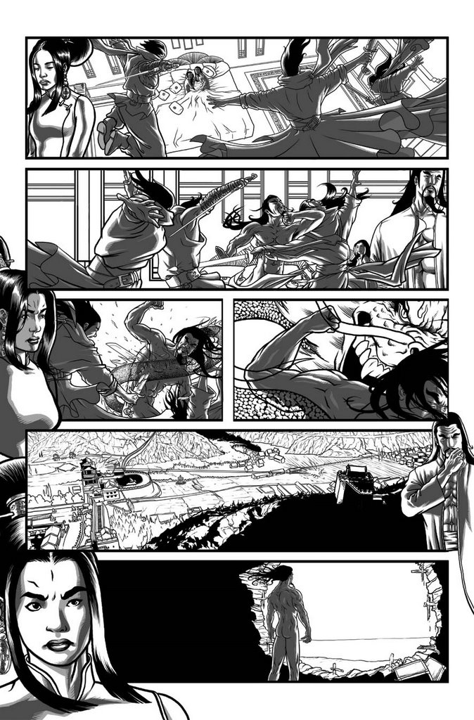
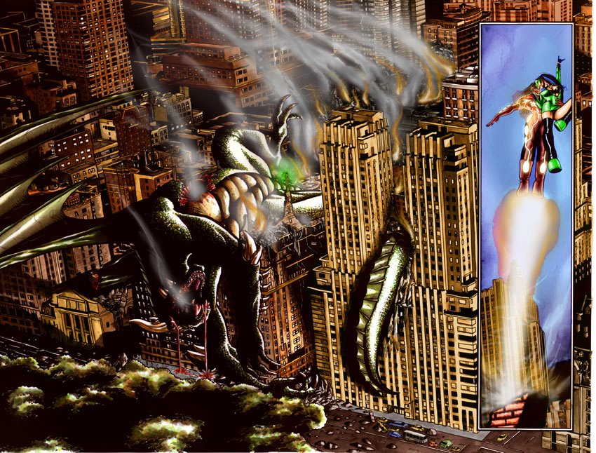
Those of you paying attention can start to see some of the other work I've butchered to make this happen. Panel 3 is a sewer scene from THE FISHER that still hasn't seen print. I'd love to show you guys parts of that, but I'm not sure where I stand legally there. Basically, it's an entire 22 page (24 maybe) comic that I drew for Phospherescent Comics. It's where I met Annette. It was my last Aussie hurrah before throwing myself into Top Cow and Space Dog work. Last I heard they're thinking about doing it in black and white (WHY?!! WHY?!!!)

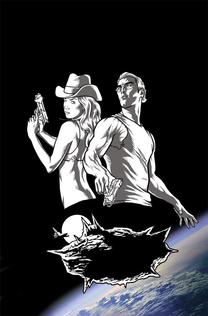
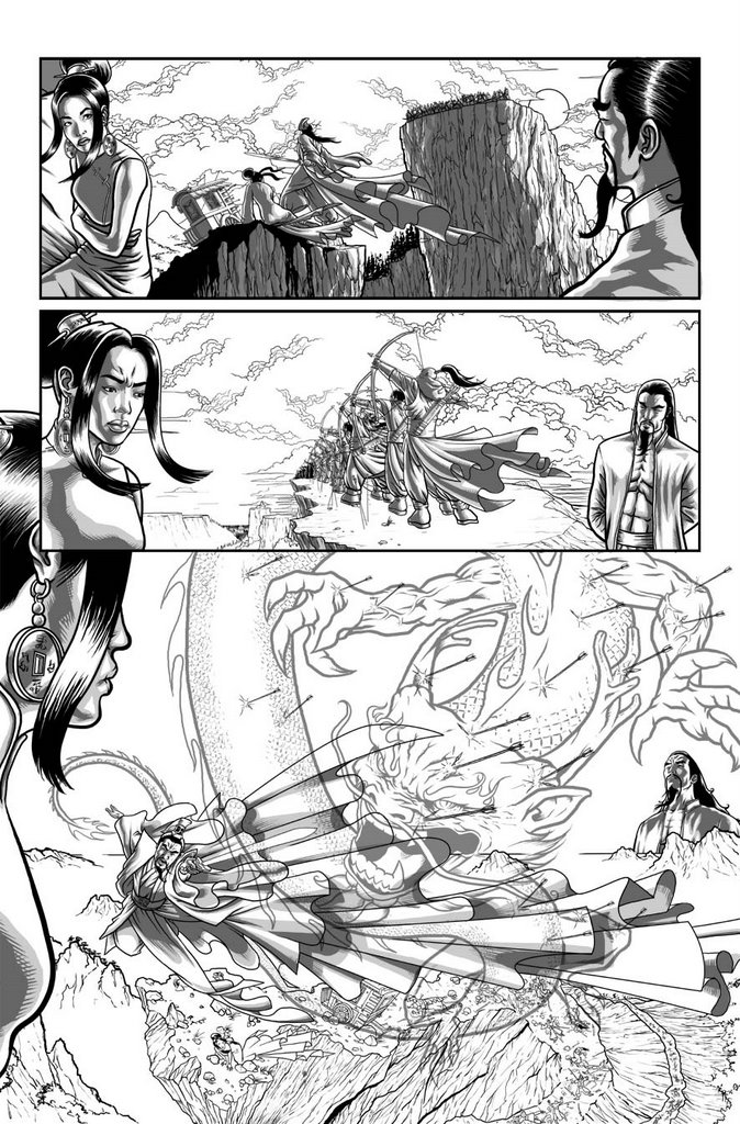
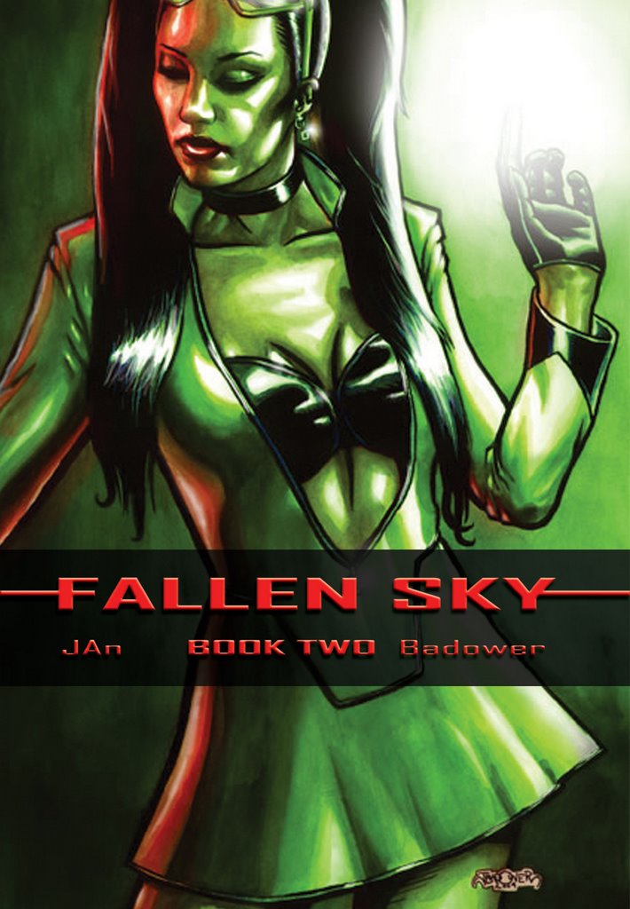
Panel 4 is the double page spread from FALLEN SKY that I posted a couple of days ago. I just redrew the central figures.

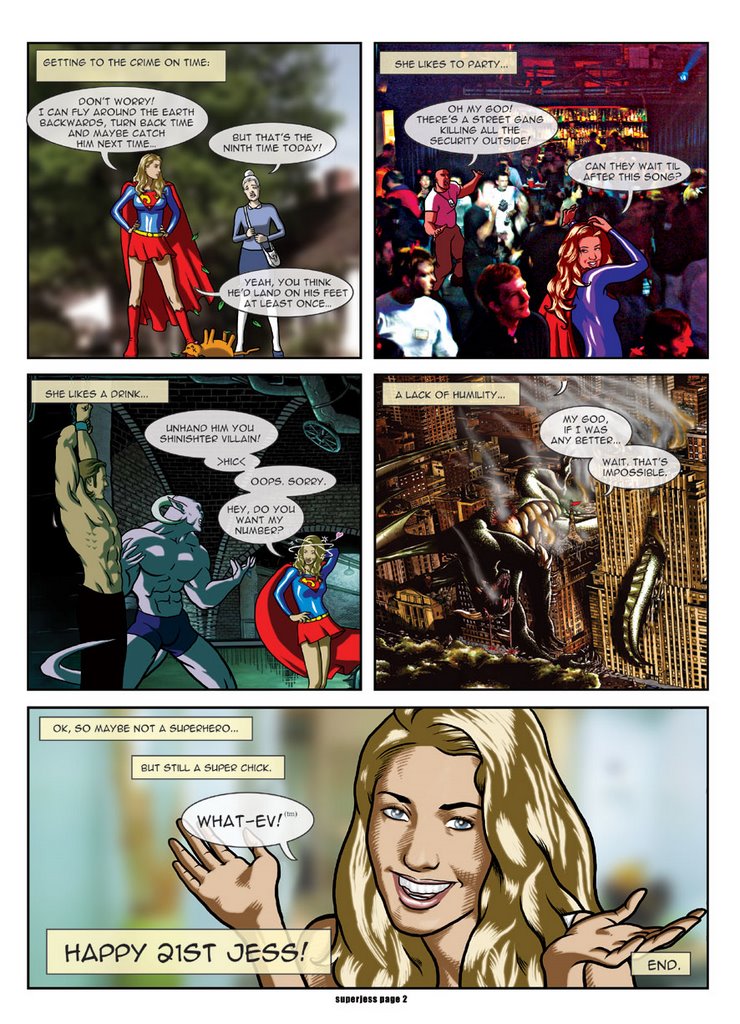
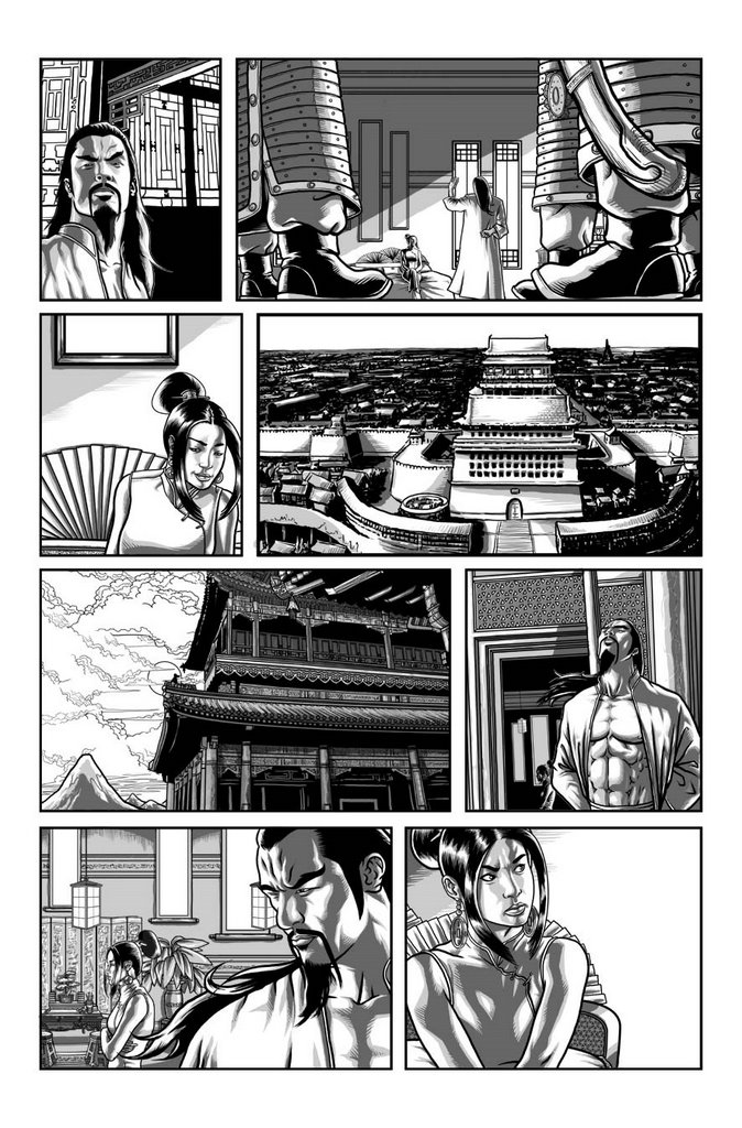
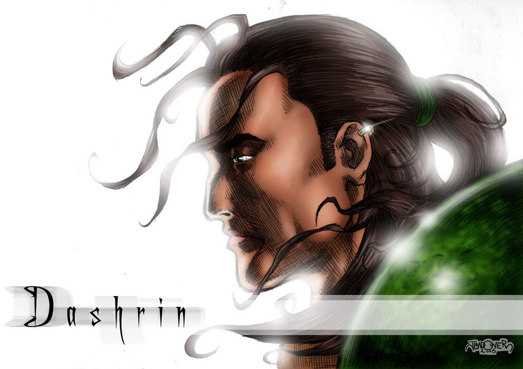
The likeness on the last panel (panel 5) is easily the best, but my favourite gag is panel 1. Such a geek in-joke.

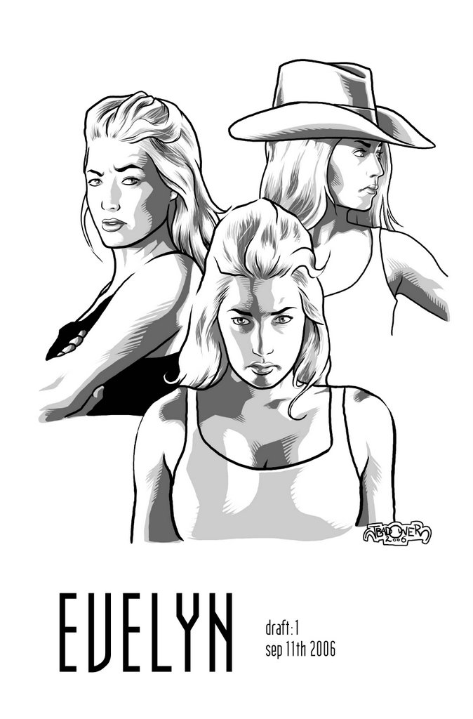
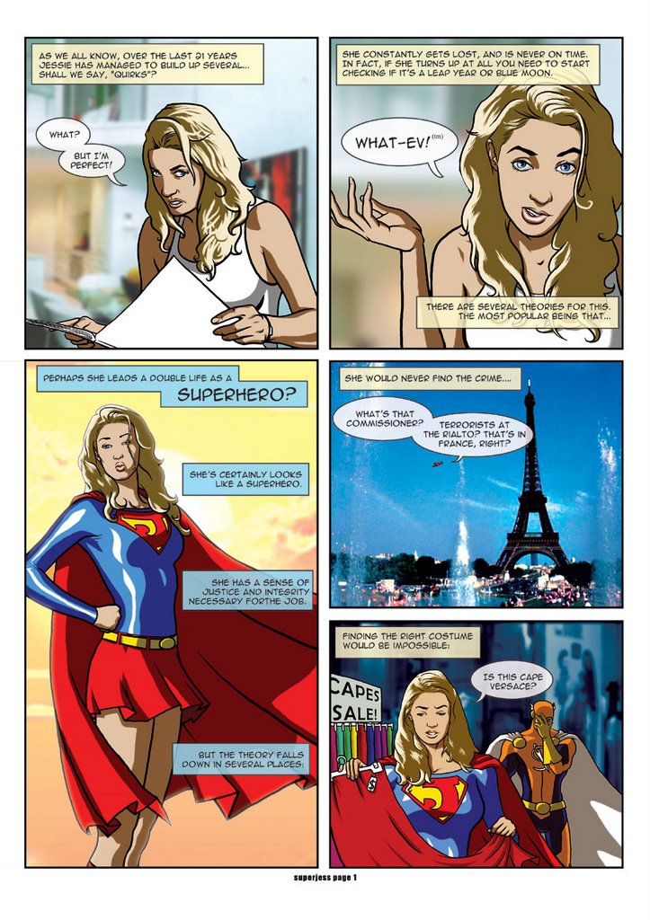
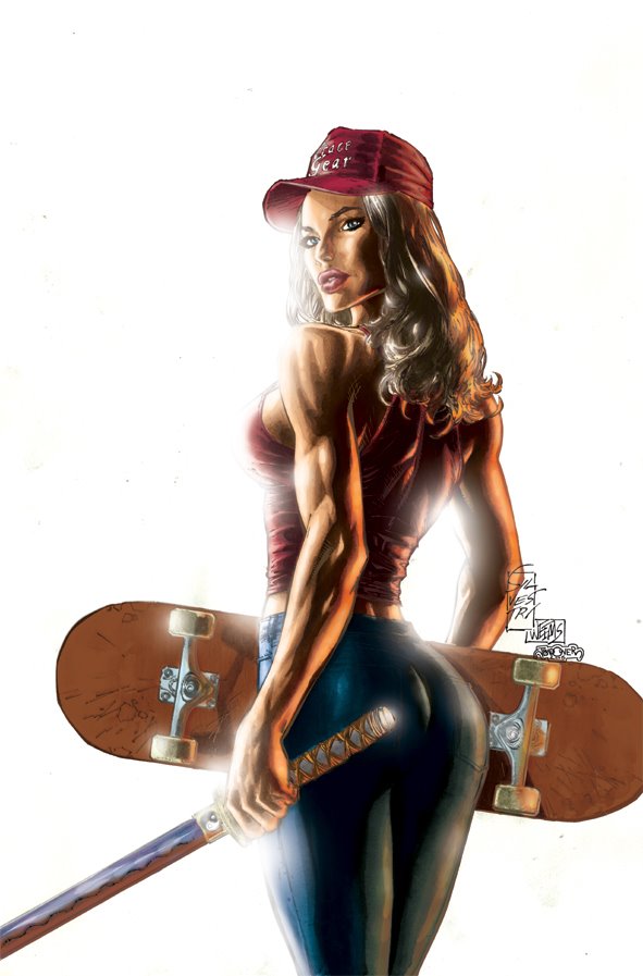
It's funny, I'd known Jess for a while but never considered asking her to model for me. It's only when Ash asked me to do this and I'm working from the photos that Ash gave me (yeah I felt like such a stalker) that I'm like, "Wow! She'd make the best superhero! And she's really easy to draw!"

The funny thing is that some people are easier to draw than others. I have no idea why. Some faces are impossible to nail down, others just flow straight out of the pen. Even with a photo (certain types of lighting can make your job easier) you can still be in trouble. People think it's really easy, that you can just trace stuff and it will look like them. Uh uh. If you've never done it before, try it some time. Get some tracing paper and trace over a photo. I guarantee it will look NOTHING like them. Likenesses are an art.

So Jess has bailed me out of a couple of last-minute deadline predicaments, and I've helped her with her films (storyboarding etc). You will see more of her cropping up in my future work. Another poor soul conscripted into the relentless (and model-dependent) Jason Badower art machine.

You could be next...

SUPERJESS - page 1


First up, I should really emphasize that this is a total piss-take. Jess is one of the funniest, smartest, creative and motivated girls I know. She's incredibly switched on and the whole thing was taken with a huge amount of grace on her part.

I basically took all the little things that I knew about her (yes, I do pay attention when you clients get chatting) and rolled them all into one-panel gags. It's totally over the top with a nice little grain of truth at the centre.

I could only two tone everything (three for the lycra) and relied heavily on photos for backgrounds because of the time constraint. One week to write, draw two pages and a cover - all fully coloured and lettered. As I said before, if it wasn't a bucket of fun, I wouldn't have done it.

The colouring was Luna Brothers inspired (see Girls and Ultra).

I liked fading out the letter balloons so that they integrated with the artwork also. I think it meshes better.

Friday, October 20, 2006

SUPERJESS - cover


Last year I was asked by Ashleigh (the client who played Lucy) whether I do commissions. I replied that it depended upon the size of the project, what it is, and how much I'm getting paid. She mentioned that Jess (Ash's training partner and also one of my clients) was having her 21st. Apparently, the girls go to greater and greater lengths to commemorate each other's 21st. Videos were commonplace and speeches were almost passe (no hypheny thing above the "e").

Seeing the comic-likeness I did of her for Lucy, Ash asked me if I would do a comic for Jess. I asked her if she had any ideas. She mentioned that Jess basically looks like a superhero and would I do a comic about her as a superhero. I said I would get back to her. That night, the comic basically wrote itself. It's only 2 pages, but it was pretty dense with gags from knowing Jess for about 6 months at that stage.

I called up Ash, emailed her the script, talked cash and the deal was a go.

This was done at the height of my Luna Brothers influence. It also inspired me to colour and ink the Frank Quitely Superman. If you take another look at it, you can see the pallette is almost identical.

While it's not a perfect likeness of her, it does certainly does capture her.

So Jess... I've asked you repeatedly over email if I can post this and you haven't replied. I don't usually take silence as consent, so you better get in touch with me if you don't want any more of this to go up. =)

Wednesday, October 18, 2006

ZERO-G Atom Weaver 2


It's funny how characters evolve over time. In film it's usually a straight-forward direction. A single step. In tv and comics, it's a subtle rotation, one degree at a time, until you realise you're facing a totally different direction. Characters change for all sorts of reasons. Conflict, relationships and being affected by events around them.

One of the things that they don't often mention to you about, is time. In preparing and working on Zero-G I've been incredibly influenced by Frank Quitely (All-Star Superman), Tony Harris (Ex Machina) and Steve McNiven (Civil War). Their clean, open approach is refreshing, has magnificent clarity and above all... is damn fast to do.

The crux of their style is having a good colourist. When I finally unclenched my ass and realised that Annette is better than I ever will be (and better than most of the guys who colour each of these three's work - and she's only at the start of her career), I realised I could sit down and concentrate on the stuff I do best. Performance, mood and storytelling. I've put so much of the stuff that made my style so visually distinctive in her hands now.

So what you see above you is my style for Zero-G and the change in Atom Weaver also. Don't judge too harshly until you've seen Annette's colours. What you're looking at is only half the picture.

Tuesday, October 17, 2006

ZERO-G Atom Weaver


So here's the first sketch of our protagonist "Atom Weaver". Yes, that's his real name. Trust me, Alex Zamm (the writer) totally makes it work. There's a reason, and point to his name. It's clever and works.

I did forget to give him his glasses. You can see them on the pinup below.

Alex did a very clever thing and "cast" all the characters from actors. After Googling them I got a really good idea of was meant to be who, and what he was looking from each of them.

Oh yeah, several people have asked me about the plot for Zero-G.

An asteroid is passing by Earth, and NASA geologist Atom Weaver discovers that it is full of enough valuable minerals to upset the global economy. Countries and corporations start rushing for the asteroid before it leaves Earth's orbit. Reluctantly Atom is drafted aboard the mission for America. The US team find themselves trapped on the asteroid with a terrible menance after them. Also the asteroid is not what it seems. It has a very clever, very dark purpose.

For the sketches I used the crazy tonal effect which I've ditched for the finished pages. I just realised I don't need to be such a control freak when Annette is so damn good.

Monday, October 16, 2006

FIRE Kimono


Part of my job art directing for Space Dog involves me doing character designs. Normally this work is done by the penciller on a book, but Roger Mincheff and David Wohl seem to really like my design aesthetic. So much so that they pay me an extra fee to design characters for their books.

David has the Harajuku girls (see earlier pinup near the start of this artblog) appear in another form. He wanted them visually tied in but largely unrecognisable. I also wanted to communicate a sense of their sexiness and ethereal wisdom. He also wanted a stylised homage to the Ying Yang (on her sash). This was fun. It is both revealing and modest. This is what she looks like without all the piercings, tattoos and hair extensions.

I designed all four girls, but they were really only colour and hair variations on this design. Cos I'm such a nice guy, I only charged him for one character. =)

ZERO-G PROMO POSTER colour


So I had about a day to draw this, and Annette had about two days to colour it. She totally carried my ass over the line on this one.

First up, they didn't like the disembodied figures hanging in space, so they asked her to blend them in. Then I couldn't find a NASA logo so she found one and chucked it on his shirt. Then I asked her to do them all sweaty... and I will be damned, she pulled it off! I still don't know how she did that effect. It's one of my favourites cos it's so subtle! She also toned down his arm a bit... but he is still way too ripped.

I love the little blood spatter on his top, and the fill lights are beautiful.

Saturday, October 14, 2006

ZERO-G PROMO POSTER b&w


I figured I'd been rambling on about Zero-G for long enough that I should post some of the work that Annette and I have done for it. I also realised that there's so much of it, that if I posted it all at once you'd just be stuck with it for months.

This image was done for a one-sheet for the comic. A one-sheet is a single sheet with a blurb and image to promote the book/idea. This was done for San Diego earlier this year. I think I drew it in a night (if I recall correctly.

What's funny is the comments I've had in the past about my (and the general) depiction of the female body. That it's "unrealistic", "exaggerated" and "destructive". All fair and reasonable comments. But I'd like to think that I aim my target at both the sexes. The brief for the guy is that he is a NASA geologist. He has to be athletic but not huge. Matthew McConaughey was the guideline here. So being rushed for time I used myself as a model - as I kinda fit that build. I basically just lightboxed myself and changed the head. When I removed the photo I was shocked.

The guy looked weedier than Dr. Banner. He was a bean-pole that might blow over in the wind. He was nowhere near athletic.

Now let's get something straight. I'm not a weed by any means. I'm 6'1, 90kg and can hammer out five reps of a 100kg benchpress. But I looked TINY in comic-book land. And unlike a lot of the women who complain about my depiction of the female form, I put a LOT more time into my fitness that 99% of them. I tell you this because of the crushing horror that overtook me when I had to beef this guy up just to make him look "athletic" in comic world.

Back to the benchpress...

Friday, October 13, 2006

EMPEROR B&W page 5


Finally the fabled page 5.

Fight scene!

I still wanted to communicate a sense of the ethereal, even in a fight scene like this. I also realised that this is the height of my Ultimates/Bryan Hitch influence. Widescreen panels (look at the Ultimates, every panel is wider than it is taller). I'm only just starting to get over this fixation as I'm realising that they have pans and dolly's and we have tall panels etc.

To restrict yourself to only widescreen panels it to basically restrict yourself to a non-moving frame.

Also, a total lack of sound effects means that you have to work harder as an artist to communicate the power of things. I love comic art, you can go totally over the top with things at the cost of $0 to your budget. I love how extreme panel 5 is and in panel 6 where he looks out you're supposed to see a trench disappearing away with a smoking body in the distance.

ZERO-G: Got that page done! Now to hammer some more out...

Thursday, October 12, 2006

EMPEROR B&W page 4


Yay! Page 4. Still one of my favourite pages. I would have loved the bottom panel to stretch across two pages. I'd love mountains disappearing away on both sides into the mist and the horizon.

Still, what you're really missing here is JAn's script. If this ever gets published, we will definitely let you know when and where. It's such an elegant story.

I feel hungover. It's my third day that's more than 12 hours long this week (13.5 today, 14.5 yesterday). I'm so tired I can barely pick up my pen, and blogging is hurting my eyeballs. I just want to sleep and I have to get up at 6am again. But I promised I'd finish the page tonight...

Wednesday, October 11, 2006

EMPEROR B&W page 3


It's funny, I was chatting to JAn the other day and the comment he keeps getting from people is, "You and Jason are just so lucky!"

He then mentioned a quote from (we think) a tennis player who said, "Yeah it's funny... The more I practice the luckier I get."

If practice was luck, then every piece that I have posted here is about 10 hours worth of luck. That's a lot of luck.

So yeah, I guess I am pretty lucky.

Here's page 3 in black and white. Give it a couple days and you will see page 5... Hang in there.

Zero G is going slow but well. It's easily some of my best stuff. Some innovative design work and I'm getting great feedback on the performance of the characters too. It's not up to these pages in terms of technical work, but these pages took twice as long.

Tuesday, October 10, 2006

EMPEROR B&W page 2


No, I'm not retreading old ground, I should have shown you guys this first. Unfortunately, this is like hitting someone with a jab after you've knocked them out with a big cross.

This is the black and white artwork which I have to Annette. There are two separate greyscale layers to communicate a different tonal range. There's a 50% layer and a 25% layer, and where the two overlay it's 75%. I did this because I really wanted to control my shadows. I personally love fill lights, and Annette wasn't big on them at the start. I started shading like this to show her what I meant.

Again, this is another reason why I draw on Photoshop, because it's almost impossible to do this by hand.

Monday, October 09, 2006

RESPECT MAH AUTHORITAH!


Years ago I did an Advanced Diploma of Multimedia at Holmesglen TAFE (that I later went on to lecture in). Peter Allen (no not the singer!) is the head of the department and taught the design section. His specialty was his assignments. I found them incredibly fun and innovative. I was working on a cartoon with the design/multimedia team from Swinburne and showed them the assignments that we were getting. They were blown away by the creativity and thoroughness of his assignments.

One of them was to create all the marketing material for a fictional movie. I decided to turn the comic book called the Authority into a movie. I had huge fun discussing who should play who with my geek buddies. I think my likenesses are pretty good here (except that's Vin Diesel as the Midnighter).

I was faced by two problems at the time. First was that you were NOT allowed to use anything that wasn't your intellectual property. If you didn't take the photo, then you weren't allowed to use it. Even royalty-free photos were banned.

Secondly, my RSI (repetitive strain injury) was so bad I couldn't hold a pen to draw with, use a mouse or a keyboard (it's 100% better thank you for asking).

So I taught myself to watercolour. These are some of my first paintings and are touched up in Photoshop to make them look more like photos. I have not used photo overlays in ANY way. The Midnighter is a photo of me in a Batman mask (don't ask) with the ears removed.

Sunday, October 08, 2006

DASHRIN


This is another EQ2 wallpaper signature that I did. It was a fairly spontaneous one. I was on the train home from Bendigo (visiting my parents - thanks for asking). I had run out of graphic novels to read. My brain was broken from doing layouts and I just wanted to sketch something. The lighting for a portrait came to mind. What you see before you is a rare pen sketch done with a bic biro. It's been blown up a bit and coloured on Photoshop.

Dashrin (the character name of Lee - see the dragon post a couple weeks ago) is my guild leader. Without sounding too geeky (god, why do I bother trying to be cool?) a guild is a large group of people who all play together. It is the guild leader's job to moderate and co-ordinate (in this case) about 100 people to play nicely, fairly and co-operatively. Truth be told it's a thankless job. Countless hours spent each week organising people instead of playing. No pay, and very little thanks.

Except this picture. Thanks Dash.

NEXT: Wow! that's my entire backlog that I'd put aside on my break! In a moment of procrastination between Zero-Genesis pages (going well, thanks for asking. Will you see any? Not whole pages. But just panels and highlights here and there) I have planned my next 6 weeks of daily posts... And I haven't even considered scanning in artwork that I actually drew by hand.

THUNDERSTAB


I'm a big believer in rewarding altruism. I play an online game called Everquest 2. You run around and meet up with other people in a Lord of the Rings-like world and kill stuff. There are ways that other people can help you. Very powerful characters can help weaker characters.

Nowhere else in my life have I found so many people who are so selfless with their time, advice and help. One in particular was a guy whose chat handle/character is the assassin called Thunderstab.

He basically took me and my friends under his wing and helped us level through the game, making the impossible merely challenging.

As thanks I drew this up for him.

THE GOD MACHINE


In the early 90s I got into a band called the God Machine. They had two albums, and on the eve of the release of their second album, their bassist Jimmy Fernandez died from a brain anneurism. They are easily my favourite band. I go through phases of listening to them. Sometimes nothing for up to six months, then I won't take it out of my cd player for a month.

They're angsty, heavy guitar rock similar to Tool or Cog. I especially love the lyrics (rare for me as I don't really listen to lyrics).

I decided to go searching for their stuff the other day on the web and found that they had a couple of EPs, singles and recordings on top of these albums. I was stunned! It was like new music from a band that broke up almost 10 years ago! But I didn't trust any of the vendors and none of the extra stuff was on Ebay.

So I contacted one guy who had put up the guitar tabs for all their songs including some of those singles and EPs. I figured he would have copies, right? Obviously people don't trade for money. But I showed him this blog and offered my services. He asked for a new title page for his website. He suggested a band portrait. It was only a couple hours work but he emailed me the songs. Now I have more songs from my favourite band, something I never dreamed possible. It's like I just got let into Lucien's library in Sandman and found the lost songs in Dream's library of music that only ever got dreamed.

The design comes from the two albums. The framing texture is a scan of the cover of the first album. The second album is plain white with very plain, tiny black text on it. Hence the way I drew the portrait. I tried to lend a sense of foreboding and cool that the normal band portraits didn't quite capture.

Thursday, October 05, 2006

MONSTROSITY ONE-SHEET


Spacedog has a huge amount of intellectual property ideas that they're working on. Because of the huge success they've had producing The Covenant (in cinemas now!), they've just started a specific entertainment division office in New York to join their LA one.

The genius to their ideas is that they start everything with comics. Comics make the greatest pitch sheets. The producers can all sit down over a latte and read the comic putting them all on the same page. It's a quick read and they can all see the characters and take the story to the screen together.

Before they make their comics though, they make one-sheets. A document with a single image and a quick blurb about the story. This is a One-sheet for a new title called Monstrosity. The art is by Andy Finlayson (keep an eye on him, he's going to be the next Aussie superstar) and it's coloured by me. I don't normally colour stuff but there was no time to ask Annette and they needed it for a meeting with Miramax, Lion's Gate or some such people immediately.

TECHNICAL: I painted a watercolour texture which I scanned in and placed in a layer behind her. I then tinted the watercolour layer green and using the burn and dodge tool placed my highlights and shadows on her. I then selected the areas of skin and clothing and using the colour balance tool shifted them to where I needed them to be, but still maintained a greenish hue. I finished off with a bit of air-brushing to help define the light source. Overall: 1 hour.

Tuesday, October 03, 2006

WITCHBOOBS


I thought I wouldn't push my luck too far. You have all been really patient with my colouring attempts (and some of you not so). So I thought I would get back to some Kwokian goodness.

There's no getting around that I got a little carried away with this piece. Back when I drew this, there was the possibility that Renae Geerlings was looking at my work. So I thought I'd send this piece around. Little did I know that Renae (had very smartly) got the Witchblade out of this getup and into a tshirt and jeans with the Witchblade like a gauntlet on her right arm. I of course didn't know this and thought that it was T&A all the way. Given that I couldn't show her "A" I think I went a little overboard on the "T".

A funny comment is that a friend of mine got abused for looking at pornography at work when I emailed him this piece.

My favourite bit is still the little asian kid standing to her right. =)

I guess I should explain the piece. I felt that the Witchblade was such an over-saturated image in the comics community that she could be sitting at a bus-stop and no one would pay her any attention.

Again, Annette has done a stunning job.

Monday, October 02, 2006

SILVESTRI INNOCENTS PAINTING


While I was over in San Diego, I got shown Marc Silvestri's cover for the Innocents graphic novel. I really liked it, and was excited about the possibility of what I could do with it. I asked if they could send me a high quality version of it so I could paint it.

Included above is the artwork as done by the Top Cow team. Totally slick.

This is the artwork that I did using Marc's pencils:


The main art note that we got from AOL Red (the teenage division of AOL who we did this in partnership with) was that it was too sexy. Her ass was too prominent and her boobs too full on. So taking that on board I tried a lighting scheme that would tone both of the elements down. The other main challenge was that I had never painted over anyone's artwork before. It was important to me that it still look like a Marc Silvestri piece. It's watercoloured with the pencils overlayed over the top.

It was definitely something fun to pass the time. Reminds me of the Quitely Superman that I did. It is such a buzz seeing my sig next to Marc's.

NEXT: More posters and pinup work...

FALLEN SKY: Page 2 and 3


So JAn's script basically had us pulling out further and further on page one as they're flirting gets more and more full on. We see that there's some sort of destruction behind them. A fire... rubble. Then you turn the page and see this.

The only dialogue is from Girl:Fusion and she say, "So. You wanna f*ck".

In panel 2 (the inset) he obviously agrees and off they go.

This took me about 3 weeks. It's A2. While it's a nice piece... (it's a lot more impressive at real size) I find it underwhelming. Not enough bang for the amount I invested in it. But, it did set a new standard of work ethic for me. I started putting a lot more detail on my backgrounds ever since. I kinda went bananas drawing all those windows. There's probably almost a thousand windows on this page.

I'd colour it totally differently if I had to do it again... But this will do for now. Boy, I'd love to see what Annette would do with something like this. One day...

Ok, that ends the FALLEN SKY show. I told you it was unfinished. Just as I finished this splash page we started on the surfer Proximity Effect story. Although, I will show that later. In the meantime, some more wallpapers and poster art.

FALLEN SKY - Girl:Fusion cover


Don't worry, I don't count this as a "real" post. This is basically in response to Mike Nason's comment on my choice of colour. This is the artwork with the typeset for the cover. I like the layout and I think the choice of pallette draws the eye - especially on the noisy comic book racks. On a nice shiny paper stock it would look really nice.

I especially like the placement of the logo.

Sunday, October 01, 2006

FALLEN SKY - page 1


Here's page one. It's an interesting colouring technique that I played with. It's drawn on Photoshop, printed, toned with watercolours (ie. black, whites and greys), scanned back in and coloured in Photoshop. I like it cos it's quick but also doesn't look too sterile, which is my problem with most computer colouring. It's one of the things I'm most jealous about Annette's work. It's totally digital, but it has a slick organic quality to it also.

In the script, they're basically hitting on each other. Well, she's hitting on him anyway.