Friday, November 30, 2007

FEARLESS

Oh man, I'm going to be laying the smackdown on your bandwidth with this one.

A while back I was contacted by Mark Sable, the writer of the HEROES Mohinder story, "Blackout". He had a new comic in the works called FEARLESS and he asked me if I would be able to contribute a pinup. I was really excited to draw some "widescreen" super hero stuff and said, "Sure!".

I asked him for as much material about the comic to read as possible. He sent me some beautiful pdf's of the first two nail-biting issues written by him and David Roth and incredibly illustrated by PJ Holden. Holden's style was reminiscent of Mike Mignola, an incredibly graphic, shadow-oriented style. It's a story about a man sufferring from chronic anxiety who relies on a drug that makes him fearless. Donning a suit of powered armour he patrols the city as FEARLESS until undesired elements start to figure out his identity. It's a fun read, and I highly recommend it.

I then looked at it for a while wondering what I could contribute. What would be my take on FEARLESS? Looking at all those shadows I started wondering what was in them. I decided that my take on FEARLESS would be to create a movie-style visualisation. The thing about films, in contrast to comics is that they spend a great deal on things which are going to visually display the budget. In this case, the FEARLESS suit itself would be the thing which most of the money was spent on. An illustration equivalent would be to spend most of the time on it. So that was my first goal.

I also mentioned I wanted to go as widescreen as possible. Recently I felt like I'd been cooped up as an artist. Blackout was all set in one room in a hospital and my Zero G stuff was all inside at the moment. I needed to get out visually. I wanted to explore just how much damage a being like this could do. I didn't have time to draw all these people scurrying away, so I thought what better way to communicate FEARLESS' power than by having him toss cars around in a decimated street.


Knowing that unlike poor PJ Holden, I wouldn't have to draw panel after panel of this suit (which is why most costumes are kept pretty simple) I decided to go hog wild. Here is a detail of the armour. You can make out all the skull motifs. I really got lost in all the texturing. I'm showing you a close-up here, as really no one is going to notice otherwise. So look closely, damn you!


The next step it to create my greyscale tone. I paste in my watercolour layer and again, using the burn and dodge tool I start to paint the lighting in. My reference is a photo of me in my underwear pulling the same pose. No, you will definitely NOT see that one (even though I look pretty damn good in that one). I start to exaggerate the lighting. I already see him surrounded by flames. I also know that each of the lamp posts are going to be illuminated lighting him up. My goal was to create really powerful, moody lighting which was such a signature of PJ's work. I wanted him lit from behind and underneath with flames so I rendered it as such.

Once I'm happy with the tonal work here, I then start to paste in the background texture. I look at the clock and realise that I'm not going to be able to draw the city I planned to put into the extreme background. I texture the cars on the foreground, again trying to be aware of the different light sources around each surface.


Onto the colour. As I've mentioned before, colour theory isn't my strongest. I like strong, bold palettes that make my illustrations stand out. So I'm about to let you in on a step by step guide as to how I cheat on more complicated pictures like this.

First up I colour in all the colours like a kid's colouring book (trying to stay inside the lines). I tried to pick a wide variety of colours for the cars. I kept to the colouring scheme from the comic for FEARLESS, in fact I think I actually sampled the exact colours from PJ's actual illustrations.


Now normally I would paint flames in myself, but this was a freebie favour for Mark and I was on the clock. I had paying gigs to get onto. So I scoured my files, archives and the web for some nice fires. Using the wonders of Photoshop's clone tool I pasted these flames in to the image trying to merge them as realistically into the scene as possible. I wanted to create as intense a situation as possible. The flame under the bonnet in the car on the foreground should have a powerful foreboding element of danger. I wanted the inferno behind him to just radiate heat. No one should be able to stand in front of a blaze like that.


Now I start inserting all my visual effects. I mentioned I wouldn't have time to draw an extreme background, so I created this one from a couple of photos. I also needed to up the drama. I grabbed my flame textures and started painting them into all the reflective surfaces. The flames inside the car on the foreground might be within the car or simply reflected flames from in behind us. I liked the subtle inclusive nature of those flames. It made it feel more real to me.


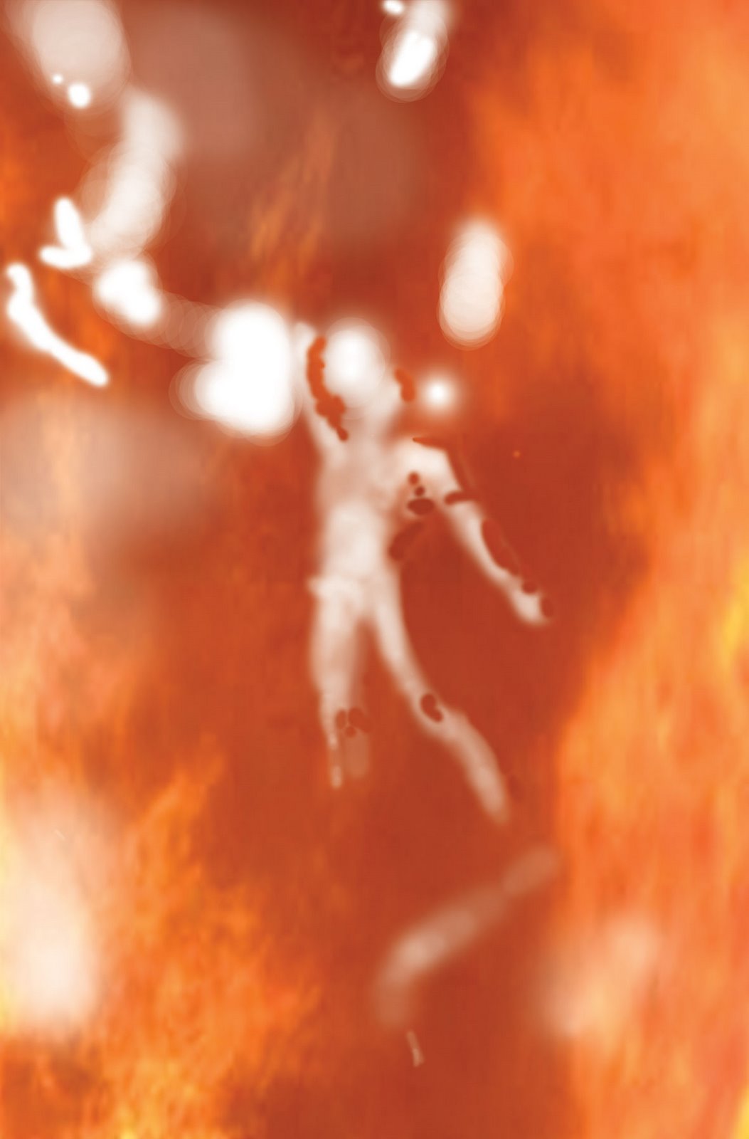
Seems pretty honest so far, right? Well here's where the cheating begins. Most good artists would be selecting warmer colours and beginning to blend them to create the heat and reflective flame we would expect from each of the surfaces. That's WAY too complicated for me. Seriously, a warmer red but not too orange? Bollocks to that. So I found this nifty technique. I create another layer and set it to COLOUR under layer effects. I then begin to paint in a texture over the top of the scene, using the eraser where necessary to allow FEARLESS and certain other elements to stand out. This is what that layer looks like without the colour effect on it.


This is what the normal coloured artwork looks like when the Coloured layer is active. Suddenly it unifies my entire picture. The way I see it, everything has a certain colour under perfect white light. I paint everything like this. I then select what light we want to view the picture under. A sickly flourescent like Blackout or a raging inferno like FEARLESS.

I've also started to add my light sources including the lamp post behind him. I also increased the white heat intensity of the flames and added energy from his boots.


And finally the airbrush. My main goal is to make FEARLESS stand out amidst the chaos around him. I add shine and sparkle to the armour (and lose my line art - sob!). I exaggerate the main light coming from above and add a glow to the light from the flames reflecting on his armour. I add lots of shine to his claws as I want them to be white hot from the fire.

Overall my goal was to create a wide a scene of destruction as I could. I wanted to show the unleashed power of this being as he floats above us. It's an impossible scene of destruction with a being poised, above us, totally at home in the carnage he has created.

I can't tell you how much fun this was.

Thanks Mark!

COMMISSIONS

Still taking them. Email me at grael23@yahoo.com for all the prices and details.

SKETCHBOOKS: See previous posts for photos. $10 + $2 postage in Australia and $5 to anywhere else.

Wednesday, November 28, 2007

Commission: LILITHIA


This was a fun one of an original character from Stef (see various comments and photos). That's her and I in the Comics 'R' Us photo. Stef has been asking artists to do renditions of her fictional character for ages.

Most people I work with are very shy about giving me too much information about the picture. I'd rather what Stef did and give me heaps and let me draw the line (so to speak) when enough is enough. Stef gave me links to all the previous commissions she had requested, photos of her necklace and gown. I also asked her to write me a short story which helped inform me as to what the character was about.

SKETCHES: I did a whole bunch of sketches. You can see here that I got up to 12 different sketches here.
This stage is very important compositionally. I like to make sure that the client is getting exactly what they want. I had it narrowed down to three that I like and Stef picked one of them! Way to be on the same page! Creatively this is the toughest part for me. Having to wrap your brain around a problem 12 different ways is intense. I was saved from this on Batman as Lee knew exactly what sketch she wanted. All I knew was that she had a long gown, a necklace (all the poses would show off the necklace so no profiles), and she was associated with the moon. I wanted her sitting on a crescent moon like a fairy tale.


LINEART: Stef also came up with the idea that she could be holding something in her left hand, so I added that. In the story, Lilithia is a cosmic being who creates galaxies on the other side of the universe. Unknowingly she is being watched and loved from afar by an astronomer from Earth. I tilted the head so that she's not looking at us anymore (unaware of the viewer) and had the idea to pop some sort of galaxy in her hand. I also extended the dress so that it drifted off on the cosmic winds to add some sort of scale and depth to the piece. Stef as an aside mentioned that Lilithia is also associated with the lotus flower and lilies. To further add depth I drew a whole bunch of lotus flowers drifting off into the distance.

TONE: As I mentioned, I scanned in a water colour greyscale texture that I painted once. I then start going in and painting my form. I knew I wanted a powerful down light on her face, and a strong fill light coming from behind her. I also made sure that the moon was lit in the same way. While there was a lot of copy and paste on the lotus flowers for the line art, I textured them all individually here. I left the train of the dress white as I knew I wanted it glowing ethereally. I also knew that the galaxy in her left hand would be glowing so I made sure that my tones reflected that.

BASIC COLOURS: Normally I let my background define my foreground colours, but Stef had a very clear idea of what colour her dress, hair and wings were. I painted all this in exactly as she wanted.


BACKGROUND: As far as a linear process goes, here's where things get a bit blurred. I found this background and I liked the basic colours it had. I blurred it out, upped the contrast and moved it all around so it would work with Lililthia in the foreground. It's also at this stage that I started taking samples from the background and painted the fill light (that pinky light on her butt and back). I could have gone blue, but that just didn't work. It made her look cold, and I wanted her to have a warmth within that loneliness. I also added the galaxy and its glow here.


AIRBRUSH: I like my airbrush, and I tend to use it conservatively, but here I went overboard as I wanted the most fantastic over-lit, over the top glow. I wanted her skin and texture to almost reflect and radiate light. It was important to me that she almost looked like a dream. I added glows from the Lotus flowers too to make them look unreal.

Overall I quite like this piece. It's a total departure from the other stuff that I've done. It was a great mental exercise and break.


COMMISSIONS

If you'd like a piece done, drop me an email and I will send you a document detailing prices for all sorts of permutation.


SKETCHBOOK

$10 + $2 postage in Australia, and $5 anywhere else. Signed and/or personalised. Your call.


Monday, November 26, 2007

Commission: BATMAN

So here was the first cab off the block.

I have an older Supergirl which I will go through later. But I wanted to show you guys Batman as I kept a pretty detailed process diary of how it all came together.


SKETCHES: Ok, so Lee Ann (Ororo on the comments) asked me to do a head and shoulders of Batman for her nephew. Normally, I would have shot her a bunch of sketches to approve. Generally my sketches are quick visual ideas exploring poses and lighting. But Lee Ann found a convention sketch that I did of Batman that she liked. She wanted a full version of this.

PRE-PRODUCTION: I had the pose and I also had a very distinct lighting in mind. So I found a cape and a lycra top, set up my lighting and made myself Batman-stern. Ten shots later I found the one I wanted. No, you don't get to see it. =)

I did so some shots with the head down, like the sketch, but they just didn't work. The head up had a sense of majesty and nobility. The head down made him look really mean and also the lighting wasn't as nice.

LINEART: Heh. The stage I spent the most time on looks like I spent the least on. You'd think Batman woud be easy, right? But for me, every character involves investigation as to what they look like for me. Sure, I could draw someone else's Batman, but that's not MY Batman. I decided I wanted his cowl to always be scowling like the early Neal Adams and recent Alex Ross versions. I initially drew all these lines around the cheeks too, but they just didn't work. I also liked the more "techy" feel of Simone Bianche's and the Batman Begins versions. So I started drawing all these lines on that made it look like a helmet. But that sucked. So I erased them all and went for something really simple. When I look at the lineart (even though I tweaked the lips a lot) it still looks like me. Heh. Let's see if I can fix that at the next stage.

GREY TONE: I then paste into the lineart a watercolour texture that I painted myself. I then use the dodge and burn tool to create my shadows using my photo as reference. In my photo it had a very strong dramatic top light and I really wanted to emphasize that. It threw the eyes into shadows and had these huge, dark obscuring shadows that created a great sense of mystery. Unfortunately it just looked really dark and menacing to me. Given it was for a kid, I needed to tone this down. So I threw in what is known as a "fill light" from his right hand side (over his right shoulder). This enabled me to break up those shadows and show his eyes as well as the right side of his body (that was all originally just black).

BACKGROUND1: Lee Anne just wanted a blank or textured background. For me this usually means finding a nice photo or texture that I can paste in behind the figure with minimal adjustment. I also let my backgrounds define my colour scheme. I liked the idea of a sunset or sunrise; Batman about to head off into the night to work, or just about to finish up.


BACKGROUND 2: I then found this other background of buildings and pasted it in over the sky. I added a layer effect (multiply) then played with both layers for a bit to make them merge stylishly. Surprisingly, I didn't do any colour balancing work. I liked the palette just the way it was.


COLOUR1: So as I mentioned, I let my backgrounds dictate my colour scheme. I'm a big fan of ambient light. I then painted in his face, eyes (blue - I think Alex Ross made them brown, but I needed blue for this painting) and symbol.


COLOUR 2: This is where I merge the background and the foreground. On the right side of him I started to colour in that fill light that I had painted in at the greyscale stage. I sampled colours from the background and painted them over him to give him depth and make him feel like he is actually THERE.


AIRBRUSH: The last thing I do is go in with a low opacity air brush and make my lighting as dramatic as possible. In this case it was indicating all the areas that I first planned for. The top of his head, nose, left cheek, upper lip, chin and shouders were all strongly illuminated on my photo reference and with the airbrush tool I make them pop dramatically. My goal at this stage is to add an extra sense of drama and create a lighting effect that would take thousands of dollars to set up normally.

So that's my Batman for Lee Ann and her nephew. Enjoy guys!

Coming up next is Lilithia (an original character) for Stef.

COMMISSIONS

Still taking them. Even if you're just curious, shoot me an email for the pricing document that should answer all your questions. I recommend Aussie based people to get in early as I'm heading overseas sooner than I thought. More on that next post...

SKETCHBOOK

Ok, here's some photos of what I'm talking about. This is the cover of the booklet:


This is each of the interior pages and the back cover.

As I said, it's 12 pages, full colour on beautiful cardstock, A5 (fold an A4 page in half). They're $12 + $2 postage in Australia or $5 for anywhere else.

Happy to sign em up and send em off. They're the only way you're going to get any of my HEROES prints as I'm not selling them individually.

Friday, November 23, 2007

CLASSIC COMICS: Aftermath

So these are the final five cylons. Ah, don't mind me. Just been watching waaa-ay too much Battlestar. Can you watch too much Battlestar? I guess when you've numbed yourself to its brilliance you've watched too much. I guess that's why I cap my daily limit to two episodes with a significant break in between.

Anyway... Sketches. These are 3 HEROES ones left over for customers and three for the guys who ran the store. Damnit, I forgot to scan Black Adam - which was damn fun. Hey Mark - any chance you can email me a photo of him or something?

MR BENNET BEING SEXY: Is the man even capable of being sexy? Romantic? Loving? Sure. But sexy? So anyway. I think I made things a little weird here. C'mon, you can't tell me him and Moho have all those phonecalls and don't get into a little, "So... What are you wearing?" material.


PARKMAN: Not bad. A nice solid sketch. A decent likeness. Of my fast 10 minute sketches, this was one of the best.


NATHAN: Ok, I think I took a little longer than 5-10 minutes on this one. Nah, you think? Man, I'm proud of this. It came out real nice! One of the reasons I took so long on this is I owe someone a Nathan sketch. So, hey Willow, email me and I will send you a inked up copy! I still owe you a Nathan.


JAYNA & SNAPPER CARR: Who? Exactly. Jared from Classic asked me if I had got any really weird requests. I replied that some freak asked me for Jayna from the Wonder Twins, and Snapper Carr mascot of the JLA. So here you go Jared. Ya freak. =)


SPIDERMAN & MARY JANE: I spent a bit of time on this one as it was for Pino, the owner of Classic Comics. Pino has (I believe) every issue of Amazing Spiderman. I really like the composition and I'm sure it's something that I will come back to again in the future. It's got power and tenderness. I like it.

Thanks again Pino for taking me out for dinner and drinks with the other Classic boys last night. I had a ball geeking it up with you guys. Topics covered included: Why the Flash sucks, How Superman got killed by Doomsday, various San Diego anecdotes from everyone, horror films (I really gotta go see Halloween to support my friend Tyler Mane) and drawing. It was a great geek up! So thanks again, Pino!

Thanks also to Jared, Alex, Corey and Mark for a great night.

COMMISSIONS: Still pimping these. The pre-xmas list is getting tight. Email me for a price list on grael23@yahoo.com

SKETCHBOOKS: The sketchbooks are a 12 page beautifully printed A5 collection of all my HEROES prints including: The final page from the Death of Hana, Sylar, Peter, Claire, Noah and Claire, Hiro, and three pages of unprinted artwork from other projects. They were sold at Armageddon and the three Melbourne signings I did. I've got a few left over. They're AUS$10 each. It will cost me AUS$2 to mail within Australia and AUS$5 to mail to the states or wherever else. If you'd like one, please email me at grael23@yahoo.com

Thursday, November 22, 2007

CLASSIC COMICS part 3/3

And here's the home stretch for the Classic sketches:

BLACK CANARY: What's this character without her fishnets? It's a tough one to do a head and shoulders of. I've read enough Birds of Prey (Go buy it! Australian Nicola Scott does the artwork!) but I found this one really tough. Looking forward to drawing her again.


HAN SOLO: Good ol' Harrison! Here's the lovely Jacinta back again for a pressie for her mum. I knew my Enterprise wasn't the best, so I wanted to make sure this was a good one. She definitely wanted the grin. So I merged a couple of the photos she provided and got this. I do like it.


CAPTAIN JACK HARKNESS: From Torchwood. A great request from Siobhan. I'm extremely happy with how this turned out. It's a great photo merge for me. It looks like him, but unlike any of the photos I was given. Very happy.

Siobhan even asked me to write a sign saying, "The Badowers" implying that they might have a gallery of my stuff at home. I'd love to see a photo sometime. =)


YSANNE ISAADE: I know I spelt that wrong, but that's roughly right. I think. Here's the last of the three musketeers, Aurora. She even brought coloured sharpies so I could do this hot Imperial agent's blue and red eye. What forward planning!

I was so taken aback that the girls rocked up to all three of my signings. They were the only people that did. Given it was near the end of the day I presented to them the five HEROES prints that I had done: Peter, Sylar, Claire & fire, Claire and Bennet and the final page of the Death of Hana. Jacinta grabbed the final page, and I think Siobhan grabbed Claire and her dad and Aurora snagged Peter. Thanks for all the support guys!


PARKER SPIDERMAN: Friends commented that this was one of my best pictures from the innovative design. I had to confess that at that stage of the day, I couldn't figure out how his arm went, so I just drew it like this. Heh. Hiding behind design. I like this one though. I was really trying to channel McNiven's Spiderman. It's a strong design.


DEATHBLOW: This is Corey with a fun Deathblow sketch. I wish I had a better copy of it. My grey pen was running out so it started smearing the black creating a sorta of washy painted effect as it bled the black everywhere. I thought it was a nice and appropriate effect for the character.


CLAIRE AS SUPERGIRL: This has gotta be close to one of the biggest geek wet-dream sketches I've drawn. Hats off to Looch for having the balls to request it. It was a fun sketch to do. I'm sure it was as much fun for me as it would be for a chick drawing a shirtless Peter.


DIB VS ZIM: This was for a customer of Classic who couldn't make it. I started drawing this in Jhonnen's style. Then I asked myself what was the point? So at the prompting of one of the guys around me, I drew it in my own style. It's so much more fun! That's poor Mark (your Black Adam is being delivered today) being conscripted by me to hold up all my pictures.


LOGAN WITH A CIGAR: Even though Hugh Jackman did a great job, my vision of comic book Logan has to be the one I grew up with: short, hairy, ugly and smoking a cigar. I saw an amusing sketch by Alex Ross of Logan chewing on a toothpick as that's what he had to resort to after he was told he wasn't able to smoke anymore.


PETER: And a Peter to finish things off. He looks a little weedy... Sorry Milo. It's your season 2 haircut with your season 1 body.


So thank you to everyone who waited so long at Classic Comics. It meant to so much to me. It sounded like people were having a great chat in the line. I hope that you managed to channel any frustration into retail therapy and thus support Pino who does the tireless job of running Classic Comics.

COMMISSIONS: Yeah, I'm still taking orders until I freak out from the amount of work. Email me at grael23@yahoo.com for details and prices.

SKETCHBOOK: People have been asking me if I would sell these to people outside of Australia. Now that I have Paypal set up, I'm selling my convention sketchbook. I might do a proper entry. I gotta figure out how much to mail the damn thing to the states. If it would stop raining here in Melbourne (a rarity) I might venture out for post office details and a coffee.

Wednesday, November 21, 2007

CLASSIC COMICS part 2/3

Part two!

POWERGIRL: This lovely lady wanted a Powergirl. She told me that she got chatting to Amanda Conner who apparently loves drawing Powergirl cos of her massive boobs. I'm wondering if Amanda digs drawing Powergirl for the same reason I dig drawing huge, muscle-bound guys? Cos of their massive man-boobs. I mean pecs. Pecs. Yeah, that's what I meant.

Pecs.


DREAM & PETER: This is Lorie, aka Queen Amadala from Armageddon. The Dream is for her friend Amy who emailed me earlier that week lamenting that she couldn't make the signing. She asked me if I could draw her a Dream. I love drawing Dream, so it was a pleasure. I wish it wasn't so blurred. Lorie asked for a season 2 Peter (I'm sensing a pattern as to what the women want) and brought me a beautiful picture of Wolverine, Cyclops and Jean Grey. Thanks Lorie!

HIRO & KENSEI: This lovely couple really brightened my day. I met Jess at Armageddon (her Mr Tea t-shirt made an indelible impression) and her exuberance really helped her to stand out in my memory. The two went hardcore HEROES here on the requests. Darryl asked for Hiro and his dad (George Takei) doing the Vulcan "live long and prosper" hand gesture. I unfortunately had to indicate the queue and confessed that I could only draw one character per person to be fair. Jess asked for a Kensei. Luckily I had this one tucked away in the back of my brain. I really don't know David Anders face that well... but I think it sorta captures him.


HAWKGIRL: The last time I ran into Dan it was Friday at the Comics 'R' Us signing. He was insistent that next time he wanted a Hawkgirl without the helmet. He even brought his own reference of her, which was great! I thought this was a really nice sketch.


TWO FACE: This guy is great! Look at that face! I had no idea at the time that he was pulling a "Two Face" himself. I got such a laugh when I dumped it onto my computer and looked at it properly for the first time. Thanks for the laugh, dude! When he asked for this I freaked for a second. Which side was scarred and which side was normal? Asking around, no one was sure! I was sure it was the left and just went for it. Documented evidence backed me up. =)


ULURU: This guy is great! I'd previously drawn a Moho and a Haitian for him. This time... Uluru! He saw one I did last week and dug it so much he wanted his own, but with the hand held up menacingly! Damn blurry photo! Perhaps this was during one of my coffee withdrawal periods?


PSYLOCKE: I had great fun drawing this, but the proportions are all off. Why? Let the bad artist blame his tools. Normally artists work on an incline table so you can see the top and the bottom of the page evenly. By sitting too low (as I was) you end up distorting the picture you're working on (in this case her head is slightly too large). Sorry no mega boobs on her... I don't believe asian super-ninjas should be stacked.


HIRO: This was a different sorta Hiro. She wanted it drawn like the Alex Ross cover. That was fun to draw a less cartoony Hiro. But I still prefer my cartoony ones. =)


SYLAR: This guy was the friend of the last lady and was a really nice guy. I had great fun drawing him a Sylar. The energy around his hands on the sketch is silver pen.


HIRO: This was a funny one. She decided to get a friend's Xmas present early. Apparently her friend is a huge HEROES fan and digs my stuff but couldn't make it down. So she waited two hours to get this Hiro done for his Xmas present. She then insisted that she hated photos even though I recall her as being quite pretty. Anyway, I thought this was a funny thing to do. If there's any present where the thought counts... this was it!


YATAAA!!!!: I'm so glad I love drawing Hiro given how popular he is on the request-front. This was a great idea for a picture. Apparently Masi and Adrian Pasdar shot this for real themselves in Times Square and no one recognised them cos no one thought it could possibly be them. =)


WONDER WOMAN: Not suffering from low-seat-itis as badly as Psylocke (I realised what happened on the last one), but if I had to do this again, I'd make her head smaller. I gotta practice my Wonder Womans. For a character I like so much, I haven't quite figured her out yet...


One more set then I will start showing some commission artwork.

COMMISSIONS: Still taking order! Email me at grael23@yahoo.com and I will send you my pricing document. I just got Paypal setup, so that makes things easier!