Friday, September 29, 2006

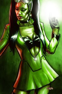
FALLEN SKY - Girl:Fusion


Many years ago, JAn and I were hard at work on a superhero comic called "Fallen Sky". It was totally buzzed about it. I love superheroes, and with JAn's insanely, laterally creative brain, I really felt we were doing superheroes that were widely accessible to anyone. It was the superhero at its best: as metaphor. We had an incredible freedom to discuss issues like the media, celebrity, sexuality, stereotypes, music, selling out and buying in. There is an elegance to metaphor not afforded to the direct attention of an issue.

Girl:Fusion was one of these characters. My idea was to create characters and names for characters that looked real. Superheroes who would wear cool stuff and be the cutting edge of celebrity. Gear that people would wear.

Our current publisher isn't too big on superheroes. He's leaving that to the other kids in the sandbox. But one day JAn and I are going to come back to this idea and knock some socks off.

For those who are wondering... she wears bike pants underneath to protect her modesty while flying.

TECHNICAL: Lineart drawn in Photoshop, printed onto 150gsm watercolour paper. Painted with watercolour and then scanned back into Photoshop for colour adjustment and airbrushing.

NEXT: More FALLEN SKY art...

Thursday, September 28, 2006

KRIS


So hot on the heels of the Lee pic, was the deadline for another picture. Brad, the writer of Career Suspect (details here, review here) a short 8 page story I did ages ago asked me to do a portrait of his girl friend. Apparently, while Brad is totally into comics, she doesn't really like any comic book artists except for me. I'm totally overwhelmed by this (given that Brad and JAn's living room is basically furnished in my art - I guess that's fortuitous). So the opportunity to do her justice was a real challenge.

The challenge was while I had met Kris a couple of time, I didn't really know her. I mean, all I knew was that she had good taste in guys and art (I just couldn't resist that one). Brad also gave me a pretty open brief along the lines of, "draw her as a comic character in a fantastic setting."

Some sketches later (and an inspired photo for the background) and I ended up with this. Personally, I love the pallette. It's so different to the colours I normally use. I also had fun retouching the background (it's a combination of about 4 photos) that inspired the mood and theme. My only regret is her dress. I just don't think the style of it does her justice. Kris is not a big girl, and I should have spent more time on the fall of the dress to emphasize that.

The hardest thing is imagining the lighting on someone's face. Most of the reference photos I was given are flat flash photography that just has no soul when you're trying to draw a portrait (similar problem to Lee's portrait). So trying to imagine Kris' face with different lighting while still maintaining a likeness was tough.

Other than that... I like it.

TECHNICAL CRAP: Again drawn with flat edge brush. 40% opacity overall, and 20% opacity on the face. Airbrush for mist and halos.

LEE


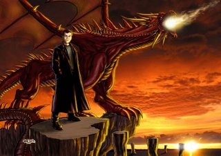
This was a commission piece for a friend's birthday. I met a bunch of lovely people online playing Everquest 2 (think World Of Warcraft... but for smart people) and some of these people live in Melbourne. Two of these are the organisers in an online community, Nicola and her husband, Lee.

Nicola called me mentioning that it was Lee's birthday and that she was looking for a unique present for him. She thought that a portrait of Lee in front of a huge dragon would be perfect. We worked closely together through roughs, colour designs and sketches. It was quite refreshing working with someone who both knew what they want and had some creative skills themselves. Eventually this came into being. The original artwork is 300dpi A3, but the final print was A2. Seeing my artwork that huge was really quite inspiring for me. It went from being a nice piece to being an absolutely majestic piece.

It's digitally painted using a 40% opacity flat brush in Photoshop. The background is a photo that's been totally touched up. My only regret is that you have very little sense of scale of the dragon. Only its massive tail snaking towards the foreground gives you an indication of how huge it is.

It's also one of my favourite dragons, and I stole its body for a dragon I had to design for the Innocents.

It's also a pretty good likeness of Lee.

Happy birthday, mate!

Tuesday, September 26, 2006

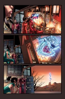
EMPEROR Page 4


The fourth and final page of the new version of the Emperor.

I love Annette's subtle colours here. She uses colours I wouldn't even think to use.

My favourite bits (besides the big-ass dragon and his massive Spawn-like robes) are the mist that Annette did and the trail of bodies running down the mountain, implying that he killed his way up there. Her clouds are incredible too! She does the best clouds ever.

ZERO-G: I'm currently chatting to models about what I need from them. The problem is, I'm going to have to keep hassling these poor people because I'm only getting one script at a time. I would love to shoot everything in one sitting, but it's just not to be. I am planning on getting a kick ass camera phone so I can shoot ref photos on the fly and do pick up shots when I'm hanging out with people. You all might find yourself making more appearances in my comics this way!

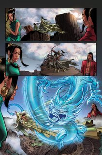
EMPEROR Page 3


Here's more of Annette's gorgeous work. I asked her to play with a different pallette in each scene. An idea inspired by HERO, the Jet Li film.

Just to give you an idea of how long it took me to do these pages... If you flick back to page 2 panel 5... That panel took me all of Xmas afternoon. That was a LOT of work. Page 3 was fun. This was where I got to go crazy. The idea of the Proximity Effect is that you get ONE power. JAn wanted to embody Chi, and had the idea that the Emperor can manifest his chi like the heroes of Hong Kong action comics like the Storm Riders. Roger (our editor) decided that this was too general a power. How can one power stop arrows, help him leap up buildings etc etc. So JAn came up with the idea of his chi manifesting as a forcefield, which in my first draft of this story looked like something the Invisible Girl might have done. In this second draft, I decided that his forcefield looks like a huge Chinese Dragon. It can carry him and protect him. The dragon is also a common anthropomorphic representation of chi also.

Today: More art direction. Approving pages for David Nakayama's Revved #3 and going through Bing Cansino's layouts for Innocents #3.

Tomorrow: Start drawing Zero G! Yay!

Sunday, September 24, 2006

HERE WE GO AGAIN!


They say to never begin with an apology, but I'm hardly beginning. I'm continuing. Forgive me father for it's been almost two months to the date since my last post. And that one hardly counted. It was like trying to pass off holiday snaps as art.

Anyway, I'm back with a HUGE backlog of stuff to show you all. While I haven't been posting, I sure didn't stop drawing.

I've got my new project ZERO-G with Alex Zamm (dir. Inspector Gadget 2 - go see it if you loved the cartoon. It's honest, faithful, has great heart and is a bucket of fun). It's a ripper of a script. I've got a bunch of character sketches from that to show you.

In the meantime there's a bunch of old stuff to post too. Wallpapers, birthday presents, old comic pages, character designs, band illustrations, paintings, mockups and pinups.

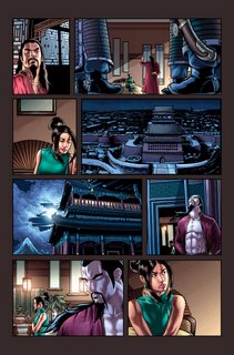
First up, I just have to show (what I think) is Annette Kwok's and my highlight to date. This is for a Proximity Effect story called "the Emperor and the Concubine" by JAn. This is page 2. I have pages 3 and 4 also drawn before we both got waylaid by other projects. Somehow, someday I will finish it.