Friday, December 28, 2007

THE DARK KNIGHT

I hope you all had a Merry Xmas. Apart from my sister's absence and too much nagging and many pep talks from my parents, I had a great, (sort of) relaxing Xmas. The highlight of which, I finally got to do some writing. I've been working on a proposal for Roger, and my good friend, Alex (who is a professional editor, my longest friend and all-round sorta good guy) had a look of it. Taking all his feedback on board I finally got around to re-working the proposal. I also wrote the script for the first issue, and I'm incredibly excited by how well it turned out. It dialed the whole idea up to eleven. I'm waiting with baited breath for Alex's final thoughts before I send it onto Roger.

In the meantime, here's a Xmas present I worked on for one of the trainers I used to work with called Beau. I accidentally bumped into Beau's girlfriend, Lucy at a train station and she mentioned she was looking for a Batman print for Beau. Given I wouldn't have time to work on one, could I recommend where to buy one? I mentioned that not only would I have time to work on it, I would love to work on it. The best thing was that Beau would never know what was going on as our meeting had been a total chance encounter. What a great surprise!

So thus began torrent of emails back and forward.

THE FINAL SKETCH:

I sent her a bunch of layout sketches, and after some deliberation we agreed on this which was actually the amalgam of three other layouts. We liked the idea of the rain, the three quarter menacing pose and the old Gotham rooftop. Lucy really liked the idea of the Bat-symbol and stressed emphasizing the muscles as "Beau loves the muscles!"

THE FOREGROUND LINEWORK

The next stage was the foreground line art. I had a bunch of goals as I drew this. I had done all my cowl studies when I drew the portrait of the Dark Knight for Ororo, so it was figuring out how the costume works. First up, he has to look REAL. While I applaud the stylistic choices in BATMAN BEGINS, my Batman has to look like a guy in tights. It's classic and it's what I like. Clark Bantram and Sandy Collora proved that it works in BATMAN: DEAD END (please check this out if you haven't seen it). As you can see, my line work is simplistic and merely indicative of form and shape. I had great fun doing some research finding obscure, fun and convincing things to put on the top of the roof. I moved the cape back over his shoulder so we could see the muscles on his arm more. It made him more powerful and less elusive.

BACKGROUND LINEWORK:


Next up I added the city elements. Lucy really wanted to see Gotham city. I found a bunch of skylines as reference and used them as the basis of what I wanted to create. I was looking for an epic, dark urban jungle sprawling into the distance. It may be a silhouette, but all those damn windows are drawn by hand. The trick was to make sure that Batman was the tallest most dominating element in the composition.
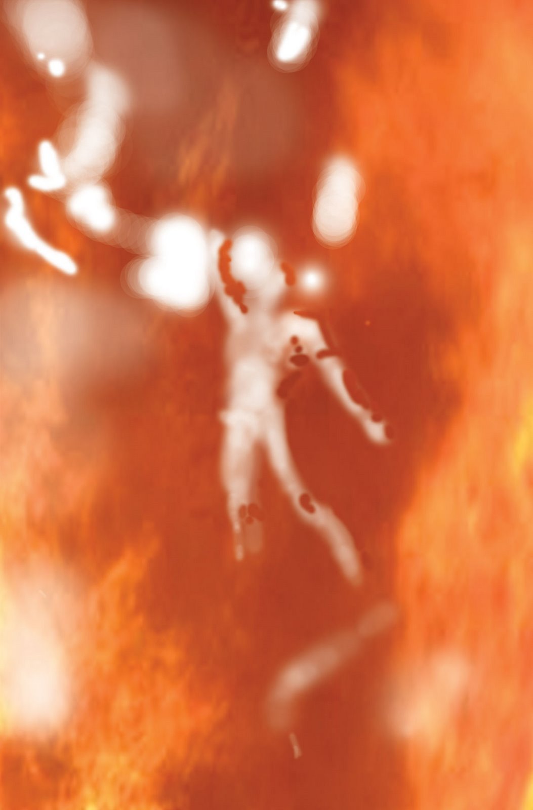
TONED FIGUREHere's where I have the most fun. This for me is where the magic happens. As I mentioned, the line work is merely indicative of what I want. It's shadow, form and lighting that breathe life into a piece for me. I researched billowing sheets, capes and cloaks for ages. I have a tendency to fall back to the Todd McFarlane "Spawn" style cape when I'm not concentrating. I love that look, but it's stylistic, not realistic. As I mentioned, I wanted this to be as realistic as possible. Finally I was able to cobble about three different photos into a good reference base for me. I was one step away from going outside with a sheet and hoping for a windy day. My favourite part is the cloak billowing between his legs. It has such a convincing reality to me.

CLOSEUP COWL
I really enjoyed exploring the different textures on the costume. The gloves, shorts, boots and cowl are all meant to be a shiny almost armoured, pvc-like material. The cape is a slightly more matte texture, as you don't want something shiny trying to hide you in shadows. I've included a closeup of the cowl and chest so you can see the detail. The symbol is raised and embossed with a shiny black texture. The cowl has large eye holes (so he has full vision). Screw the tiny eye-slits. I used to have a Batman mask (don't ask) and you can't see jack in it.

FOREGROUND TONE

I then moved onto the more mundane task of toning the background. I was aware that previous pieces had been a little too airbrush happy as I hadn't figured out my lighting beforehand. Keeping that in mind I was very careful to render the lighting and textures as accurately as I could so that only minimal airbrushing would be needed.

BACKGROUND PHOTO TEXTURE INSERTS

To finish off the toning of the background I scanned in some textures. Here's some very manipulated clouds which gave me some colour. Studying some night city skylines I worked up a reddish glow down the bottom to help merge it with my idea for the city's lights reflecting off the clouds. You can see here that the ground is a fun manipulated wet texture. The grating is something I found and just adjusted the perspective. I knew I was going to add steam over the top of these so I figured a scanned in texture would do the trick. I needed to have something there, so as I pulled steam away we could still see something lurking beneath rather than just flat black emptiness.

CITY RENDERING
Lucy wanted Batman to be as noir and desaturated as possible. I mean, let's face it, he's black and grey with some yellow on him. But in order to merge him into the background, I thought I should do the background colour elements first. The city itself is a combination of hand painting every damn window, painting in a whole bunch of manipulated city textures, and light airbrushing to create the glow from the streets at night.

FOREGROUND COLOUR:
I added a very subtle red glow to Batman's left side to merge him into the city. It also helped make him more three dimensional. I added very subtle colour elements to the foreground roof elements. As Batman is pretty much colourless, I didn't want any bright colour elements distracting us from him. As such, the palette is muted. I added some subtle red reflections on the rear elements to tie them into the city in the background. I created the Batsymbol separately and it is a combination of layer effects and subtle perspective distortion to overlay it onto the clouds above Gotham.

STEAM EFFECT
Right from the sketch I knew I wanted Batman standing on top of a steam vent. For all his seriousness, Batman is extraordinarily theatrical. Despite his no-nonsense attitude, he knows the value of showmanship to create as much fear as possible. Covering his feet lends an ethereal, non-real feeling to this powerful, aggressive figure. I knew I didn't want to do this with the airbrush. It would look fake and forced, so I created a steam texture and painted it in with the clone stamp tool. I then went in with a gentle eraser airbrush and allowed elements like the grating and more of the fold of the cape between his legs to show through.

AIRBRUSHING
As I mentioned before, I had been going overboard with the airbrush because I wasn't making effective decisions at the earlier toning stage. Having done that on this piece, I was able to keep my airbrushing to a minimum just highlighting the left side of his body and certain choice elements.

RAIN
Lucy loved the idea of the rain, and I'm glad she insisted. Her insistence made a good piece, great. I was watching Batman: Dead End and noticed that when you shoot rain at night, it fades to invisibility in the shadows and pops on the brighter elements, especially light sources. I created a rain texture and painted it over Batman on three separate layers. In the past I had used a subtle colour layer effect to unify my pictures. I found that the rain did this for me. It unified all the elements into one single piece.

CLOSEUP

Just to give you an idea of how much I think about this, here's a closeup of his utility belt. I did a bunch of research to see what everyone else was doing, but I was generally unsatisfied with previous ideas. They were usually too noisy or too simple. The locking mechanism is on the top and bottom of the buckle and both elements need to be pressed firmly to release. It is essential that it can be done with one hand. On either side of the buckle are his different gas pellets. There are five on each side. Enough for an arsenal, and few enough that you can count each by touch to figure out which one you want to use. Next to the gas pellets are his shuriken in the shape of a bat-symbol. The idea is that there should be about 5 in each clip. There is an indentation in the middle of the shuriken so Batman can flick them out with his thumb for easy access and hip throwing. The pouches are off to the side so they don't inhibit running or front kicks. They are also flexible so they don't inhibit side kicks. I figure his grappling gun is on his other hip.

The narrative behind this is it's a first person view of a criminal who has run out onto a rooftop to get away from the cops below. He's just burst onto the rooftop looking for an escape. He turns to his right and sees the Batman. Knowing that fear is his greatest weapon, the Batman has chosen where to stand for maximum dramatic effect. He's ready and poised for the coming confrontation.

I would argue that this is the best piece I've ever drawn. I love the hell out of it. It just ticks all my boxes and has turned out exactly how I wanted it to. Lucy and Beau were appreciatively impressed, and that made it even more worthwhile. Merry Xmas, Beau!

GOING AWAY PARTY: So I'm off to live in LA via London for three months. Here are the details for my going away party. Everyone's invited, even if I haven't met them! So bring em down.

FUTURE BLOGGING: I'm back on track and out the other side of the holiday woods. Expect regular posting.

BOOK RECOMMENDATION: World War Z by Max Brooks. God, I loved this book. I haven't had this much fun in ages. While the son of Mel Brooks doesn't leave you gut laughing, he lacks none of his dad's wit and intelligence. It is the most brutal, realistic depiction of a zombie apocalypse I've ever seen. It knocked my socks off.

COMMISSIONS & SKETCHBOOKS: Still taking new orders. Delivery dates are moving into mid Jan. Sketchbooks (there's a photo on some post) are $10 + $2 postage in Australia and $5 overseas.

Hope you all had a great xmas!

Saturday, December 22, 2007

THE CHICKEN OR THE EGG?

Ok, now this was something I mean to post after I saw the HEROES season 2 finale.

As I've mentioned previously, when I shoot photo reference of the characters, I really try and get inside their heads. I study their personality, body language and their character to figure out how they would react and act in each situation that the writers have given me to draw. Sometimes it's tough, sometimes it's easy. Sometimes I make a bad call and stray from what I later realise how the character would react, but sometimes... sometimes I hit the nail on the head.

Even though Roadkill obviously came out before the season 2 finale, I would never hope to presume that what I drew here informed Zachary Quinto's performance nor Allan Arkush's direction. Rather, I like to think of it as another time when I managed to nail down a character's performance in my own mind. In some weird or wild way, I managed to tap into the performance subconsciousness that is Sylar.

I'm pretty happy about that. It's not a brag, nor a boast. Just a pleasing observation that I made the right call:

Friday, December 21, 2007

DARK JESTER

Well, the date on this file scares me as it says 2005.

Amazing how time flies.

I have sometimes mentioned the talented writer I used to work with called, JAn. We did a bunch of stuff together that I've just found. It's old, but it's good stuff. Great stories that still resonate with me. There's a great chemistry between JAn and myself.

Well, JAn also runs nightclubs. This was a logo for a goth-industrial club him and a couple other of my friends ran called Dark Jester.

Despite it being 2 years old, I'm still pretty happy with it. It's one of my earlier Photoshop pieces, but it's still pretty damn solid.

There's going to be more new stuff to show you guys after Xmas. Heaps of it that I can't show as it's all presents. In the meantime we're going to go through my old archives and dig out some stuff that I'm still proud to show people.

Oh, I got interviewed for the Age newspaper (Melbourne's most respected newspaper) dipping their toes into the sordid melting pot that is popular culture. I'm curious as to how it comes out. I've got a photo shoot on Monday. I better shave...

Monday, December 17, 2007

KARA


12 days! I think that's the longest that I haven't blogged since I took that huge break last year. So what's happened? Unfortunately, it has nothing to do with alien abduction, accidental arrest, deportation, kidnapping or a zombie apocalypse here in Australia (I'm reading World War Z and The Walking Dead, so I'm a little obsessed right now). It has more to do with me heading away for the weekend and miscalculating the number of pages I had to do as a full time comic book artist. I accidentally came in under my weekly quota, and then worked my butt off to get back on my deadline the last week. Blogging was a luxury I had to forgo.

I also slipped back all my commission dates back a week, and you would have received an email from me, if I had to do so. But it's all good now. I'm in a great rhythm of drawing, smashing out a page a day as well as back into the commissions, so it's all back to normal at Camp Jason.

I'm also working on my writing pitch and enjoying the hell out of it. I love writing! While I draw, my brain nuts out the problem that stopped me writing last time, then as it clicks, I jot it down for later. It's a great process.

"But don't you draw?"

This has been the most common reaction. It's like human beings are only capable of one of the other, and only an incredible amount of audacity will allow you to consider doing both. But I realised that what I really enjoy doing is telling stories. Now I'm growing less and less interested in telling other people's stories and dying to tell my own. I'm looking forward to showing you the first one.

Now for today's piece: KARA. Why not Supergirl? I mean, everyone knows that Supergirl's real name is Kara. But Kara is also the name of my model and inspiration here. From the moment I met her, I thought to myself what a great Supergirl she would make. Despite being a fair few years older than Supergirl, Kara is funny, smart, lovely and that is actually her body. She's kinda stunning.

I wanted to get away from the Playboy cheesecake that permeates the current comics where she's depicted less like Supergirl and more like Superslut. I find those depictions of a 15 (16?) year old girl... dubious. When I wanted to do my own take I wanted to infuse her with a personality that I find interesting. So I turned to Kara, and she leaped at the opportunity to model as Supergirl for me.

My goal was to create a depiction of the character that young women would idolise as much as I idolise Superman. I wanted an ethereal, almost non-human majesty combined with a smile and tilt of the head that belies her humanity.

Thanks to Kara's patience and creativity, we shot a bunch of great reference photos, and I will get to more pieces in the future. In the meantime, thanks for bringing Supergirl back for me, Kara.

Unfortunately there's no step by step process as I was horrified to find that I'd flattened the image. =(

COMMISSIONS: Still taking these on, but delivery dates have moved to the new year. Upcoming are a bunch of original characters, Diamond Lil, Emma Peel, Deathblow & Grifter, some portraits and more!

SKETCHBOOKS: Some are still available (I'm finding them sandwiched between piles of comics, papers and books). $10 + $2 postage in Australia and $5 for outside.

Tuesday, December 04, 2007

HAVOK & WOLVERINE

Sorry I've missed a couple days. I normally try and blog at least three times a week. But I've been really under the gun as far as deadlines go.

I'm officially a fulltime comic book artist! I've left my personal training business, Body United and embarked on the world of sequential illustration. I couldn't be more excited. It's taking some getting used to. My goal is for five pages per week. Throw in the commissions and that makes Jason a very busy boy. I will talk more about the nature of the job sometime. I had an interesting conversation with the boys at Alternate Worlds about it. I think I let them in on some stuff they previously hadn't considered. But I will go into that more some other time.

This is a commission for a very good friend of mine, Brett. Near the start of this blog I did a party invite for Brett's 30th featuring him standing atop a pile of superhero bodies. Brett had long been musing about getting me to do this piece. He had long loved the camaraderie between these two characters and wanted a piece to capture the love he has for this era of the X-men. It was my pleasure to draw this. I'd been chomping at the bit to draw Wolverine and I love Havok's design - yes, even that goofy tripod head piece.

We started out with a bunch of sketches. I did ten sketches. For some reason I find single characters very easy, but two or more figures start to get very complicated. Brett and I both agreed on a direction and finally honed it towards this piece. I was adamant at this stage, that while Hugh Jackman did a great job in the movies, comic Logan should be 5'2, incredibly muscled, hairy and ugly. Brett agreed.

My favourite part of this stage was Wolverine's claws. I just loved how they turned out. They looked so sharp and deadly. In fact, I moved him to the left to show off the points of them. As I draw I begin to create a story in my head. Departing from the original sketch, I moved to a lower angle with Logan and Havok looking upwards. I visualised a huge robotic Sentinel towering above them, its search lights illuminating the two mutants. When I submitted this version of the linework to Brett he had created his own story in his head of the two facing off against multiple opponents who surround them. Wolverine taking on the front runners while Havok picked off the leader and those trying to flank them. I had to realign their heads and bodies to cater for this.

We went back and forwards and eventually worked towards this design. Mentally, I was thrown. So clear was my vision that it was a little difficult changing it to accommodate Brett''s direction. But as I began to create the tonal layer I found myself exploring the light. This is hands down the most satisfying part of the drawing process. It's when the characters become real to. It's funny, I used to do the most elaborate line work and rendering, and now I do it all at this stage. I even do it for my sequential comic work. This is now my signature style. (tm) =)

I was really excited about having Logan illuminated by Havok's energy blast. I found that exploring that was the most enjoyable stage for me. I love lighting. I tend to zone out when listening to people as I'm studying the lighting on their face, trying to memorise it for a future picture. I get some unusual looks, but no restraining orders yet. This is what the tonal layer looks like under the linework. It's almost a painting unto itself. But there's something old skool comic book about me, and I just can't seem to give up my linework.

Now in the past I'd let my backgrounds dictate my colour palette for my foreground. Not so in this case. I knew exactly what sort of colour palette I wanted. Havok fires blasts of super heated plasma that are normally indicated as white hot. I though that what better colour communicates heat than red. I know, I know. I'm a genius. Get that Nobel Prize ready, I've almost figured out world peace.

So I just slapped down basic colours. Havok's costume is mainly black, so that was easy, but Wolverine's skin is a little more complicated. The background is a couple of photos sneakily slapped together. Brett didn't request a background so I just wanted some sort of ruined industrial texture.


To keep with my solid comics background, I used basic "Jack Kirby" power dots to get started. For those of you who don't know them, comic book legend, Jack Kirby would communicated powerful energy with these crazy circles everywhere. Trust me, he doesn't just make it work, he kicks it out of the suburb. So before I went crazy with the glows and the airbrushing, this is my little homage to him.

So here is Havok with all his special effects circles. It's one of the coolest designs for a power. These huge crazy concentric circles. I hadn't seen anyone play with the light off them or a crazy glow before, so I felt like I was dethroning that artistic virgin. Settle down, let me have my moment. This is the most action I get!

Ok, so now it's a matter of integrating the two figures into the background. Their palettes are so strong that they're basically just popping off the image. First up, I figured that the white light from Havok's blast would illuminate them in a clear and untinted fashion. So, that meant that every spot that wasn't illuminated by the blast could be painted with a red fill light reflecting off the background. I had fun finding the right colour and saturation that brought the exact level of depth without making them look like they're in a 80s video clip.

Here's that red fill light. It integrates them nicely into the painting. My final red overlay is very subtle this time as I want to let the white hot light pop the most. Some more air brushing over the top to make the light from the plasma burst seem insanely bright.

Overall this piece, (like many of my pieces) is an exploration of stylised, impossible lighting. It's like taking a photo of a lightning strike. These blasts would probably last a second, and in that exact moment the camera goes off. It's an impossible picture that I try to make as realistic as possible. My favourite kind.

As an aside, I'm totally over drawing all of Wolverine's body hair. When I do my Wolverine story, in the first scene Wolverine's going to be walking out of a waxing parlour.


COMMISSIONS: Booked pretty solid, but I could still get one or two in before New Year. Email me at grael23@yahoo.com for more details.

SKETCHBOOKS: Still hocking these babies: $10 + $2 postage in Australia or +$5 anywhere else.

Friday, November 30, 2007

FEARLESS

Oh man, I'm going to be laying the smackdown on your bandwidth with this one.

A while back I was contacted by Mark Sable, the writer of the HEROES Mohinder story, "Blackout". He had a new comic in the works called FEARLESS and he asked me if I would be able to contribute a pinup. I was really excited to draw some "widescreen" super hero stuff and said, "Sure!".

I asked him for as much material about the comic to read as possible. He sent me some beautiful pdf's of the first two nail-biting issues written by him and David Roth and incredibly illustrated by PJ Holden. Holden's style was reminiscent of Mike Mignola, an incredibly graphic, shadow-oriented style. It's a story about a man sufferring from chronic anxiety who relies on a drug that makes him fearless. Donning a suit of powered armour he patrols the city as FEARLESS until undesired elements start to figure out his identity. It's a fun read, and I highly recommend it.

I then looked at it for a while wondering what I could contribute. What would be my take on FEARLESS? Looking at all those shadows I started wondering what was in them. I decided that my take on FEARLESS would be to create a movie-style visualisation. The thing about films, in contrast to comics is that they spend a great deal on things which are going to visually display the budget. In this case, the FEARLESS suit itself would be the thing which most of the money was spent on. An illustration equivalent would be to spend most of the time on it. So that was my first goal.

I also mentioned I wanted to go as widescreen as possible. Recently I felt like I'd been cooped up as an artist. Blackout was all set in one room in a hospital and my Zero G stuff was all inside at the moment. I needed to get out visually. I wanted to explore just how much damage a being like this could do. I didn't have time to draw all these people scurrying away, so I thought what better way to communicate FEARLESS' power than by having him toss cars around in a decimated street.


Knowing that unlike poor PJ Holden, I wouldn't have to draw panel after panel of this suit (which is why most costumes are kept pretty simple) I decided to go hog wild. Here is a detail of the armour. You can make out all the skull motifs. I really got lost in all the texturing. I'm showing you a close-up here, as really no one is going to notice otherwise. So look closely, damn you!


The next step it to create my greyscale tone. I paste in my watercolour layer and again, using the burn and dodge tool I start to paint the lighting in. My reference is a photo of me in my underwear pulling the same pose. No, you will definitely NOT see that one (even though I look pretty damn good in that one). I start to exaggerate the lighting. I already see him surrounded by flames. I also know that each of the lamp posts are going to be illuminated lighting him up. My goal was to create really powerful, moody lighting which was such a signature of PJ's work. I wanted him lit from behind and underneath with flames so I rendered it as such.

Once I'm happy with the tonal work here, I then start to paste in the background texture. I look at the clock and realise that I'm not going to be able to draw the city I planned to put into the extreme background. I texture the cars on the foreground, again trying to be aware of the different light sources around each surface.


Onto the colour. As I've mentioned before, colour theory isn't my strongest. I like strong, bold palettes that make my illustrations stand out. So I'm about to let you in on a step by step guide as to how I cheat on more complicated pictures like this.

First up I colour in all the colours like a kid's colouring book (trying to stay inside the lines). I tried to pick a wide variety of colours for the cars. I kept to the colouring scheme from the comic for FEARLESS, in fact I think I actually sampled the exact colours from PJ's actual illustrations.


Now normally I would paint flames in myself, but this was a freebie favour for Mark and I was on the clock. I had paying gigs to get onto. So I scoured my files, archives and the web for some nice fires. Using the wonders of Photoshop's clone tool I pasted these flames in to the image trying to merge them as realistically into the scene as possible. I wanted to create as intense a situation as possible. The flame under the bonnet in the car on the foreground should have a powerful foreboding element of danger. I wanted the inferno behind him to just radiate heat. No one should be able to stand in front of a blaze like that.


Now I start inserting all my visual effects. I mentioned I wouldn't have time to draw an extreme background, so I created this one from a couple of photos. I also needed to up the drama. I grabbed my flame textures and started painting them into all the reflective surfaces. The flames inside the car on the foreground might be within the car or simply reflected flames from in behind us. I liked the subtle inclusive nature of those flames. It made it feel more real to me.


Seems pretty honest so far, right? Well here's where the cheating begins. Most good artists would be selecting warmer colours and beginning to blend them to create the heat and reflective flame we would expect from each of the surfaces. That's WAY too complicated for me. Seriously, a warmer red but not too orange? Bollocks to that. So I found this nifty technique. I create another layer and set it to COLOUR under layer effects. I then begin to paint in a texture over the top of the scene, using the eraser where necessary to allow FEARLESS and certain other elements to stand out. This is what that layer looks like without the colour effect on it.


This is what the normal coloured artwork looks like when the Coloured layer is active. Suddenly it unifies my entire picture. The way I see it, everything has a certain colour under perfect white light. I paint everything like this. I then select what light we want to view the picture under. A sickly flourescent like Blackout or a raging inferno like FEARLESS.

I've also started to add my light sources including the lamp post behind him. I also increased the white heat intensity of the flames and added energy from his boots.


And finally the airbrush. My main goal is to make FEARLESS stand out amidst the chaos around him. I add shine and sparkle to the armour (and lose my line art - sob!). I exaggerate the main light coming from above and add a glow to the light from the flames reflecting on his armour. I add lots of shine to his claws as I want them to be white hot from the fire.

Overall my goal was to create a wide a scene of destruction as I could. I wanted to show the unleashed power of this being as he floats above us. It's an impossible scene of destruction with a being poised, above us, totally at home in the carnage he has created.

I can't tell you how much fun this was.

Thanks Mark!

COMMISSIONS

Still taking them. Email me at grael23@yahoo.com for all the prices and details.

SKETCHBOOKS: See previous posts for photos. $10 + $2 postage in Australia and $5 to anywhere else.

Wednesday, November 28, 2007

Commission: LILITHIA


This was a fun one of an original character from Stef (see various comments and photos). That's her and I in the Comics 'R' Us photo. Stef has been asking artists to do renditions of her fictional character for ages.

Most people I work with are very shy about giving me too much information about the picture. I'd rather what Stef did and give me heaps and let me draw the line (so to speak) when enough is enough. Stef gave me links to all the previous commissions she had requested, photos of her necklace and gown. I also asked her to write me a short story which helped inform me as to what the character was about.

SKETCHES: I did a whole bunch of sketches. You can see here that I got up to 12 different sketches here.
This stage is very important compositionally. I like to make sure that the client is getting exactly what they want. I had it narrowed down to three that I like and Stef picked one of them! Way to be on the same page! Creatively this is the toughest part for me. Having to wrap your brain around a problem 12 different ways is intense. I was saved from this on Batman as Lee knew exactly what sketch she wanted. All I knew was that she had a long gown, a necklace (all the poses would show off the necklace so no profiles), and she was associated with the moon. I wanted her sitting on a crescent moon like a fairy tale.


LINEART: Stef also came up with the idea that she could be holding something in her left hand, so I added that. In the story, Lilithia is a cosmic being who creates galaxies on the other side of the universe. Unknowingly she is being watched and loved from afar by an astronomer from Earth. I tilted the head so that she's not looking at us anymore (unaware of the viewer) and had the idea to pop some sort of galaxy in her hand. I also extended the dress so that it drifted off on the cosmic winds to add some sort of scale and depth to the piece. Stef as an aside mentioned that Lilithia is also associated with the lotus flower and lilies. To further add depth I drew a whole bunch of lotus flowers drifting off into the distance.

TONE: As I mentioned, I scanned in a water colour greyscale texture that I painted once. I then start going in and painting my form. I knew I wanted a powerful down light on her face, and a strong fill light coming from behind her. I also made sure that the moon was lit in the same way. While there was a lot of copy and paste on the lotus flowers for the line art, I textured them all individually here. I left the train of the dress white as I knew I wanted it glowing ethereally. I also knew that the galaxy in her left hand would be glowing so I made sure that my tones reflected that.

BASIC COLOURS: Normally I let my background define my foreground colours, but Stef had a very clear idea of what colour her dress, hair and wings were. I painted all this in exactly as she wanted.


BACKGROUND: As far as a linear process goes, here's where things get a bit blurred. I found this background and I liked the basic colours it had. I blurred it out, upped the contrast and moved it all around so it would work with Lililthia in the foreground. It's also at this stage that I started taking samples from the background and painted the fill light (that pinky light on her butt and back). I could have gone blue, but that just didn't work. It made her look cold, and I wanted her to have a warmth within that loneliness. I also added the galaxy and its glow here.


AIRBRUSH: I like my airbrush, and I tend to use it conservatively, but here I went overboard as I wanted the most fantastic over-lit, over the top glow. I wanted her skin and texture to almost reflect and radiate light. It was important to me that she almost looked like a dream. I added glows from the Lotus flowers too to make them look unreal.

Overall I quite like this piece. It's a total departure from the other stuff that I've done. It was a great mental exercise and break.


COMMISSIONS

If you'd like a piece done, drop me an email and I will send you a document detailing prices for all sorts of permutation.


SKETCHBOOK

$10 + $2 postage in Australia, and $5 anywhere else. Signed and/or personalised. Your call.


Monday, November 26, 2007

Commission: BATMAN

So here was the first cab off the block.

I have an older Supergirl which I will go through later. But I wanted to show you guys Batman as I kept a pretty detailed process diary of how it all came together.


SKETCHES: Ok, so Lee Ann (Ororo on the comments) asked me to do a head and shoulders of Batman for her nephew. Normally, I would have shot her a bunch of sketches to approve. Generally my sketches are quick visual ideas exploring poses and lighting. But Lee Ann found a convention sketch that I did of Batman that she liked. She wanted a full version of this.

PRE-PRODUCTION: I had the pose and I also had a very distinct lighting in mind. So I found a cape and a lycra top, set up my lighting and made myself Batman-stern. Ten shots later I found the one I wanted. No, you don't get to see it. =)

I did so some shots with the head down, like the sketch, but they just didn't work. The head up had a sense of majesty and nobility. The head down made him look really mean and also the lighting wasn't as nice.

LINEART: Heh. The stage I spent the most time on looks like I spent the least on. You'd think Batman woud be easy, right? But for me, every character involves investigation as to what they look like for me. Sure, I could draw someone else's Batman, but that's not MY Batman. I decided I wanted his cowl to always be scowling like the early Neal Adams and recent Alex Ross versions. I initially drew all these lines around the cheeks too, but they just didn't work. I also liked the more "techy" feel of Simone Bianche's and the Batman Begins versions. So I started drawing all these lines on that made it look like a helmet. But that sucked. So I erased them all and went for something really simple. When I look at the lineart (even though I tweaked the lips a lot) it still looks like me. Heh. Let's see if I can fix that at the next stage.

GREY TONE: I then paste into the lineart a watercolour texture that I painted myself. I then use the dodge and burn tool to create my shadows using my photo as reference. In my photo it had a very strong dramatic top light and I really wanted to emphasize that. It threw the eyes into shadows and had these huge, dark obscuring shadows that created a great sense of mystery. Unfortunately it just looked really dark and menacing to me. Given it was for a kid, I needed to tone this down. So I threw in what is known as a "fill light" from his right hand side (over his right shoulder). This enabled me to break up those shadows and show his eyes as well as the right side of his body (that was all originally just black).

BACKGROUND1: Lee Anne just wanted a blank or textured background. For me this usually means finding a nice photo or texture that I can paste in behind the figure with minimal adjustment. I also let my backgrounds define my colour scheme. I liked the idea of a sunset or sunrise; Batman about to head off into the night to work, or just about to finish up.


BACKGROUND 2: I then found this other background of buildings and pasted it in over the sky. I added a layer effect (multiply) then played with both layers for a bit to make them merge stylishly. Surprisingly, I didn't do any colour balancing work. I liked the palette just the way it was.


COLOUR1: So as I mentioned, I let my backgrounds dictate my colour scheme. I'm a big fan of ambient light. I then painted in his face, eyes (blue - I think Alex Ross made them brown, but I needed blue for this painting) and symbol.


COLOUR 2: This is where I merge the background and the foreground. On the right side of him I started to colour in that fill light that I had painted in at the greyscale stage. I sampled colours from the background and painted them over him to give him depth and make him feel like he is actually THERE.


AIRBRUSH: The last thing I do is go in with a low opacity air brush and make my lighting as dramatic as possible. In this case it was indicating all the areas that I first planned for. The top of his head, nose, left cheek, upper lip, chin and shouders were all strongly illuminated on my photo reference and with the airbrush tool I make them pop dramatically. My goal at this stage is to add an extra sense of drama and create a lighting effect that would take thousands of dollars to set up normally.

So that's my Batman for Lee Ann and her nephew. Enjoy guys!

Coming up next is Lilithia (an original character) for Stef.

COMMISSIONS

Still taking them. Even if you're just curious, shoot me an email for the pricing document that should answer all your questions. I recommend Aussie based people to get in early as I'm heading overseas sooner than I thought. More on that next post...

SKETCHBOOK

Ok, here's some photos of what I'm talking about. This is the cover of the booklet:


This is each of the interior pages and the back cover.

As I said, it's 12 pages, full colour on beautiful cardstock, A5 (fold an A4 page in half). They're $12 + $2 postage in Australia or $5 for anywhere else.

Happy to sign em up and send em off. They're the only way you're going to get any of my HEROES prints as I'm not selling them individually.