Showing posts with label Logo. Show all posts

Monday, February 12, 2007

RICH & EILIS & UPDATE


Hey all,

Sorry to be so AWOL, but I should explain what's happened.

I basically hit the wall on all the stuff I can show you guys. It took 100 posts, but that's most of everything I've got to show you. That basically took me from last year until I started Zero G. Given I've been working on that for the last 3 or more months it's all I've really got to show. Unfortunately, I'm reluctant to show any more. You're going to have to check out the preview con edition, or pick up the book later this year.

In the meantime, I'm working on book 2. There's also some HUGE news which I will post in the next day or two. Probably the biggest news of my career since I started working for Roger and until Zero G comes out.

Stay frosty!

In the meantime, here's an engagement present I did for a lovely lady and her husband of them as comic book characters. Apparently he even replaced his Alex Ross print with it. There's not much higher praise than that! What's an engagement present? Well, she decided that she got the ring, so he should get a present in return. Take note ladies, this is how it should be done. =)

Monday, October 02, 2006

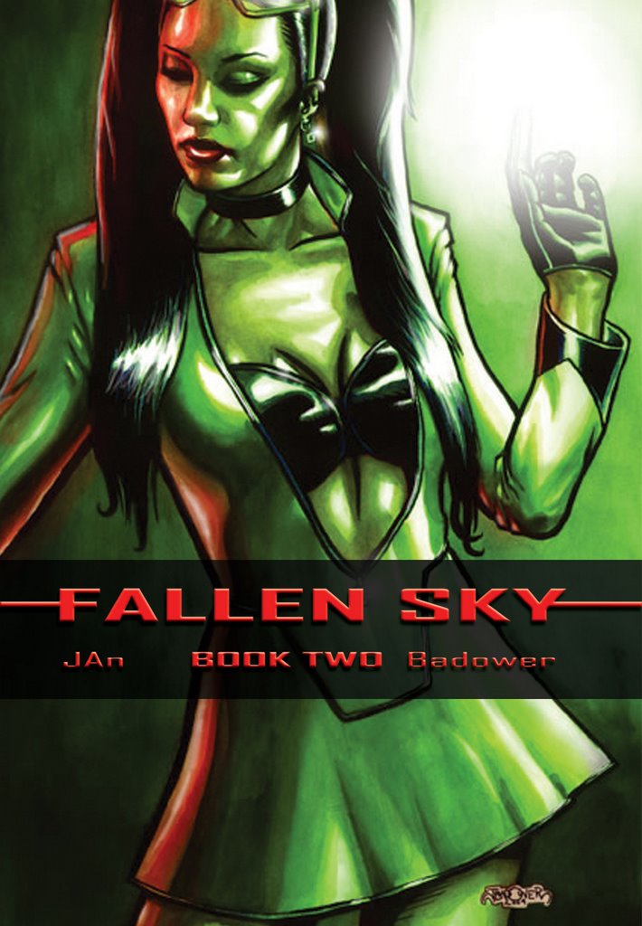
FALLEN SKY - Girl:Fusion cover


Don't worry, I don't count this as a "real" post. This is basically in response to Mike Nason's comment on my choice of colour. This is the artwork with the typeset for the cover. I like the layout and I think the choice of pallette draws the eye - especially on the noisy comic book racks. On a nice shiny paper stock it would look really nice.

I especially like the placement of the logo.

Friday, June 23, 2006

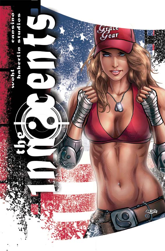
INNOCENTS COVER 1B: design 2


And we have our winner. Not quite as much breathing space as on the first design, but much closer to the original sketch. I wanted a strong powerful figure to attract attention from a distance. The beauty of what Annette does is that it attracts your attention from a distance then keeps on giving as you go closer and closer to it. On some levels there's an incredible amount of closure required making the piece almost impressionistic. On some other parts it's incredibly literal... pore for pore, stitch for stitch.

Seeing how I feel, I might do an extreme closeup of the eyes just to show you the sort of detail that Annette puts in. It's quite incredible.

My next job is to go through the interiors of the book and offer some constructive insights to make them better under the deadline we already have. Unfortunately it's been drawn and coloured already making changes really hard to do.

For those of you interested in the Tokyopop project, we just got a fascinating email from them placing Lucy at the top of the list of the projects they like. Keep your eyes and ears peeled. While I'm not asking for any formal submissions, those of you who read my blog can have a little heads up. Here's the first thing we're going to need to get you sold as a Tokyopop artist:

- 5 pages of sequential art featuring the style you're going to use for the series. It must contain figures and background. The darker, more urban and gritty it is, the better. JAn and I would love to have a Hiroaki Samura or Kazuo Koike sorta look and feel. That line-heavy manic intricate manga. We're inundated with clean line manga and we want a more organic, rougher feel.

So those of you who are interested start putting together 5 pages of good, solid storytelling. Inked. If a penciller and an inker pitch as a duo that's fine, but I'm not putting together inkers and pencillers. And no, you won't get paid more if there's two of you. One flat rate to divide between you (or keep for yourself). No figures yet, but a standard Tokyopop budget will apply.

Don't send it to me yet, and don't blame me if you've drawn your ass off to send me something and it all falls through. Way I figure, is if you don't have 5 good pages lying around or aren't in a position to hammer out 5 pages anytime soon, then you're not up for the gig. It will have a manic timeline so an artist with a high page turn around will be smiled upon.

Thursday, June 22, 2006

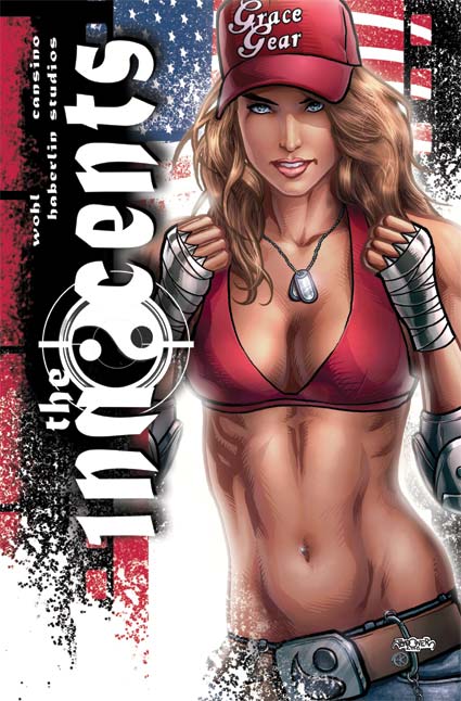
INNOCENTS COVER 1B: design 1

Technically, it's actually design 2, as I designed the one that made the grade first. It's my fav but it got the big knock back.

That's ok. I'm not emotionally attached to any of them. I just want the piece that makes Roger and David the happiest.

I hope you can start to see what I mean how a picture becomes a cover. It's about space, design, placement and position. It's about what you emphasize and what you cover up.

For those of you wondering about the white sprays there, it's a black ink spray that I scanned in, grabbed in a selection created a new layer coloured it in white and then copied that onto the image. There's a couple different spatters, some just linear (straight on) and others with some movement to them.

You can start to see the amount of post production work that goes into one of my covers too. Having the pretty picture just isn't enough. I need layers, depth, texture and focus.

And it was hella fun.

Obviously the tie in to the San Diego cover is obvious for anyone who saw the first cover. Similar but different. I felt it was important to create a design that would be immediately obvious that it's the same cover. If they ask me back to do the next one, I can't wait to take the design a step forward rather than sideways.