Saturday, November 07, 2009

GI JOE part 2

Damn, I thought I posted this. Apparently not. So without further ado, let me bring you the blogpost that time forgot.

Not a huge amount to say, so let's let the pictures do the talking:

<- Snake Eyes Basic: Here's the base I used for all the Snake Eyes pictures. Generally I drew a head and body for all the characters and just drew over the top in various layers to create each costume change. Slower than a phone booth but more variations than a big "S".


<- Snake Eyes Arctic: His outfit looks a little bit... effeminate because I had to pull his sleeves up so that we could interchange the guns I drew. Each gun came with a hand so we could just overlay it over these illustrations. I believe I somehow merged the Duke arctic illustration here using the magic of Photoshop.


<- Snake Eyes: Movie. Take your basic Snake Eyes, and dice into small pieces. Put pieces into a searing pan with sesame oil and wasabi and stir lightly. Add belts, buckles, arm bands and enough pockets and pouches to make Rob Liefeld happy. Serve with white wine.


<- Snake Eyes: Paris. Over in France right now, if you're a super ninja, hooded coats are all the rage. Gone are the accessories and pouches, in are sleek lines and minimalism. It's so gauche to show how you're going to kill someone. Let the victim guess and then get sucked in by your designer lines, and dynamic flowing silhouette.


<- Snake Eyes Accelerator: This design was unfortunately never used. Mainly because it would have broken not just the game, but the universe itself with it's conceptual awesomeness. Snake Eyes in an accelerator suit would initiate mass suicides across the globe as humanity would have no further purpose knowing it had peaked at this moment of uber-coolness. Survivors of this zeitgeist holocaust would go into psychic shock, blocking out the entire concept of our society and go back to living in caves trying desperately to reboot humanity and society until once again they inevitably conceived the idea of Snake Eyes in an accelerator suit.


<- Scarlett Movie: I really like these armored designs for the JOE team. Drawing them I got an opportunity to get inside the thought process behind them. They look and feel reasonably practical to me. I hate stuff that looks impractical. Huge breastplates where you wonder how they bend at the waist just irritate me to look at.


<- Scarlett Fatigues: shown here modeling the desert camouflage texture. Not what I'd design for a basic fatigues outfit. But at least it doesn't make her look like a box. I remember bumping into a police officer lady I worked with when she was out of uniform. I almost didn't recognize her because she actually had a figure! Most fatigues and uniforms do nothing for either men or women.


<- Scarlett arctic: This was basically just an illustration of the outfit she wore in the film for this particular sequence. I like it. She looks cute and practical. I decided to leave out the textures for this one as I think the costume stands up quite well by itself.


<- Scarlett Accelerator: I'm pretty sure she never had one in the film, but I drew one up just for her. I used the basic Duke model and just tweaked it so it fitted over her. I tried to follow the mandate of making it still look like an accelerator suit but also let you know that there's a woman not a man inside of it.


NEXT: One last GI JOE post coming with Stormshadow and the Viper.

Wednesday, November 04, 2009

GI JOE


I know I've been really quiet recently, but that doesn't mean I haven't been drawing my tush off. I've just been too busy to blog about it! But that's changed so let's do some catch up on what I'm allowed to talk about.

<- The Baroness in her Paris outfit modeling (of all things) a tiger camo texture. If you ever fall into a pit of tigers in the middle of a gunfight, this is what you want to be wearing. But beyond its impracticality, it looks bad ass. This whole texture is a homage to Tony "The Tiger" my housemate who coded the game.

My housemate, Tony works for an amazing company called THE VISIONAIRE GROUP (TVG). They're an incredible digital company responsible for a lot of a-level movie websites (Wolverine: Origins, Gamer, Surrogates and the Watchmen Motion Comic). He heard they needed an illustrator so he put my name forward. I did a storyboarding job for an ad for them (something I don't normally do - but this was very fun). Jeff, my contact there is a huge comic book fan so he loves my style and the way I work. The next project was the immense GI JOE FACEBOOK application.

<- The Baroness in her standard slinky and sexy movie outfit. This year in Milan they're doing full body cat suits with a large camouflage print. This is an underrated, practical design used exclusively for assaults in fake, plastic gardens. Take it into a real garden and your ass is grass.


Tony and the team designed the game and it was up to me to design the characters to fit into it. We had a meeting and a thousand and one great ideas were thrown around. The basic premise is that you start with a lowly grunt you can customize them through rewards garnered from successful battles to make a unique unstopable fighting machine. My favourite idea was that the highest level of costume you can unlock was the 1980s original Joe costumes.

<- Here's the Baroness in her plain leather outfit. I'm not sure when she wears this in the film. No, I haven't seen the film. You can read why down the bottom of this blog. I included this one without the texture because I like it just plain. There's enough going on without adding all the extra camo textures etc. I love how shiny she looks. I love drawing shiny textures. They're so much fun. Ok. Maybe it's time for me to get out more.

Unfortunately the 80s idea got shelved, but the rest of the ideas were put into play. You can choose from either three members of the Cobra team - Baroness, Storm Shadow or a Viper or the Joe team - Duke, Scarlett and Snake Eyes. They start off pretty standard, but there is an insane level of customization. Arctic gear? Sure. What color? What texture? Did you like the outfit from a particular scene in the movie? Chances are it's there and you can make it any color and any sort of camo texture you'd like. Let's not even talk about guns and vehicles.

<- Arctic Baroness was a version that wasn't in the film. But we decided that everyone would have an arctic costume. So I had to design this based off her other costumes. It's very similar to the "movie" costume with a hood and white furry bits. It's like a slinky leather version of what Han Solo wore in Empire Strikes Back. Here we see her clad in her urban texture on the arctic outfit. Perhaps she's planning on assaulting Finland or Boston in the winter?

We had to be smart about this. We had a capped budget so we had to be careful what we did within that to get the biggest bang possible. We quickly determined that if I had to draw each gun for each person, that's six versions of the same gun! I think there are 15 guns all up. So 6x15 is... a lot more than we had the time, money or will to draw. A generic gun arm pose was figured out. You will note that all of the weapon arms sit at right angles to us with the palm open towards us. This way we could draw each gun once and it would fit into anyone's hand.

<- Duke in his training outfit. I think this is what he wore all around base. I love drawing different textures, and in this illustration, playing with some very fun, very dramatic lighting. I think he's in his urban camo texture here. The texture for this illustration only went on his pants. It's like he's wearing different fatigues. He's doing what everyone does, and covering his ass.

A huge shame was that they asked me to draw the likenesses for the actors, and I think I did a really nice job. I've included them here so you can see them. But unfortunately there was some clause somewhere that the actors (or someone) needs to approve every likeness that's drawn or painted of them. Somehow that couldn't be done. It was either time or cost prohibitive.


<- Here's Duke in his combat armor outfit that he wore for the movie. I did love this design. Here it is with... aw crap. I can't even remember what texture is on it. And the thumbnail I'm staring at is too small to make it out. I've spent too many years not eating carrots and being single to make that out. But anyway, drawing it made me appreciate the subtleties of this beautiful design.

If you look at the actual game they've stuck new heads of previously approved artwork on top of the bodies that I drew. This was less than ideal, but it was the solution we all had to roll with and I totally understood why they had to do so. I was told that Paramount absolutely loved my rendition of the characters, and that many of the women especially loved what I did with the Baroness. It's a shame that the original heads didn't get used in the game, but you can see those original heads here.

<- This is Duke's fatigues with a small camo texture. There's a large and small one. I guess you might want to measure the leaf size of the surrounding foliage you're going into. Nothing more embarrassing than deploying into the field in the wrong camo size. But seriously, each camo texture created a whole different look. The small worked better on some outfits, large on the others. So we let the user decide.

I think TVG did a great job of compositing the new heads and you would never know the difference if I hadn't pointed it out.

Another thing that I did to make the characters all look like they're occupying the same space was to add a fill light. I picked the fiery glow from the promo posters that were released. It added a sense of urgency and danger. I personally love a good fill light. It can add an extra level of dimension and round out images that seemed flat before.


<- Duke in his plain arctic gear without any textures on it. I don't think Duke ever got to wear this in the movie. So I adapted it from what Ripcord wore.


The huge irony of working on this project is that I never got to see the damn film! I mean, it's not like it would have cost me anything. I could have claimed it on tax. But I dragged my poor, supportive but ultimately suffering girlfriend off to the Arclight. We got there five minutes late and they refused to sell us tickets. I mean, what were we going to do, ruin someone's enjoyment of the ads or a random trailer they could catch on the Quicktime site? Seriously people. I think we need to stand down a moment.


<- The unused Accelerator Suit that I drew. Unfortunately this bad boy never saw it into the game for one reason or another. So feast your eyes on the technological badness of the Accelerator suit. Scarlett and Snake Eyes got one too. I know what you're thinking. Snake Eyes + Accelerator suite = World freakin' Dominating Awesome. Maybe you can just pretend that he has one.

NEXT: More GI JOE

Friday, October 30, 2009

CASTLE PART 3

Andrew Marlowe, creator of CASTLE shook my hand and wished me luck with all the work I had to do. All the while you're speaking to him, you're painfully aware that you're speaking to someone incredibly intelligent who is measuring your every word and intonation. His insights during the meeting were quick and incisive. He cuts to the point quickly and effectively communicating that he had already played out all the possibilities in his head. I learned a great deal watching him work and I'm beginning to appreciate the qualities and the level of vision required by a show runner.

After Andrew had left I turned to Howard Grigsby the producer of CASTLE. I asked him if it would be possible to come down to the set and watch any of my art being filmed. He said of course and would keep me in the loop.

Unfortunately schedules clashed and I wasn't able to see the sets that were made out of my artwork. Nor did I see any of the scenes that involved my graphic novel. But I got to sit in on the scene at the police precinct where Castle explains to Beckett why people get involved in the vampire sub culture.
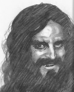
Gina was my guide and took me around the set. The first thing that hit me was that the precinct set is HUGE. Holding cells, corridors, office after office, interrogation (er interview) rooms, stairways to nowhere, and of course the main area where Detectives Beckett, Ryan and Esposito have their desks. I first ran into Seamus Dever who plays Detective Ryan and then Jon Huertas who plays Detective Esposito. At the time I hadn't watched enough CASTLE episodes to appreciate who I was meeting. My reaction would be very different now. They were really low key and stopped by for a chat when they realized I was new and how I was involved in the show.

Afterwards, I mentioned to Gina that I'd love to meet Nathan Fillion. I asked her if it would be "out of line" to get him to sign a couple copies of Firefly that I'd brought with me. She said he's super cool and snagged him as he zoomed past on a kid's scooter. It looked miniscule on him. I'm not small, I'm 6'1 and 215 pounds and he made me feel pretty tiny. He's gotta be 6'3 and 240 pounds and he carries it well. He was fun and gracious and signed both the Firefly dvds with his signature, "Watch this, it's good".

When I later gave my friend her dvd she totally flipped out and actually jumped into the air several times waving her arms and legs like a hummingbird. She's a pretty cool cat, and to see her lose it was gratifying and hilarious.

I'm a reasonably cool customer, but I may have gushed around Nathan and there may have been some fanboy babbling.

Maybe.


Anyway... moving on. They finished shooting the scene and it was great to watch them work. Then the crew moved across to Castle's apartment which is also huge. And it's a really nice apartment. It was all decked out for the Halloween party and Michael Courville from the art department gave Gina and I a tour through the Halloween candy that he had especially catered for it. The whole apartment is so thoroughly designed. Everything is thought of. The letters of congratulation and rejection to Castle on his wall are all proper letters not garbled words. The books on the shelves seem like the sorts of things that Castle would read and they're all real books. He has fencing statues (reminiscent of the time that he and his daughter Alexis began an episode fencing.

I ran into Barry, the first AD and a huge HEROES fan. I mentioned to him that I'd brought down my first HEROES graphic novel for Stana to sign but that she was nowhere to be found. Above and beyond the call of duty, Barry ran upstairs and asked Stana to come down and chat to me. I was taken aback. Stana was lovely, very tall and very lithe. As I handed her the graphic novel we spoke about her character on HEROES, Hana Gitelmann and how the character was the mouthpiece for the online fans. I commented that the writers probably didn't realize her rise in popularity and really should have included her in the show more. She would have been the perfect way to keep the sprawling cast together.

On the plus side, I got to draw her Death which set me on the map as a creator who cared about his work on HEROES. She had a great laugh at the ridiculous portrayal of her body and clothing by some of the artists. I told Stana how the fans agreed and how I tried to get them involved and to put their money where their mouth is and get them to design a dress for Hana. Meanwhile she's flipping through the pages of the story I drew and I'm getting increasingly nervous. I then hurriedly told her how I was going to do a competition for who gets to kiss Hana. She laughs flicking through the pages saying, "So who won? Who did I kiss?"

Then her hand moves away from the offending panel...

http://jasonbadower.blogspot.com/2007/05/hana-part-1-i-eight-hana.html
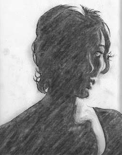
Yeah. Em-BAR-RASSING!!!!

We laughed so hard. I told her that at the time I didn't have a girlfriend, and I joked that if I wasn't getting any action in real life, I could at least get some in my comics. So I drew myself in thinking that I would NEVER HAVE THIS CONVERSATION with Stana. She (graciously) laughed very, very hard.

So she asked me if she could write something in the front of the HEROES graphic novel for me as well as sign it. "Will your girlfriend read it?"

"Yeah, but you can write anything. She's totally cool."

So Stana wrote:

"To Jason, For the best virtual kiss I ever had. Stana."

And that ladies and gentlemen is why Stana Katic is awesome.

That concludes my time on CASTLE. I had a ball and was overjoyed to see how well it turned out. I only hoped that my artwork would be integrated as well as it did. Thank you to everyone involved for making it such an awesome experience. I hope you liked seeing the extra artwork and if you go back and watch the episode again (206) you will see where it fitted in.

As a final piece of icing on the cake, I turned in my invoice. A day later I got a call from Howard, "Jason, we need to have a talk about this invoice.". I start thinking, "Oh god, I've over charged. I thought it was fair but he's going to ask me to compromise or explain some of the invoice. Here we go..."

Instead Howard says, "I've been talking to Alfred (the head of the art department) and we both think you did a tremendous job and seriously undercharged us. We think you should redo this invoice. Here are some suggestions..."

Howard basically increased the invoice by 50%. I was so humbled, and stunned. I knew I'd probably undercharged myself, but fair is fair. I quoted a price so I felt (as a man of honor) that even though the amount of work blew out, I had to stick to that price. That Howard would call me to tell me that he didn't think it was fair to me tells you the caliber and integrity of the people working on this show.

Immeasurable.

Castle. 10pm ABC.

They've made me a fan for life.

NEXT: More freelance work. The GI JOE Facebook application.

Thursday, October 29, 2009

CASTLE part 2

I've attached here some of the main artwork that we saw and didn't see in the actual show. I did a great deal for CASTLE that didn't make it onto the final cut. Hey, it happens. I'm more concerned about giving them what they need rather than what they use and don't use. If I even felt slightly bad about not seeing all my work featured that feeling is assuaged now by showing you the artwork right here.

These first two pieces are the key pieces of the tree that we see. They kept referring to this off as Crow's sketch work, when it was obviously a digital print out. That's ok, I mean they wanted Crow to be a digital artist. Karen and Alfred even asked me extensively about my setup at home. But when it came to the final cut I think that detail got lost in the mix. My only concern was that I did a great deal of actual sketch work using actual charcoal work for them. Yeah, you heard me. REAL artist stuff. Non-digital artist stuff. I generally don't tend to work in media other than digital because I tend to wear everything that I work in. The charcoal was no exception. I looked like a chimney sweep by the end of a solid drawing session.

But I remember the story involving these two digital pieces of the mother very well. I am by nature, nocturnal. As the night draws on and the numbers on the clock reach their maximum and start again at one my creativity winds up more and more. So I tend to get to bed around 4am and rise from my coffin around 10am. So when a call comes at 8am, it gets shut off pretty quickly. Except when my phone reads, "CASTLE".

I answered the phone, still trying to hang onto the blanket of sleeping hoping that I could slip back under again. They apologized profusely. The order of the scenes they were shooting had been moved around for logistical purposes. But then they realized they needed artwork for the scenes. They needed a sketch of the mother under the tree, and perhaps also a close-up so it read better. And they needed it by 10am.

I told them that I could do the charcoal sketch but even if they sent someone now we couldn't courier it back to them in time. They assured me that a digital sketch would be fine to send by email.

I remember going into full-on fight or flight mode. My adrenaline was pumping so hard my hands were shaking - which doesn't help you draw, believe me. Now I know how Kaylee felt with Captain Reynolds yelling through the intercom to get the engines back online or they're all going to be raped to death by Reavers.

I managed to get them done in time. Somehow. You don't have much choice when you realize an entire production is waiting on you to get something done so they can get to work. Every minute is costing ridiculous amounts of money. I remember after the adrenaline come-down going back to bed to sleep for another 4 hours. I was so exhausted.

The "pool of blood" picture was for a piece that sat on Crow's easel. I originally misinterpreted it and drew it much smaller. Once that confusion was cleared up I was given the go-ahead to do a huge 3 foot by 4 foot piece. I drew the faces separately and glued them on, figuring that no one would ever notice and it wouldn't read for the camera. Now apparently the glue started to give and her face started peeling off. But it made for a really nice creepy effect. It's one of the key images as Castle and Beckett enter Crow's apartment. An accidental piece of art. I wish I could take credit for it, but I think that goes to Alfred and Karen.

I took a photo of the piece before I painted in the pool of blood. I was terrified that the pool wouldn't work and I'd have to digitally rework the piece. Turns out, it ended up looking ok. I also liked that it's a subtle mislead that Morlock killed her and possibly him.

What I loved is the amount of thought that goes into every aspect of the production. Everything is considered. In addition to the huge "pool of blood", Alfred Sole, the head of the art department wanted a huge mural for Crow's wall. It was supposed to be a work in progress or visual diary for Crow. So every night Crow would awaken from his nightmares and draw what he dreamed. Visions of his mother mixed with Morlock and the tree and blood. I threw paint at the mural, flicked it, smeared it. Drew on it with paint and charcoal and ink and everything I could get my hands on. It's about 4 feet wide and 6 feet tall. That's my toes in the corner as I climbed on my ottoman to take that photo. It was the only way my camera lens could get the entire piece in.

They also asked me to do a bunch of sketches to cover up Crow's wall. Here are two of Vixen his vampiric lover. I ended up asking Samantha Shelton to "friend" me on Facebook so I could steal some pictures of her to draw from. She kindly accommodated my bizarre request to Face-Stalk her. I was concerned that I wouldn't know what her makeup would look like. Then I realized that all the goths I know change their looks more often than a chameleon sitting in the window of a moving train.

I also did a sketch of the daughter, Crow's sister, but I can't seem to find that anywhere.


Next: The third and final part of my CASTE experience. Sketches of Zoe Taylor as the dead mother and Robert Arbogast as Morlock. And of course, meeting Nathan and Stana.

Wednesday, October 28, 2009

CASTLE part 1

I've attached here the four pages of Crow's, (our murdered graphic novel artist's) comic book and the cover. You will find notes on each page next to it. It was written by the CASTLE writer's assistant John Zaozirny and edited by co-producer and the episode's writer, Terri Miller. It's important to note that the cliched, and heavy captions are intentional. After all, it's written by a twenty year old emo vampire-wannabe.

The artwork is drawn, colored and lettered by me.

<- The cover to Blood Everlasting, Crow's graphic novel. Crow's mother was played by the super lovely ZOE TAYLOR who is much prettier than the photo of her in the show. I tried to do her justice with these illustrations. She was kind enough to give me a lift home after our photo shoot. Note the blood drenched dress.

I would recommend reading the blog post first and then coming back and reading all the image comments in italics. You can click on any of the images for a higher res version.


It began with an email from (now) HEROES staff writer, Oliver Grigsby. Ollie has been the editor for the HEROES comics for a while and I think most of the best stories I've done have been with him. His email asked me to contact his father, Howard Grigsby, the producer on CASTLE. Apparently they needed a comic book artist and I was the first guy Ollie could think of. I guess the lasagne I cooked for Ollie and his wife, Abby as thinly concealed bribery paid off.

<- The original sketch for the cover of Blood Everlasting. The actor who played Morlock is Robert Arbogast, who I thought did an amazing job of playing a very subtle crazy person. You might note the similarity to my HERESY piece. It was referenced by the producers as a direct inspiration.


Anyway, Howard asked me to quote for some comic art and I did so - keeping to the rate that I quote for HEROES. Then... crickets chirping. I'm thinking, "Oh man, I've insulted him and he's looking elsewhere. He's probably told Ollie how greedy, short sighted, unprofessional and unreasonable I am."

It appears I was wrong.

Then the floodgates opened.

<- At this stage I had no idea what Robert's makeup would look like so I kept to this clean cut direction to showcase his pretty boy looks. Little did I know...

<- ...that they would go all "Rob Zombie" on us. I was excited to see that this page really got used. I drew it before the set photographer managed to get me reference shots for Robert's Morlock makeup. I had to add the beard and dishevelment afterwards. There are only four pages to the graphic novel (plus the cover) because that's all we needed. Two sets of open pages.

First I was sent Terri Miller's script for VAMPIRE WEEKEND episode 206. I had never seen CASTLE before. Reading the script I went from smiling, to giggling to downright laughing. One of my favorite lines was cut from the episode. It was a good cut, but I was sorry to see it go. I think it's the most accurate and pithy commentary on women's halloween costumes I've ever heard:


<- This is what I gave to the producers and the art department to show them what I had in mind. I drew these after the location shoot. That was a day which involved me wandering with certain members of the crew around different parts of LA trying to find locations that would work as sets. At one stage we're in a very nicely designed and appointed warehouse. A girl in lingerie and ridiculously high heels walks past and goes, "Who are all these people?" Turns out they were shooting an "adult movie" in the adjoining room.

CASTLE
You could be slutty Nurse... no,
too sexist. Slutty Doctor. Oh here,
you can be slutty Supergirl... or
love this one...

(He pulls it off the rack.)

CASTLE
Slutty slut!

I laughed and laughed and laughed. Then I asked myself why the hell I wasn't watching this show. I'm a huge Nathan Fillion fan, I had to draw Stana Katic for HEROES (see the link on the side for THE DEATH OF HANA GITELMANN) and the banter was as fast and as sharp as VERONICA MARS (probably my favorite tv show ever which Howard was coincidentally also a producer on).

<- I was buzzed to see that the last panel got so much coverage on the show. I knew that it had to resemble the location exactly. Karen, the director told me it would literally be held up to camera then removed to mirror the exact location. Karen and I meticulously coordinated the shot but I didn't hold my hopes up. How wrong I was! Those bricks and graffiti took FOREVER. Andrew Marlowe suggested the guys huddled by the burning trash can on the left.

I was asked to come down to Raleigh studios and talk to freelance director extraordinaire, Karen Gaviola; the episode's writer and co-producer, Terri Miller; the show's creator, Andrew W. Marlowe; the first AD the lovely, Barry K. Thomas; the head of the art department Alfred Sole; and of course, Howard.

<- a layout based on the photo reference I took of this old basement under an abandoned hospital. It gets used as a set so often there's still duct tape and fake spider webs up from the previous crew's efforts. But Alfred redressed it so well you'd never ever know.

The meeting was basically to show them and assure them that I can do the job and I "get" what they're trying to do. I brought my portfolio and that pretty much spoke for me. We bounced ideas, around and generally agreed that I would have a metric bucketload of work to do.

<- After looking at my reference photos I was forced to do a different angle of panel one. I just felt this angle helped the storytelling more. If you re-watch the scene before they find Morlock you can see that this is a step by step guide as to how to find Morlock's lair. If I ever get murdered I'm screwed cos I mess with geography and locations all the time. You'd need a teleporter to follow my graphic novels.

<- The idea is that Morlock has the spirit of his old lover floating over him and protecting him. But he feels alone not knowing that he is being watched over. Zoe was kind enough to pose for all these reference photos. You can see again I thought Morlock would be clean shaven.

Afterwards, Barry came up to me and told me that he is, "a huge fan of HEROES and that he's kind of locking it down right now." I'm used to this, and I'm also used to the misapprehension that a fan of the show has confused me for someone really involved in the who. I launched into my usual schtick of telling any HEROES fan that they should check out the online comics as they're set between episodes and expand on the stories in the show. He replied, "Oh, I know about them. In fact I've read them all and I'm a huge fan of your stuff. The work you did with Stana on the 'Death of Hana' was my favorite."

<- The last panel here got some great coverage and I was very happy about that. I remember kidnapping the location scout as my model. There's an amusing reference photo (that will never see the light of day) of panel one on this page of Terri playing Morlock and Karen looming awkwardly over her. They were doing that to give me a sense of perspective and composition for the shot.

I was totally taken aback. He actually not only knew my work, but liked it! Being recognized has happened a couple times before, but never in a professional capacity. Barry went on to do one of the nicest things for me and it was my favorite anecdote from my time working with CASTLE. I will go into that and meeting Nathan and Stana in a later post.

Monday, October 12, 2009

MUTEMATH: breaking the silence


Sorry to not post. But I'm so busy. And busy on stuff I can't talk about yet. But I have so much to cover and catch up on. NDA's are starting to fall by the wayside (storyboards, GI JOE Facebook apps, Castle etc.).

Now it's a bit out of keeping to recommend music. I mean, you don't come here for music reviews. And who cares what I'm listening to as long as I'm pumping out pages, right? But I just went to one of top five gigs ever last night. In the past top five gigs have generally been because I went with an awesome crew of people, and when you take awesome people anywhere you have an awesome time.

But while my girlfriend and her bff are amazing people, the ties between us were eclipsed by one of the best shows I've ever seen. Here's a review I wrote:

"Mutemath are one of my top 30 bands. I think they're cool but my girlfriend is the big fan and keeping her company was the main reason why I went.

Imagine my surprise when Mutemath did one of my top 5 gigs EVER.

Mutemath's albums are great, but onstage they are off the chart. You need to see these guys live, even if you don't know their stuff. If you're an up and coming band this show (not a gig) is a step by step guide on how to perform. They organically and spontaneously remix popular tunes and then open the flood gates on lesser known songs to show you why you should love that track as much as they do.

Every time I thought we'd peaked, they played the next song. Visually it was like Stomp meets the Blue Man Group, and sound-wise like Mutemath swallowed a jazz band and European dj. And in case you think it's a one-off they've been doing this show every 2-3 nights for almost two months now.

I paid a ridiculously small $20 for one of the best shows I've ever seen. If they were playing here again in LA tonight and wanted to charge twice or even three times as much, I'd go in a heart beat."


Please. They're still touring. And it's SO cheap. Whatever music you're into is irrelevant. Go check them out. You can thank me after.

http://mutemath.com/

Thursday, August 20, 2009

LIBERATION part 2

Thanks everyone for keeping me updated on the Deviant Art situation. It looks like they asked that person to take the artwork down. I hope that person finds other ways to channel their creativity. I'd feel bad if that person's find the experience so hurtful that they wanted nothing to do with their creativity.

On the other hand, that experience and Crystal from Deviant Art has prompted me to have a closer look at Deviant Art. I have to confess that when I looked at Deviant Art back in 2006 it was a forum for amateurs. It just seemed like it was where kids went to put up their pictures of Dragonball or whatever manga was hot at the time (as an fyi I was into Dragonball back in 1984 and had to get my mum to translate copies I would import from Hong Kong. Pretty industrious for a nine year old, huh?). But maybe I missed a memo, but Deviant Art is kicking some pretty serious booty. Adam Hughes is on there. Jim Lee is on there. Sweet.

I played with the interface a bit and really enjoyed myself. I still think the blog is the best place to talk about process. Here the focus is on the journal entry as a whole, wheras Deviant Art focuses on each piece of artwork. This makes it a bit tedious to post all the process sketches as they all come up as separate pieces of artwork rather than as a subsection of the finished piece. No matter. Every tool for every purpose, right? I'm thinking I might post more of my personal, non-commissioned work up there.

So back to this page. I would say that I didn't do a great job with Molly or Micah here. They're serviceable, but they're not outstanding by any measure. Why would I let something like this through the door? If I remember correctly I was drawing this while I was in Vegas. I woke up every morning at 9am and started drawing. My buddies woke up a lot later and headed down to theHOTEL at Mandalay Bay's wave pool, sat in the sun and started drinking. As each bucket of beers proceeded the next the texts they sent me got more and more inflammatory and insistent. So with this is mind, I may have been a little distracted while drawing these pages. I hope you can forgive me.

I'm happy with my likenesses of Claude. I know Tarot is always keen to see new Claude so I always try to deliver with him.

Wednesday, August 19, 2009

LIBERATION part 1

Well! It's finally up and I must say that I am very happy with how it turned out. I think I got some good likenesses there, the characters seem to interact really well and I like the backgrounds. It was fun playing with the different scenes, and I remembering commenting to Jim Martin (the writer) that he covered a hell of a lot of ground very, very quickly and effectively while still leaving room for the character interactions that make these stories and the show so much fun.

I really enjoy the palette of the opening sequence. I'm quite happy with my outdoor coloring. I'm still working on inside coloring that isn't too dramatic.

People have asked me what reference I used for Molly. Basically I just used the final episode of season 2. I think that was the last time she was seen. I don't know how much time has passed, so I just drew Adair Tishler as she appeared back then. To be honest, I didn't even contemplate the idea that she'd grown up. I know Micah has grown up, so maybe I dropped the ball on that one. I guess you're the judge of that.

Regardless, I think the last panel turned out to be quite a nice likeness. It was important for me after the wide establishing shot of the second panel to make sure that there was no doubt that it was Molly who was speaking.

Who names their kid "Molly" anyway? It's a great name for a kid, but not so great a name for a grown woman.

I had fun drawing the wrecked train. I'd never drawn a train before, but I had drawn a lot of wrecked stuff, so I kind of started there. I think it turned out rather well. That's one of the fun things about doing commission artwork, you always get asked to draw stuff that you've never drawn before and perhaps wouldn't have considered drawing. I think that's why I like drawing comics in general. There's always new stuff to draw to keep you on your toes artistically. And that keeps it fresh and exciting.

Toni (Acidburn133) sent me an interesting Facebook message today. She noticed that a person on Deviantart has run some filters over some of my artwork and posted it as their own work:

http://evofurianspartan.deviantart.com/art/heroes-78281346

I had a long think about how to approach the issue. Roy Lichtenstein has a notorious popularity for taking comic book panels blowing them up and recoloring them. They hang in galleries for millions of dollars while the poor original artist sees none of it. While I don't necessarily agree with Roy's art in this aspect, it is still perceived as a valid artform. I'm not sure where running some filters over my artwork lies, but my signature still sits at the bottom of the artwork, so there's no doubt who did it.

After some deliberation I contacted Deviantart asking them to get the person who posted the artwork to credit myself and provide a link to the orginal piece of artwork (which you can find HERE.) If they refuse, then I asked them to get them to take it down. See, I don't know if it's some kid, a person with a disability or someone who is just trying to be clever. As long as they credit me, don't do anything offensive with it (a subjective guideline again assessed by me) then I don't really have a problem with it.

I hope they credit me and all ends well.