Friday, February 22, 2008

PAST EXPERIENCE part 3

Oh god, I am so slack I should be taken out the back and shot. When I die I'm going to Procrastination Blogger Hell where devils dance around my cage promising to torture me... tomorrow.

It's kinda funny that no matter how hard I work during the week I'm always rushing my ass off at the end of the week to get things done. I think it comes from a serious inability to say, "No" to fun projects. Instead, I just line them all up and then balk at the amount of work that has to be done.

Right now I'm doing some huge posters for Spacedog's New York Comic Con booth. I can't wait to see them 8 feet tall! I've also got some correx to do on a friend's movie pre-vis pieces.

But let's get back to Kimiko.

LAYOUTS

JT, the writer (I figured I better remind you as it's been awhile. I hear they've also invented jet-packs between my last post) suggested that the first panel should mirror the last panel of the last page. In fact, he had very clear directions for how he wanted the scene to run. I looked over them, and they were great. It was just a matter of designing the room and the placement of Kaito and Kimiko to make it work.


LINE ART

I noticed I copped some flak from some posters on 9th Wonders who didn't like my George Takei. At this stage of the game I was ready to print panel 1 out on nice piece of photopaper and mail it to his agent I was so proud. Seriously, that's George Freakin' Takei! I was so happy with it at this stage. I'm still proud of the linewor. Little was I to know that all my efforts would be thwarted by my inability to colour him.

I do like the picture of Kimiko on panel 4 also. I think it really looks like her, and I like it how at the one moment that her father actually looks at her, she looks away.

If I remember correctly, it was about at this stage that my computer was so under-performing I thought it had been taking tips from some of my ex-girlfriends.

It was so sluggish that if it had a pulse I would have checked it to see if it was alive. This page took me 2-3 days to do! And look at it, there's really not much to look at! But I was so frustrated by panel 3, I knew that I would have to look at other, more time effective ways to finish this. I opted for the first of my photo textures for backgrounds.


TONE

George still looks like George here, and Kimiko looks far more Kimiko-like. See? I write gooder!

I remember almost rubbing my hands in glee at how well this page was turning out. I really dug the lighting on the two characters and loved how it accentuated the scale of the room.

Somewhere around this stage I'm probably chanting over my laptop in latin wearing rosary beads and a dog collar. A good old fashioned exorcism is about the closest you're going to come to any sort of technical support from me.

But, despite my best efforts to call out an unholy spirit frommy laptop, there was no screen spinning 360 degrees, no vomit and my laptop didn't even try and climb down the stairs backwards. Following in the footsteps of those pre-mentioned ex-girlfriends, my exorcism was a let down.

I decided to try another tact.

PHOTO INSERTS

So here's Jason trying to save his ass and deadline with photo textures. I can't tell you enough how much I *HATE* doing this. I feel cheap. I feel like I've asked for a refund at a $2 store.

But they look nice don't they? And how about those spiffy glass effects!

I can just see your reply now, "Boy, Jas, you do a GREAT glass effect! Don't tell me you actually DREW that glass in. You didn't put your back out actually DRAWING something did you?"

Shut up. My computer was possessed by a slavering devil from an outer circle of hell that thought that shoulder pads were still a fashion accessory and my time should be played like fingers down a blackboard. Slowly and tortuously.


COLOUR

I want you to marvel at the magnificence at which I have destroyed a perfectly good likeness of George Takei. What the hell was I thinking?! If another colourist had done this to my work I would have hunted them down, nail gunned them to a chair and fed them their toes.

As it was, I plead insanity.

For those of you who've met me, what you see is what you get. I'm one of the most chilled dudes you're gonna meet. Well, chilled as in "not gonna get angry" not as in "relaxed and laid back". I can't remember the last time I got angry at anyone. So believe me when I say I was ready to totally reenact every part of every rage zombie in 28 Days Later. I was especially looking forward to setting myself on fire and running around after people. I think it would have been cleansing.

Like the eye of the hurricane, a calm possessed me. I remembered that my friend Xander Black mentioned that he'd become pretty savvy at putting together computers and had about 8 desk tops at home. I called him and he offered to look at my laptop. So I headed around to his place.

He figured that the graphics card had crapped itself and turned itself off. He turned it back on and made some adjustments to my computer. I would of paid more attention to what exactly went wrong if I hadn't been forcefully kidnapped by his Playstation. All I know is that a couple rounds of Guitar Hero and Tekken later, my computer was working again. Oh the wonders of Playstation and its healing properties!

So Xander sat down and we throw down for some Tekken Tag (yes it's retro, but it's what we used to play against each other, and it's the last Tekken we both learnt to play).

FINAL TOUCHES

Yeah, so here's some lighting and blow out effects from the window. Blah, blah, blah. No one cares. What you wanna know is who won, right? Right?!

Yeah, I know I'm right.

I whup his ass at the start, but then he makes a comeback so brutal it has since been outlawed by the UN as a crime against humanity.

Finding my dignity and my Tekken skillz crushed under his designer boot I make a final resurgence at the end when my main man, Jin Kazama (also my digital man-crush - see below) remembers who he is and interfaces with me on a spiritual, emotional and intellectual level to unleash a mountain of destruction so big they set up a memorial service for Xander.
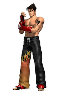
I hear that broken Tekken players make pilgrimages to this mountain of pwnage to pray at the shrine of Xander's broken spirit.

As you've probably gathered, I LOVE my Tekken. I just haven't had time for it recently. So come walk with me for a trip back in time. I promise to include an embarrassing photo to make it worth your while.

At the time, I wasn't the only one who liked Tekken. My entire martial arts club was into the game. We loved it because if you know how to fight, you can play. In the closest I ever came to cosplay, I organised my martial arts club into a performance called, "ENTER THE TEKKEN". I cast various members of the club as different characters from the game in a martial arts play that I scripted and choreographed.

Of course, I had to play my man-crush. =)
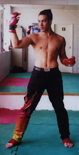
Yes, that's me. I painted those pants with a little help from a very talented ex-girlfriend. I used to wear those pants out clubbing and I got quite known for them. Another friend of mine did the makeup, tattoo (which you can't see) and hair.

I did the abs. =)

ENTER THE TEKKEN went on to win the Grand Champion Trophy in showmanship in an international tournament. Of all the martial arts trophies I won, that was the one I was most proud of.

See? Embarrassing photo. Told you it would be all worthwhile.

Next post soon, I promise!

Monday, February 18, 2008

HEROES: Past Experience page 2

Sorry about the interruption to our regular programing. I just didn't plan some deadlines very well and they all came crashing down on me. And while I love blogging, it's not my "job" per se.

Anyway, let's get back to HEROES: Past Experience.


LAYOUTS

This was a fun page. The key thing for me was to make sure that there was no problem reading that this part was set in a picture book or within young Hiro's imagination. The writer, J.T. Krul suggested in his directions that this sequence could either be drawn like the picture book from the show or in the style of the tapestries:


I'm a fairly flexible artist, and while I could do this, I knew it would take a while. I opted instead for a more cartoony colouring style inspired by Josh Middleton.


LINE ART

Obviously Kensei is asian in these pictures as no one knows that it's really David Anders. I used the samurai armour from the tv show as I believe that the illustrator or Hiro's imagination would have used the real armour as reference.

My only other vague sort of Easter Egg is that the two samurai are loosely adapted from my favourite Kurasawa film, The Seven Samurai. If you haven't seen it, it's a true classic that has inspired so much modern cinema. Here's the reference I used:


You can see that at this stage I'm still deciding how best to make the storybook stand out from the rest of the story.

My young George Takei was fun, but I think he really comes alive at the toning stage.

TONING
I knew that I was going to colour the storybook sequence differently. I knew that if I did that it would help separate the two scenes. So the toning here is really only on the final panel.

It's amazing how it goes from well, some dude, to being George Takei! I'm so happy how I can trust myself these days to be able to do this and know which stage will best achieve what I want it to.

I know some people weren't happy with my George Takei likenesses, but I thought this one was particularly good. Maybe they're just not used to him smiling?


COLOUR
It was so much fun to play with a different colouring style. I hadn't used this style since I coloured "Killeroo: book 2" years years ago! I dig the heavy shadows and harsh fill lights. I also got to play with a really bold colour palette.

Listen to me, "a bold colour palette"?! I really need to get the hell out more. I'm getting all excited over colours! Time to check my testicles at the door, I think I've just disowned all right I have to any manhood whatsover.


MY, WHAT BIG SCROLLS YOU HAVE...

So inspiration finally struck! My idea was to change the panel borders (or boxes) to scrolls. I wanted to give the feel that this story was very old and add a mythic element to this enjoyable fable.

It totally comes alive!

I was very happy with this idea. I was totally convinced that every reader would find this easy to follow and read because of this storytelling device.

I literally had to think outside the scroll.

Sorry, I couldn't resist that pun. =)


FINAL TOUCHES

I placed a faded out version of the raining arrows Kensei tapestry as my backdrop. The harsh white was too startling for me and I needed a texture behind it.

Some subtle airbrushing and colour mixing and the page was done! I was very proud of the storytelling on this page.

While it seems that this page was all fun and games, my computer was starting to seize up like a wet fish in a snow storm. I remember my satisfaction at finishing the page being tarnished by how long it took me because my computer was slowing down like some sort of cheap-ass bullet-time effect.

My frustration was building and I could feel my pants going purple and my skin green...

Sunday, February 17, 2008

PAST EXPERIENCE - interlude

I've got a big deadline on my plate, and each of these posts takes a lo-ong time to write. Instead of doing a crap job, I'm just going to put it off til Monday! Sorreee!

jas

Wednesday, February 13, 2008

HEROES: Past Experience

This hit me from out of nowhere. I open my Inbox and suddenly there's a HEROES story!

My goal for this story was to make it the most "illustrated" story since War Buddies. When I work by myself, I tend to use textures and photos to fill up space. Sometimes it's laziness, sometimes it's because of the time pressure. I wanted to avoid doing that for this piece and really looked forward to drawing every element possible.

Then the Nightmare started.

My awesome new 17" laptop (Duo 2.4Ghz and 2Gb ram and 300GB hdd) started running like a dog with four broken legs. To give you an example, the simplest move you can do on Photoshop is to grab your canvas and move it across so you can draw the next bit. It's normally an instantaneous operation that I don't even think about. Doing that was making we wait for 30sec! Because the laptop is new, I stubbornly persisted for three days of this as I refused to believe that there was a problem. In those three days I drew ONE page and I was on the verge of tears. I saw my lofty artistic goals evaporating.

Finally I called my friend, Xander Black who discovered that my graphics card had turned itself off, leaving my ram and cpu to do all the work! He solved the problem and also did some nifty Googling and discovered that the version of Photoshop I was using has incredible problems with Vista. Problem solved, and if you look carefully you can see my shout-out to him on young Hiro's t-shirt on this page on panel 3.

BUT I had 2 days to draw and colour 4 pages! Most comic artists are doing well if they can do a single page of line work a day, let alone inking or colouring it!

J.T. Krul's script really grew on me as I drew it. I've scanned the message boards and one of the constant observations that people make is that, "this was such a fluff story. It doesn't add anything to the ongoing Heroes narrative."

Well. You're wrong. For starters, all the webcomics are part of the Heroes narrative no matter how much they progress or simply massage continuity. In this case, it explores a relatively minor character and projects her into the limelight. They even updated the YAMAGATO FELLOWSHIP website to coincide with the conclusion of the story. That's pretty awesome.

The other thing people need to do is consider their expectations of these stories. Remember, these are here to COMPLIMENT the show, not replace it. Now, I'm just making stuff up, but if Matt were to die or HRG got paralysed you can bet your bottom dollar it's going to appear on the show not the comics. The comic adds texture, depth and background, but it is not meant to stand alone. And when it does, like the Death of Hana Gitelman (where you find out what happened to the second tracking system HRG talks about) people get cranky and demand that it should have been on the show!

Do we see the tightrope that they're walking with the webcomics? Too much they get crucified, too little they get drawn and quartered.

Anyway. Onto PAST EXPERIENCE


LAYOUTS

J.T had some fairly specific scene directions, which really helped me discover what I wanted to do here. I realised that we had a transition from a closeup of Kimiko to a closeup of Hiro. I felt that the most logical transition was to pull back and then move in on Hiro at the end.

So we go from closeup on Kimiko's hands, keeping her as the centre element for panels 1 and 2 (hopefully letting you know who is speaking too). On panel 3 I shift her off to the side slightly and compositionally try to introduce Hiro. I'm hoping that the line of the bench that Kaito and Hiro are sitting on will get your eye to him.

Finally I closeup in on the new action. I think it works!


LINE ART

As I mentioned, I wanted to draw the pants off this piece. I can't imagine how much drawing one would have to do to get someone to take their pants off, but I'm guessing it's a lot.

So I had a smack at it. This is the level of detail that I normally draw with when my back isn't so far pressed up against a deadline I practically need consent.

C'mon, look at those flowers! That's a LOT of flowers! I also had great fun drawing all the characters, but especially enjoyed drawing George Takei. It was fun de-ageing him! Welcome to the magic of comics!

GREY TONES

The interesting thing about the script is that it has THREE drastic scene changes in three pages (flashback, Kensei story, Kaito's office)! I had to figure out how to make sure that the reader wouldn't get confused between all three scenes.

I decided to do the flashback in the same way as the flashbacks from Company Man (Season 1, episode 17). I studied them carefully and tried to emulate the blown out whites and deep blacks. It's amusing a comic imitating a television show imitating a comic.

I really felt these grey tones brought some life to the piece. I think they're a bit dark, and if I wasn't emulating the Company Man style I would have lightened everything a lot.


FINAL TOUCHES

I noticed that the whites on the flashback sequences were really white. Like white-white! So I went in and heavily airbrushed everything. I'm normally trying to cut back on the airbrushing ("Hi everyone, my name's Jason, and I'm an airbrushoholic."), but this page actually NEEDED it. I promise!

I especially love the bloom on the last panel.

Well there we go! I consider this one of the best pages I've drawn for HEROES. I love the pacing, camera work and had (at this stage) a luxurious amount of time to draw it.

Page 2 tomorrow. The Hell Page that took me 3 days of blood, sweat and oh so many tears.

FACEBOOK: Friend me if you'd like.

COMMISSIONS: Email me for details. Huge backlog right now.

SKETCHBOOKS: $10+$5 postage. Once these last few are gone, I doubt I'm ever printing these again.

Monday, February 11, 2008

WOLVERINE

As some of you who wandered by my Facebook would know, I got a new HEROES job and that basically accounts for all of last week. Trials, tribulations and stories will be posted when it goes live. Until then, it's all very hush hush. I am very proud of it, though.

Ok, onto Wolverine. I did this piece WAY back in Melbourne. I think it was the first piece I drew on my new laptop. I just found it when going through all my archives of artwork. I can't believe I forgot about it! Huge shout out to Andrew and his brother Ashley (did I get that right, guys?) who commissioned me for this.


SKETCHES


I believe Ashley had the vision, but it was Andrew who put together one of the best, most detailed briefs to work from. When it came to doing the sketches, the picture Andrew had painted in my mind was so vivid. I remember doing an alternative just in case, but they went with the first version - purely inspired by their brief. A chance to draw a berserker Wolverine was really exciting!

LINE ART

The trick to the actual picture was to arrange all the elements in the picture into the most dynamic action-packed way possible. Those claws, man... those claws. They are a NIGHTMARE! Trying to fit all six claws into the picture without breaking Wolverine's Adamantium arms in the process was tough. They then had to look sharp and dangerous! I had great fun playing with the berserker expression. I only noticed well after I'd finished the piece, that the element that had made Wolverine & Havok so painful had been omitted! By subconscious choice or simple forgetfulness, Wolverine had broken out the waxing strips.


GREY TONES

I think this is actually my favourite stage. He just looks totally bad ass here! I think the shadows really help the perspective and the dynamism. I also really like the fill light behind him and to our right.


BACKGROUND

I found this nice moon background and it seemed to add a real sense of dynamism and enhanced the forced perspective of the picture. It also created a really nice mood and perhaps subconsciously evokes ideas of the werewolf killing at the rise of the full moon.


BASE COLOURS

I just simply laid down Wolverine's basic skin tones and the yellow and blue spandex. I don't mind the blue and yellow, but I grew up with the brown and well... browner. Logan just never struck me as the blue and yellow type, you know. And at that moment in the first X-men film, I laughed until I was escorted out of the cinema.


FILL LIGHT

What really brings the drama to the piece is this fun red light from his left. I have no idea what it is though, but it looks good! It evokes blood rages and the intensity of his fury. But really, it could just be the brake lights going on Kitty Pryde's car as she's driven into his bike. This picture is Wolverine's reaction to his prize hawg being totalled.


AIRBRUSH MAGIC

I blew out the moon and added some shine on his claws and metal shoulder plates. I love playing with lighting!


FINAL TOUCHES

It's very rare that I go back to a piece. I recently bumped into an old buddy of mine in London, Xander Black. Xander is not only an incredible painter, designer and one of the best creative directors in London, but he knows a couple of cool Photoshop tricks. He taught me one about colour balancing the image. This involves shifting the palette of colours all in one direction to create a uniform piece. I tried it on Wolvy and it looked spectacular! I emailed this new version over to Andrew and Ashley.

FINAL THOUGHTS

I love the pose. The guys put so much thought into it. But I'm pretty sure I haven't seen the pose before, and I know why. Those damn claws! The perspective on them is a nightmare. It practically gave me a headache! I'm not a big fan of the yellow spandex, but I think the colour scheme I've chosen would make even Hugh Jackman think twice.

Oh, the guys emailed their Badowerian Gallery of sketches:

I gotta tell you, it's a huge buzz seeing my work up on people's walls like this.

LONDON:

Boy have I been busy. Last week it was just me in front of a computer. But I have been out and about a little bit...

Cloverfield: This has got to be one of the most magnificent dedications to a storytelling concept I've seen in ages. Because of this it has its weaknesses and strengths. But the whole idea made me more excited than a bodybuilder with free steroids.

Kula Shaker: I thought this incredible indian-inspired indie guitar group had broken up, but JAn informed me that not only had they got back together, done a new album (Strangefolk), but they were playing live here in London! We were so excited, as we'd both got into this band when King Mob from the Invisibles mentioned them. So it's a ROCK CONCERT, right? But the English just sit there with their legs crossed and their hands folded on their knees. JAn and I are up in our seats jumping around like drunken Aussie idiots while screaming, "It's a rock concert! Get the hell up!"

London Zoo: I kinda like zoos. I hear a lot of people say that they're cruel but I don't think they consider the fact that zoos are not only keeping animals alive, but also have breeding programs to help repopulate certain species. Every time I walk through one, I wonder if I'm going to be recounting this day to my future fictional grandkids of ancient creatures that they've never seen like komodo dragons, pandas and gorillas.

CUTE BABY MONKEY! As a comic fan, I've been trained by DC Comics to love monkeys.


A REAL DAMN LION. I kept waiting for it to roar and the movie to start.

MONKEYS! C'mon, that's cute, right?CAMEL! You think you've seen camels, and then they wheel out this prehistoric monstrosity. I can't tell you how big this thing was. I actually think it was about 7' tall at the start of the hump and about 8' tall at the top. My sister and I were stunned!
KOMODO DRAGON: This was one of the highlight for me. A big frakkin Lizard! He was a bit over 2 meters long. I just wish he'd do something, though. Burn a village. Eat a virgin. Wipe a raid. Anything, you know?

TINY CUTE TURTLE! Just watching this guy walk with his bleary blinking eyes was the cutest thing I'd ever seen.
SPIDER MONKEY! No really, that's what they're called. One guess why.
TAMARIN: Man, I'd love one of these as a pet! But thus ends the monkey-fest. I got shots of the gorillas, but it was mainly all ass-shots and you really don't need to see gorilla butt.

ARTY SEA SNAIL SHOT: Except for the reflection of my camera, I love this shot.

RANDOM OBSERVATIONS AROUND LONDON:

THE LOCAL GAMBLING PLACE: They're playing it pretty straight what's going to happen to you with the name, huh? No false advertising here.
SHERLOCK HOLMES MUSEUM: A "museum" created for a fictional character! This is indeed 221B Baker St, where he actually "lived". I didn't get a chance to go in. Next time!

FACEBOOK: "Friend" me if you'd like. Just lemme know you found me through the blog. Then you can get a little story about how we met. =)

COMMISSIONS: Yeah... um. Yeah. Pretty busy, but if you're interested it can't hurt to ask.

SKETCH BOOKS: Still hocking the last few.

UPCOMING: My HEROES story should be uploaded this week or next...