Thursday, June 28, 2007

REQUEL

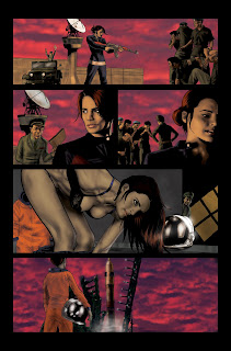
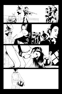
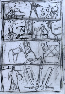
An old student from back in the days when I was a kung fu instructor contacted. He's a pretty talented young guy in his final year of film school. He needed some concept artwork done up for his film. I had just finished Hana part 2, and was looking for stuff to procrastinate on. He wanted a bunch of stuff, but I didn't really have the time to do anything. Because he was a great guy, and an incredibly loyal student back when I was teaching, I whipped this up for him in a night. The brief was that the part was supposed to be ideally played by Clive Owen. I won't go into the plot, but it involved modern day angels. It's not bad, actually.

I also wanted to see just how I did with likenesses. I was pretty happy. It's rougher than my normal stuff, but it's not bad for a night's work.

Update: I'm working with Wolfbro7 to come up with a design for the 9thWonders forum members to print out and put onto a tshirt so that we can recognise each other at Comic Con. It's almost done!

More Zero G and the SDCC portraits as awell as something special next week.

Wednesday, June 27, 2007

HANA PART 2: Epilogue

I can't tell you enough just how much THE DEATH OF HANA GITELMAN has changed my life.

It was an incredible and exhausting experience, and something I'd do again in a heart-beat. It almost put me in the hospital, but I enjoyed every minute.

Here's a quick recap:

1. My blog was averaging around 500 hits per day for a week after Hana was uploaded. Before that it averaged about 7. The idea that 500 people were taking five minutes out of their day to see my behind the scenes process. That blew me away. It was the most inspiring validation of my art that I'd ever received. I also want to especially thank the 80 or so people who drop by every day to quickly check what I'm doing. Your support means the world to me!

2. The 9th Wonders favourite artist fan poll was incredible. I was nervously watching the numbers expecting a nice close race, and I won by a landslide (94%). I was totally humbled. Especially because I was so nervous about the style I had used for the story. I'm so glad to see it was so well received. In fact, the whole experience has changed the way I draw. Right now there's PH (Pre Hana) and AH (After Hana). =)

3. The 3HEROES podcast interview. In the past I've done interviews that were then published or posted online as text. But I'd never had the opportunity to do a recorded interview before. Paul was brilliant and so incredibly supportive and helpful. He was also a joy to talk to, which helped enormously. I apologise to anyone if we went too off-HEROES, but we just got chatting. Paul assures me it's fun and we do keep coming back to HEROES.

4. The online friends and support network I've made blows me away. If I've ever forgotten to reply, just shoot me another email. I'm terrible at remembering what I have and haven't replied to. There's no slight intended. I'm just kinda useless like that. But I will reply! To all the people that email, to all the people that help me - thank you!

I've also posted the above original version of page 11. In some ways I like it more, in other ways it lacks. If you look back at the layout I did ( a couple posts ago) you will see that I also included the HEROES logo. Here's a version I did with the logo included.

Here's my worklist right now:

Final page of the Emperor (almost done)
Zero G - laid out pages 1-11. Start drawing asap!
HEROES con sketches.

Keep your eyes peeled for the above and some surprises in the meantime.

Monday, June 25, 2007

INTERVIEW!

As I mentioned recently, Paul from the 3Heroes podcast contacted me on my blog. I followed his links (as I do on most of the people who comment on my blog) and found the 3Heroes site where I began listening to his podcast. While I really enjoy Emily and Kay, I found Paul hilarious.

I posted on his blog that he would be welcome to drop me a line if he needed anything. He emailed me asking me if he could interview me. I was stunned! My first propper interview. Previously I had text pieces focusing on me, but never an actual interview where people could hear me! As most people who know me have realised - I'm not shy of the sound of my own voice. I have lectured, done countless amounts of public speaking as well as charity motivational work for under-privileged children and teens.

So we made a time to do it last Sunday. Late last Wednesday evening, Paul saw that I was on Skype and asked me if we could do a test. We chatted as he played with software. Then he asked if we could do a test interview. Well one and a half hours later at 2:30am, we finished the impromptu interview!

We were totally unprepared! Paul and I just chatted, and he emailed me back a day later saying that it was everything he needed and we didn't need to do Sunday. I was stunned, but skeptical.

Last night I listened to it, and I really enjoyed it. I realised I can't answer a question directly, but we both did a reasonable job of not only staying on topic, but having a really high-energy conversation. Paul was fantastic, and listening to it, I still can't believe that it's the first time we had spoken!

As a note, just in case any of you are fortunate enough to ever be interviewed, here's the one lesson I learnt:

REMEMBER THE QUESTION: Ramble if you've got a good story, but remember to answer the question. There were a couple times I got a bit lost and crawled up my own ass.

You can find the interview at:

3HEROES.NET

It's episode 18. It's pretty clearly marked: Interview with Jason Badower.

Enjoy! I'd love to hear some feedback.

PS. Why did I upload this image? To prove that I can draw Ali Larter after my miserable effort on page 9. =)

Friday, June 22, 2007

HANA PART 2: 11th Hour


And now fateful heroes, we come to the end of Hana's and my journey.

I'm trying to remember when I got the script for this page, and I'm pretty sure that it was before the screening of "5 YEARS LATER". So it was a fairly long time ago. So for the longest time I knew how the series was going to end. People begged me to tell them. But at the end of the day, so few things come along in life that are worth the reveal. I felt that this was one of them. You don't want to read the answer in some blog or on an email. You want to see it yourself. You want to see Nathan turn up at the last minute. You want to see Hiro stabbing Sylar. You want to feel Niki and Mohinder's desperation.

This page was the culmination of everything I wanted to see and feel at the end of the HEROES season one finale. I've had some fans comment that it was everything that they wanted and didn't get, which is incredible praise.

I don't know if the finale was a let down, I already knew what was happening ages ago. I had the joy instead of watching all the pieces in the puzzle fall into place.

When I got the description of this page I pestered poor Frank and NBC for as much reference material as possible. They came through with the goods and I managed to get screen caps for everything I needed. I wanted this page to be as authentic as possible. I'm pretty sure that everything except for Hiro's sword is perfect. On the reference they gave me I could see the red sword, but I'd never seen it before. I had no idea what it was and thought it must be a stunt prop that they would colour correct later. So I just drew Hiro's sword instead, and in some ways it looks better like this.

I might upload some of the reference images that they gave me. Some of it is test 3d renders of special effects - like Nathan and Peter flying off. I'm sure Ryan from Heroeswiki will dig them.

Next post I'm going to upload the monochromatic version of the page, version 1 if you will. There's also a bit of a story to go along with it.

OTHER NEWS: Paul tells me that the 3Heroes interview is done and that it's "gold". My interview will apparently be the entire podcast, so I'm really looking forward to that. We spoke for about one and a half hours and Paul has cut it down to what he thinks is a really entertaining hour. So for those of you who want to know what I sound like... stay tuned.

Thursday, June 21, 2007

HANA PART 2: Of Ten


So here is where I had some fun with the injokes.

First up, I can't remember if it was Ryan (of Heroeswiki) or myself who remembered the Uluru desktop from the 9th Wonders that Micah is a fan of... But I'm glad it's there. To be honest, it was probably Ryan who remembered it.

Of note also in the first panel is my injoke shout-out to the members of the 9th Wonders Forums. Wolfbro7, one of the moderaters of the 9th Wonders had been aware of my presence on the boards and my rapport with the fans there. He asked me if it were at all possible to include any sort of shout out to the 9th Wonders fans. I was already on page 5 of this story, but I instantly knew what I could do. The hardest thing about including stuff like this, is making sure that it doesn't get spotted and subsequently asked to be removed by NBC. I snuck the 9th Wonders into the taskbar on Micah's laptop. You could rationalise it that he was simply checking out the 9th Wonders comic forum in his world. =)

Of additional note is that I decided to letter this page also. Once I had designed the user interface for the captions, as well as the font, I thought it would be easier if I just did it myself. I did specifically ask Frank to make sure that the letterer was still paid for this page. I didn't want to go taking anything anyone's pay packet just because I decided to make an artistic call. The lettering is most of the actual artwork - I mean, look at the lineart. Again, there's barely anything there.

Panel 1 is simply the laptop frame before I pasted in the Tim Sale Uluru picture. I slapped the text box on top (cobbled together from a Skype window) and added the lettering.

Panel 2 is just the same text box and background with different text in it.

Panel 3 is a close up of a circuitry board, again with the text caption over it.

Panel 4 is a hybrid of panel 3 and a closeup overlay of her eye from panel 5.

Panel 5 is really the only other panel of note. If I could be so bold as to say it about my own stye - or process rather, I'm really enjoying knowing where to stop and knowing what I can do with the painting and the airbrushing. Look at Micah on page 10. The lineart barely resembles him, but the painted art is pretty spot on. I'm still stunned by my ability to just know when to stop. It obviously didn't work for Niki, but hey, there's always casualties in war. I find that the lineart on this page doesn't look a thing like Hana, but the painted art makes it look like one of her glamour shots. I'm very happy with it. It has a nice angelic look (intentional based on her angel references in part 1) while still homaging the digital noise that she has now integrated with.

The hardest thing was to not make it look like the Matrix.

So I made her blue.

Genius, I know. =)

This process again is why I don't want to do HEROES sketches at San Diego. I just don't do great likenesses as lineart.

More on those winners images coming.

Wednesday, June 20, 2007

HANA PART 2: Nine lives

As you can see, while I did very little drawing on the last page, I more than made up for it on this page.

Page 9 was hell. I don't think I spent so much time on a page apart from the final montage page.

This was so damn tough for one reason alone: Niki. I drew, redrew and redrew that picture of Niki. It killed me. Even after I sent off the final montage page, I came back and with an hour to spare, redrew this page. So despit me touting the revolutionary new drawing technique, I still got done over.

At the end of the day, I ended up coming back to this version. Not because it's a great likeness - it's not. But because it had the best performance for me.

Personally I blame my lack of photo reference. Do you realise how far back you have to go to get a picture of Niki not in a straight jacket? Really far. Really, really far. Then consider how little I had to work with and then I had to find a picture of her with the right expression with a reasonably similar lighting. Suffice to say, my likeness of Niki is inversely proportional to my likeness of Micah. I don't wanna blow my own horn here, but the likenesses of Micah on this page are pretty damn solid.

I can't believe that I never saved any of the other versions! In my haste I must have saved over them. Ah well.

I also want to apologise to the letterer on this page. Normally I have a very clear idea of where the dialogue balloons should be placed. I stared and stared at Aron's dialogue, but I just had no idea how to lay the balloons out. In the end I just drew the damn panel and let the letterer figure it out themselves? The final result meant that many people found this page difficult to read. While you could blame the letterer, I personally hold myself accountable as I really left the poor guy out to dry.

Thanks again to Ryan Gibson Stewart for finding me the reference for Niki's car, their house, Micah's room and even the model of laptop that he owns! He enabled me to leave no stone unturned, so that was pretty cool.

For my "night effects" I chucked a transparent blue layer over the top. Included here is what the page looks like during the day. =)

Tuesday, June 19, 2007

HANA PART 2: Page Eight, Final Fate


I'm going to go to hell.

Yep, what you see below is the lineart for this page. This picture of Hana is ALL I drew on this page. I'm a lying, cheating and swindling bastard. NBC and all the HEROES fans should lynch me.

So how the hell did I get away with artistic murder? Well, I grabbed the satellite that I drew from panel 3 of part 1 and enlarged it and distorted it a bit so its perspective worked for the angle. I cleaned it up so that it worked at this higher level of detail. I believe I had to redraw the "wings" on it. I then drew Hana on top.

This is one of the few times that I break the fourth wall. If you look very closely she is looking directly at us. It's like when you're about to die that your life flashes before your eyes, well I figured that just before she dies she realises that she's just a character in a story.


Then I added all the flame, re-entry effects on the satellite. If I could do this again, I would add flames to her suit to show her burning up. I don't think it was totally clear that she was burning up and going to die. Lastly I added a close-up of the planet earth, specifically Australia as per the script. I decided to flip it upside down to add to the disorientation. I wonder if they mentioned Australia specifically to totally distance it from Nathan and Peter?

Here's an earlier layout of page 8 also. As you can see, it was a great deal less dynamic, and lacked the scale of the image I eventually went with.

HANA PART 2: Seventh Heaven


I've been listening to the enjoyable 3Heroes podcast as I draw. You can find the podcasts at:

3Heroespodcast

One of the presenters, Emily commented that she enjoyed this comic more than the finale. I was really warmed by that. I really gave all that I could for this. She also made the comment that it was so good that it should have been on tv. And therein lies the trouble with the comics. The first thing I read about the comics on the posts is that they have to contribute to the tv series in some real way. The problem being, that if they contribute too much, they should be on the show itself! What a fine line these graphic novels have to walk.

My favourite 3Heroes presenter, Paul left a message on my artblog (flawedprefect) commenting also on how much he liked the art. I contacted Paul on his blog (barenaked hurley) and asked if I could help in any way. He asked me if he could interview me about HEROES and comics in general. Of course I said, "Yes" as it sounds like a load of fun. We're going to crank the nerdometer up to max there. You have been warned.

Ok, onto the page:

Boy this was a hard, hard page. Now I know one of the benefits of doing this as a comic book story is that there is effectively unlimited budget. But it just seems so weird to go so widescreen and extraordinary to the point of disbelief in this installment. This page especially suffers for it. I mean, first she cops a death-ray-like-computer virus beam, then she JUMPS ONTO THE SATELITE! My god. I wracked my brains for ages to make this fit into normal HEROES continuity. I mean, you would NEVER see this on an episode. I decided to try and play up Hana's pain and her sacrifice. I wanted panel 3 to let you know she is really dying. I mean, globlets of blood floating in her helmet? Eyes bleeding? You know it's bad.

I like the blurry star field in the background. It almost looks like a 70s sci fi movie.

GREG GRUNBERG: I managed to contact Greg's agent (thanks to Sheindie) and she contacted NBC. She informed me that NBC wish to hold onto the rights for the art for another upcoming auction they wish to do. So sorry you guys and Greg, I tried. =(

ONE YEAR: My blog turned 1 year old on may 22nd! It totally passed me by. I can't believe I've been artblogging for a year. 172 posts. That's blogging for 47% of the year. Not too bad. I did take a LOT of time off. But more importantly (to me) is that is 172 pieces of art I've posted or done in the last year. Now that's not bad at all for a guy who works full-time! I'm pretty proud of that.

Saturday, June 16, 2007

HANA PART 2: Six Shooter


This is a wonderful example of a mis-managed page. I have a theory (forgive me if you've heard it before) on the difference between art and illustration. Art is done when the artist says it's done. Illustration is done when someone else says it's done. The key to a good illustrator is making as few mistakes as possible and making sure that you complete the artwork to the best of your ability in the time given.

As you can see by the lineart, there is a great deal going on in the background that is not present on the final painted page. In the past when I have worked with Annette, she has been reluctant to place in effects or layers which would cover up the linework that I had drawn. I would ask her to do what the story requires. If I had over-drawn an area, then that's my fault. As is obvious in this case. You can see all the background that I drew - the chairs, the monitors and the background textures and details. But I decided that the "tech cloud" should be all encompassing and dominating. I also used it as a means to make Hana stand out more.

I'm such a lazy/crafty bastard. I don't believe I ever drew the satelite again after drawing it on part 1 page 1. It's just been cut and pasted over and over again. So, as you can see on the lineart, I've drawn around this cut and pasted image. Apologies if you noticed and it lessened your reading experience.

One of the toughest things to deal with on this page was the visualisation of Hana's powers in panel 4. The script looked like this:

Hana sends out a WIRELESS COMMUNICATION, like a bolt of lighting (or something), right at the SATELLITE -- but it doesn't reach the satellite, it's deflected off.

For such a low-key show like HEROES, a bolt of lightning from someone's head was going to look incongruous. But I realised I had very little choice. I tried to overlap the technical data into the lightning bolt to make it look like a technical signal. If you look, the "forcefield" is made of red data. I think Aron's captions really helped here.

Finally the last tough thing was Hana's infection by the computer virus. Again, if you look closely into her red eyes, you can see the words of data/text in the whites of her eyes. I took artistic licence drawing the blood trickling down (we all know there's no gravity in space) but I couldn't think how to make it work any other way.

Well that's page 6! I normally don't blog on weekends, but it's saturday night and it's 10:52pm and I'm already in my pajamas. I also let you all down during the week with my technical difficulties. The least I can do to show my appreciation for your patience is to continue the commentary.

Friday, June 15, 2007

HANA PART 2: Five alive

It's been a while, so let's catch the hell up. Sorry about the technical difficulties. My mouse wheel died so that it eternall scrolled downwards. In Photoshop this meant that any picture I was working on was zoomed out until it was little more than a speck in the distance.

Then while trying to fix my mouse, I managed to pour water all over the left side of my keyboard. For some reason, it took about 3 days before none of the keys on the left hand side refused to work.

Weird.

Anyway, back to Hana. This is an interesting page. It's all smoke and mirrors, and everything I've drawn you don't actually get to see!

As you can see, the top page is actually fairly detailed. I put a significant amount of work into the background. I think it's because I knew that the rest of the page would be all cutting corners.

I quite like the top panel, I like Hana's expression. It speaks of a subtle trepidation. While I think it's a decent likeness, it's hard to create an exact image of someone when you can't see their hair! One of things I did with the Zero G outfits was to make sure that you could see everyone's hair and tell everyone apart at a glance. You will also notice that she has a Chinese flag on her arm. I was tempted to do the Israel flag, but I had a look back at the story itself. I got the impression that Hana's plan had been executed no more than 5 minutes before she was captured - perhaps even as she contemplated the rocket. If she'd thought that far ahead she could have forged the documents in their system well beforehand and walked onto the base as an honoured guest. As it was, there's no way they would have had the time to sew an Israeli patch onto the astronaut suit.

This second panel could have been so much more beautiful and epic. I'm not sure what got lost. Perhaps the scale? Some trucks or people in the foreground would have really helped the scale of it. As it is, it looks a bit like a Thunderbirds mission.

The final panel is just so simple. A mediocre likeness at best. About the only thing the page has going for it is that at least she looks Israeli. The data streaming in was an afterthought after I had drawn page 6.

In other news: I finished another Emperor and the Concubine page. It's so hard to go back to this style. I'm going to make this Heroes style, my new visual style. It's so fast and effective. I can't wait to see Annette colour some of this stuff. I'm still burnt out from Heroes, and work has been relentless. I'm hoping that next week is the light at the end of the tunnel.

Thursday, June 14, 2007

PIE ATTACK!


Here's something to amuse you. Technically it's still artwork...

I was out Friday night having dinner with my favourite comic book writer, JAn. It was his going away party as he was heading off to London to live. My best friend, Alex was moving into JAn's house so the occasion was prepared for double festivities. JAn and I finished our meal, but it was a little... unsatisfying for two growing young lads. So we stopped off for pizza.
While we waited we ran into JAn's neighbour and the two chatted effusely. Meanwhile the pizza was delivered. While JAn and his neighbour chatted, I stared gobsmacked at the pizza box. JAn turned to me, "What's wrong with you?"
I held up the pizza box and said, "I think I drew this. No, I know I drew this!"

I'd drawn it about 4 years ago. If you look closely there's also a pizza on the box. Being a huge fan of photo reference I had bought a pizza for reference. Unfortunately it was getting late as I was drawing it, so I finished the picture off in the morning. I remember the note I got back from my art director, "The pizza looks a little stale."
I wished I could have whacked it into Photoshop and increased the "Succulent" filter. The correx was a little harder than that. It's pretty cool seeing your stuff around. Now if only there were some cute single chicks at the party I could have impressed...
Thanks Jel for taking and sending me the photo!

I haven't forgotten!

My keyboard is broken (I spilt water on the left hand side) and now none of the keys on the left work, and for some reason none of the numbers work either... Hmmm. Time for a new keyboard?

In the meantime, I'm typing this at work. No images here, please bear with me. I will catch up asap.

Normal programming will resume shortly!

Thursday, June 07, 2007

HANA PART 2: Fourplay


When you've made progress in your craft, sometimes you can look over your shoulder and realise that all the baby steps have taken you a mile. Sometimes, just sometimes you can point to one page, perhaps one image as the key point where you stepped up to another level.

Panel 4 is that image for me. I know a lot of people are going to snicker that it's because I was drawing a woman undressing. That's only accurate on a very superficial level. The naked body is (arguably) one of the easiest things to draw from a technical level. It's also the first thing most artists learn to draw. It's why life drawing the naked figure is recommended as one of the best ways to improve one's drawing. So it stands to reason that the (semi) naked figure is where I'm going to be able to mentally go back to basics and re-evaluate this style.

Up til then I had been kind of thrashing around trying to figure this style out as I was going. I had a system, but it wasn't working and I wasn't getting the exact look that I required. It was doing ok, but it looked rough and unfinished to me.

Here's what I had been doing:;after I had drawn the lineart (see left) I layered underneath a black and white page of ink wash splatters. I would then tone that layer using the Burn and Dodge tool in Photoshop.

As I mentioned, it was a nice technique, but it was kinda... rough. If you look at the rendering on panels 1, 2 and 3, there's something gritty about it. When I drew panel 4, it was as simple as applying a very subtle Gaussion Blur to it. It kept the organic nature of the watercolour texture, but smoothed it out just enough that if I Burnt or Dodged it, the result was slicker and subtler than what I had previously been doing. I also learnt to slightly adjust the colour of the tonal layer. This brought the textures more to life and made them a little less flat. Two quick and easy techniques that were little more than a couple of mouse clicks... I just hadn't considered them.

For those this doesn't seem like mumbo jumbo to, I hope it helps you.

Wednesday, June 06, 2007

HANA PART 2: Three-fully

It's funny, but for a guy so well versed in action (ex stunt man and black belt martial artist) I'm terrible at comic book action. Laying out this page was akin to pulling teeth. I believe it was one of the last pages I handed in.

But perhaps I've put my finger on the pulse of the problem? Comic book action is not the same as real life action.

Let's start with the problems that the script initiated. There's so much action communicated in the script:

Splash Page - Hana QUICKLY, grabs the GUN with one hand. KNOCKS OUT a guard with the OTHER HAND. And KICKS a THIRD GUARD in the gut. F*cking action star.

As an aside, I love the energy of Aron's scripts. The final line brought it all to life for me. =)

It's almost impossible to communicate all this action in one image. I drew sketch after sketch of the possible layouts, finally being drawn towards this image. It contains what I call "implied action". I don't know what she's doing to move the two bald guys (3rd and 4th from left) but it just works. She emanates a convincing energy that makes you believe that something has happened by the sheer power of her movement.

It's once I unclenched my reality-gripping butt cheeks and just go for an image that communicates the spirit of the movement that I find real success. And that's the key. It's something Frank Miller does especially well. These dreamy idyllic beautifully choreographed almost-sequential images of action vignettes. It's a rare skill that I haven't had enough time to develop. I'm looking forward to disecting that skill and replicating it. Very few people can do it. It's either blow-by-blow action (which I like, but doesn't work too well in comics - it means the majority of the comic is spent trying to depict a fight) or it's so decompressed that all you're looking at are seemingly random images meant to convey feeling rather than a sequence. The best comic book action lies in between.

But why can't you depict it blow by blow? A good way to put it is that the space needed to depict a fight is inversely proportional to the time it takes to watch it on film. That is, what only takes seconds on film, takes an INCREDIBLE amount of space in comics. Remember, most fights are a series of quick, quick cuts to communicate the action. Imagine that each cut is a panel - a separate image that needs to be depicted. You're looking at close to 100 cuts or more for your average small Jackie Chan fight scene. That's 100 panels or around 20 pages... for a SMALL fight scene. That means you just shelled out US$2.95 for what would be a minor fight scene.... Basically a waste of your money as it doesn't progress the plot at all.

POSTER/PRINT: thanks to SHEINDIE from 9th Wonders who found me Greg Grunberg's manager's details. If this goes through Sheindie, you got yourself a thank you incoming. =)

Tuesday, June 05, 2007

HANA PART 2: Dos Dedos Mis Amigos!

This was again, another easy and fun page. My main effort was spent trying to adjust the colours so as we moved forward through each flashback the colours became more vibrant and familiar. Again the trick for the first three panels were to draw people of appropriate ethnicities. Drawing three totally different Jewish people was fun and interesting. I wish they were somebody as they would probably be nice portraits. I'm sure I could have used some friends or something and made some brownie-points while I was at it, but I guess there's a limit to even my gratuitous injokes and muti-tasking.

POSTER UPDATE: Sheindie has emailed me Greg Grunberg's manager's number and I gave her a call and spoke to her assistant. I've now got her email address and will send her an email moving this to the next stage. Sheindie has already done some groundwork and mentioned it might be "doable". Great work Sheindie! I've got an idea for a special thanks for you.

SUMMER COMICS: Regrettably I won't be working on any HEROES comics until August. Apparently the whole team has been pulled off as they've loaded up the big guns. Ahh well.

Monday, June 04, 2007

HANA PART 2: One Giant Step


This was one of my favourite pages of the whole series. First up, it's totally different to everything else. Aron's script jumps scenes faster than a video clip, yet is held together by a narrative tighter than Noah's love for Claire.

My main goal was to communicate a child-like sense of wonder without dismissing the danger. I’m especially happy with the picture of the young Hana in panel 1. I don’t often draw children, and I think she looks great, and she has real personality to me. As I joked in an earlier post, “I just drew the cutest kid… EVER.”

I enjoyed the minimalism of the second panel. There’s a fair amount of detail and texture on the house. The house itself is based on a photo of an actual house I found in Tel Aviv. That’s how authentic I was in my research.

In panel 3, I wanted you to believe with her that for a split second she can fly. That an umbrella and faith will hold you aloft despite the unimaginative laws of gravity and physics. I love the overblown clouds and dream-like light. I think it lends to the nature of the flashback without actually having to use clumsy visual tools to tell you it’s a flashback.

The final panel is easily the weakest. It still does the job, but it’s not a great piece of art. It just does the job. I like the crop. I think it gives you more of a sense of motion, that any second now (perhaps if you turn the page) she will fall into frame. It’s an unusual storytelling choice from me, but I’m quite happy with it.

As an aside I heard a flattering conversation about me from some professionals I admire. It’s not often you get feedback in this business, especially feedback that labels you “hot” and “new”. It really made my day.

Off to work on the Emperor!

COMPETITION: Acidburn133! Email me your HEROES picture requests! I’d like to get started this weekend.

APPEARANCE: I’ve been invited as a guest to ARMAGEDDON EXPO in Melbourne in October 2007. My name’s not on the list yet, but I will be there with my good mates David Wohl (Witchblade, Darkness co-creator) and Christian Berenek (SE7EN: lust).

http://www.armageddonexpo.com/