When you've made progress in your craft, sometimes you can look over your shoulder and realise that all the baby steps have taken you a mile. Sometimes, just sometimes you can point to one page, perhaps one image as the key point where you stepped up to another level.
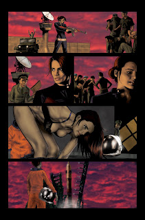
Panel 4 is that image for me. I know a lot of people are going to snicker that it's because I was drawing a woman undressing. That's only accurate on a very superficial level. The naked body is (arguably) one of the easiest things to draw from a technical level. It's also the first thing most artists learn to draw. It's why life drawing the naked figure is recommended as one of the best ways to improve one's drawing. So it stands to reason that the (semi) naked figure is where I'm going to be able to mentally go back to basics and re-evaluate this style.
 Up til then I had been kind of thrashing around trying to figure this style out as I was going. I had a system, but it wasn't working and I wasn't getting the exact look that I required. It was doing ok, but it looked rough and unfinished to me.
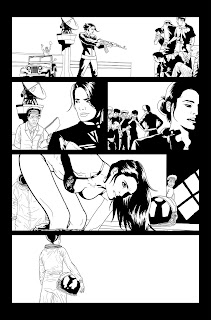
Here's what I had been doing:;after I had drawn the lineart (see left) I layered underneath a black and white page of ink wash splatters. I would then tone that layer using the Burn and Dodge tool in Photoshop.
 As I mentioned, it was a nice technique, but it was kinda... rough. If you look at the rendering on panels 1, 2 and 3, there's something gritty about it. When I drew panel 4, it was as simple as applying a very subtle Gaussion Blur to it. It kept the organic nature of the watercolour texture, but smoothed it out just enough that if I Burnt or Dodged it, the result was slicker and subtler than what I had previously been doing. I also learnt to slightly adjust the colour of the tonal layer. This brought the textures more to life and made them a little less flat. Two quick and easy techniques that were little more than a couple of mouse clicks... I just hadn't considered them.
For those this doesn't seem like mumbo jumbo to, I hope it helps you.


10 comments:
Your Photoshop skills are way more advanced than mine, Jas. I just barely understood what the hell you were talking about ;-)
KJC
I like the way you carried the reflection on the astronaut helmet to outside where Hana is staring at the rocket (pane 4 of the first photo of Fourplay). It works (even if it doesn't make sense).
Regarding the previously posted pics of 'HANA PART 2: One Giant Step', I can view the first one here now, but not the latter two.
Ryan forwarded me links to them on the Heroes Wiki, so I've seen them but you still may want to update your blog.
omg, let me just say how much I love this new set of expressions from the guards! They've just gotten their asses handed to them physically and now again verbally. I love it :)
I totally see what you mean about the style on this one - the grainyness is really noticable on the officer's uniform in panel 2, but the smoothness in panel 4 = <3. Seriously. Baby steps? More like bounds and leaps ;)
Though I don't have Photoshop, have the same tools you mentioned in my paint program. Love that Gausian blur. When applied to a background it almost makes it look like painting on marbled glass. A really cool three dimensional look. Glad you decided to let us little people in on your process.
It's really very beautiful Jason. Not being an artist, I couldn't put my finger on it when I first read it. You really opened my eyes to the reason it stands out.... No wonder that Chinese official dude is sneaking a peak at Hana. :)
See, the problem with your blog is that I can't just keep saying "Wow, smegging awesome work, dude!" Because if I did...
Wait... did I just...
*smacks forehead*
SEE? Ya see what I mean??
;)
Wow. Amazing stuff, Jason!
Hey Jason, Paul from the 3 Heroes podcast. Love your work - you've captured the essence of a 1970s airbrushed HeavyMetal panel so accurately!
Well done.
KJC: I need to do English subtitles. =)
Miami: LOL! I actually cut and pasted that helmet! Sneaky spot! Pics should work now.
acid: Yeah, this one was a HUGE jump. It's such a satisfying page.
drdx: A pleasure! I hope it helps.
Ryan: Heh. I loved drawing that old chinese dude. I'm so proud of that panel. I just wish it was less suspect subject matter.
polsons: lol! I hope I can keep getting "wows" from you in years to come. That would be a worthy goal.
david: Thanks for dropping by, mate! See you in San Diego! I can't wait!
flawedprefect: Welcome! Wow, old skool comic reference. I love it! I'm downloading your podcasts now. =)
The pics from that old post actually work now. It looks like you forgot to remove the non-working image refs, but at least they work. Kudos on finally getting that fixed.
Post a Comment