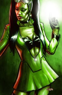
Many years ago, JAn and I were hard at work on a superhero comic called "Fallen Sky". It was totally buzzed about it. I love superheroes, and with JAn's insanely, laterally creative brain, I really felt we were doing superheroes that were widely accessible to anyone. It was the superhero at its best: as metaphor. We had an incredible freedom to discuss issues like the media, celebrity, sexuality, stereotypes, music, selling out and buying in. There is an elegance to metaphor not afforded to the direct attention of an issue.
Girl:Fusion was one of these characters. My idea was to create characters and names for characters that looked real. Superheroes who would wear cool stuff and be the cutting edge of celebrity. Gear that people would wear.
Our current publisher isn't too big on superheroes. He's leaving that to the other kids in the sandbox. But one day JAn and I are going to come back to this idea and knock some socks off.
For those who are wondering... she wears bike pants underneath to protect her modesty while flying.
TECHNICAL: Lineart drawn in Photoshop, printed onto 150gsm watercolour paper. Painted with watercolour and then scanned back into Photoshop for colour adjustment and airbrushing.
NEXT: More FALLEN SKY art...


4 comments:
wow, she looks awesome. Looks like she has some great stories and character behind her
Hey Liz!
Thanks for coming back!
Yeah, she's a fun one. I'm looking forward to telling her story. In the meantime, she's just a cool visual. =)
Hi Jase!
long time an'all that.
Sounds like your havin fun...living the comic book dream..so to speak...inbetween all the hard work, that is.
Fallen Sky sounds like a cool project. I'm sure you and Jan will get to do it eventualy. She looks cool enough. But personaly I don't get into that type of coloring, it's to strong for my tasts. That's not the same thing as saying there's anything wrong with it though! The next pic youve posted with the color palet you say you like is allso more aling the lines of what I would consider good coloring. With all the millions of colors that we have available for comic books and yet we (all) seem to only use a very small number. I'm sure there are practical reasons for this but, well I guess I'm just rambling now...whatever.
Check out my art page for a colored spiderman pic I did 2 days ago...
hang on I havent finished yet!
The point I'm fumbling my way to is this: ya hear alot about how the environment that the charactors in these storys we do should be represented as realisticaly as posible to suport the believeability of the crazy charactors. Yes? well, shouldnt that also include the colors? its hard on the eyes when everything (or most evereything) is rendered in primrie or secondarie colors...hang on, who's post is this anyway?
sorry, I'll shut up now.
Later.
HAhahah!
I totally agree, Mike.
This was actually supposed to be a cover. I wanted the strong green to really draw the eye. I figured that a big solid blob of colour on the racks would attract people's attention.
Great to hear you're still drawing, mate! Link your art blog in your next comment. I'd love to take a look at it.
Post a Comment