Showing posts with label The Innocents. Show all posts

Monday, October 02, 2006

SILVESTRI INNOCENTS PAINTING


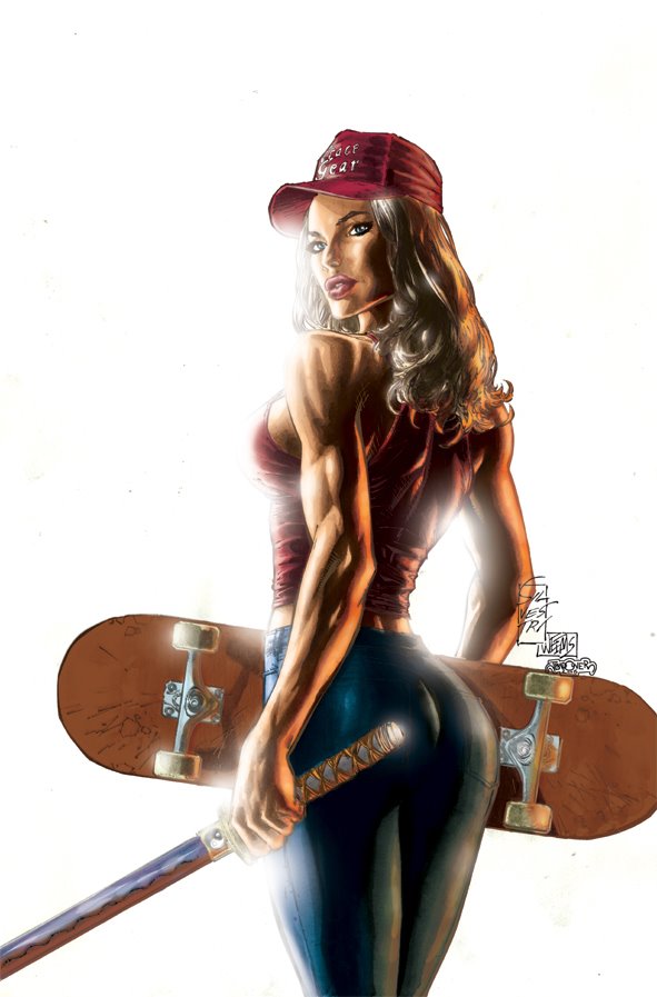
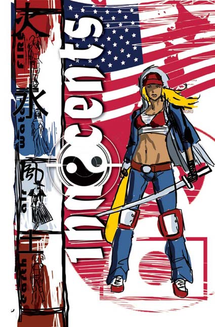
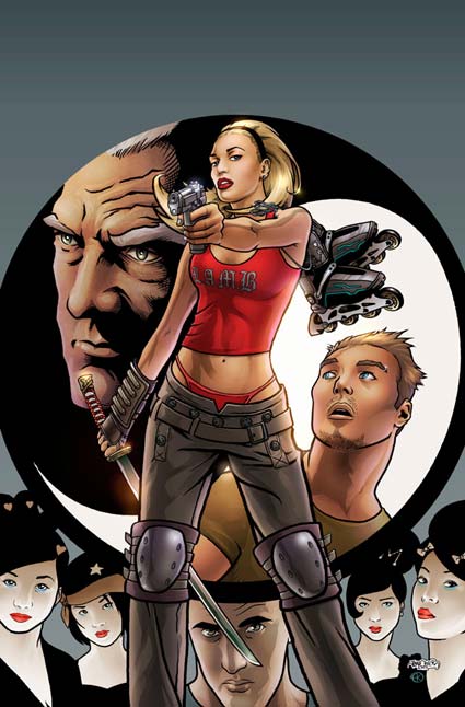
While I was over in San Diego, I got shown Marc Silvestri's cover for the Innocents graphic novel. I really liked it, and was excited about the possibility of what I could do with it. I asked if they could send me a high quality version of it so I could paint it.

Included above is the artwork as done by the Top Cow team. Totally slick.

This is the artwork that I did using Marc's pencils:


The main art note that we got from AOL Red (the teenage division of AOL who we did this in partnership with) was that it was too sexy. Her ass was too prominent and her boobs too full on. So taking that on board I tried a lighting scheme that would tone both of the elements down. The other main challenge was that I had never painted over anyone's artwork before. It was important to me that it still look like a Marc Silvestri piece. It's watercoloured with the pencils overlayed over the top.

It was definitely something fun to pass the time. Reminds me of the Quitely Superman that I did. It is such a buzz seeing my sig next to Marc's.

NEXT: More posters and pinup work...

Tuesday, June 27, 2006

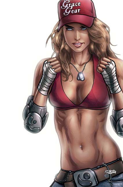
INNOCENTS COVER 1B: CLOSEUP


I really hope Annette doesn't mind me doing this, but I thought I'd show you guys what only I seem to get to see.

I don't know if this is a "How-to" more a "behind the scenes". Believe me, I've been staring at her work and still can't figure out how she does it!

But look at these eyes! look at the eliptical highlights, they're incredible. They bring such like on such a subtle level it's incredible. Look also at how much of the actual colouring is impressionistic. It's so simple in some areas yet sells so much!

I've had people raving about her hair and dying for a closeup. Well there you go. She's taken my tonal layers, colourised them and then gone in and created airbrush selections in keeping with the linework.

My favourite things about it:

1. The shine in the eyes.
2. The highlight above the left lip.
3. The fill light from the character's right.
4. The glow from the background on the inner areas of the eyes
5. The lipstick colour.
6. The coloured linework (inspired from Ex Machina and then cranked up to Annettian proportions).

Got some more stuff incoming. It's just gotta be cleared first.

Friday, June 23, 2006

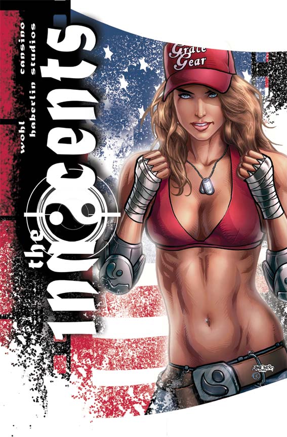
INNOCENTS COVER 1B: design 2


And we have our winner. Not quite as much breathing space as on the first design, but much closer to the original sketch. I wanted a strong powerful figure to attract attention from a distance. The beauty of what Annette does is that it attracts your attention from a distance then keeps on giving as you go closer and closer to it. On some levels there's an incredible amount of closure required making the piece almost impressionistic. On some other parts it's incredibly literal... pore for pore, stitch for stitch.

Seeing how I feel, I might do an extreme closeup of the eyes just to show you the sort of detail that Annette puts in. It's quite incredible.

My next job is to go through the interiors of the book and offer some constructive insights to make them better under the deadline we already have. Unfortunately it's been drawn and coloured already making changes really hard to do.

For those of you interested in the Tokyopop project, we just got a fascinating email from them placing Lucy at the top of the list of the projects they like. Keep your eyes and ears peeled. While I'm not asking for any formal submissions, those of you who read my blog can have a little heads up. Here's the first thing we're going to need to get you sold as a Tokyopop artist:

- 5 pages of sequential art featuring the style you're going to use for the series. It must contain figures and background. The darker, more urban and gritty it is, the better. JAn and I would love to have a Hiroaki Samura or Kazuo Koike sorta look and feel. That line-heavy manic intricate manga. We're inundated with clean line manga and we want a more organic, rougher feel.

So those of you who are interested start putting together 5 pages of good, solid storytelling. Inked. If a penciller and an inker pitch as a duo that's fine, but I'm not putting together inkers and pencillers. And no, you won't get paid more if there's two of you. One flat rate to divide between you (or keep for yourself). No figures yet, but a standard Tokyopop budget will apply.

Don't send it to me yet, and don't blame me if you've drawn your ass off to send me something and it all falls through. Way I figure, is if you don't have 5 good pages lying around or aren't in a position to hammer out 5 pages anytime soon, then you're not up for the gig. It will have a manic timeline so an artist with a high page turn around will be smiled upon.

Thursday, June 22, 2006

INNOCENTS COVER 1B: design 1

Technically, it's actually design 2, as I designed the one that made the grade first. It's my fav but it got the big knock back.

That's ok. I'm not emotionally attached to any of them. I just want the piece that makes Roger and David the happiest.

I hope you can start to see what I mean how a picture becomes a cover. It's about space, design, placement and position. It's about what you emphasize and what you cover up.

For those of you wondering about the white sprays there, it's a black ink spray that I scanned in, grabbed in a selection created a new layer coloured it in white and then copied that onto the image. There's a couple different spatters, some just linear (straight on) and others with some movement to them.

You can start to see the amount of post production work that goes into one of my covers too. Having the pretty picture just isn't enough. I need layers, depth, texture and focus.

And it was hella fun.

Obviously the tie in to the San Diego cover is obvious for anyone who saw the first cover. Similar but different. I felt it was important to create a design that would be immediately obvious that it's the same cover. If they ask me back to do the next one, I can't wait to take the design a step forward rather than sideways.

Wednesday, June 21, 2006

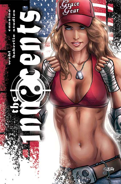
INNOCENTS COVER 1B: Colour

It's funny, I've actually tried a really different tact with drawing women with these pieces.

I’m a huge fan of Adam Hughes and his artwork has been an incredible influence on me. His women are just incredibly sexy. It was only when I got to drawing Grace (chick on the left) that I really started to think about the habits that I have when I draw a chick Hughes style. Thick, thick mascara and blood red lips. But I figured that Grace isn't that sorta chick. She wouldn’t be caking on the makeup. She's a more natural looking girl. So I figured that would be a really exciting direction to go in. I left the lips more open and not so dark. I went easier on the eyes.

The thing that really sold me on it was what Annette did. You see there are some things about makeup that a heterosexual non-crossdressing guy will never, ever know about makeup. The stuff that Annette did... wow. I learnt so much. One of the great learning curves for me was back on the Harajuku girls for the first Innocents cover. She drew them with blue eyeshadow. Now I would NEVER think to do that, but being a girl Annette did it and it worked big time!

There's just some things women do better than guys...

Next up: The rejected design for the cover.


Monday, June 19, 2006

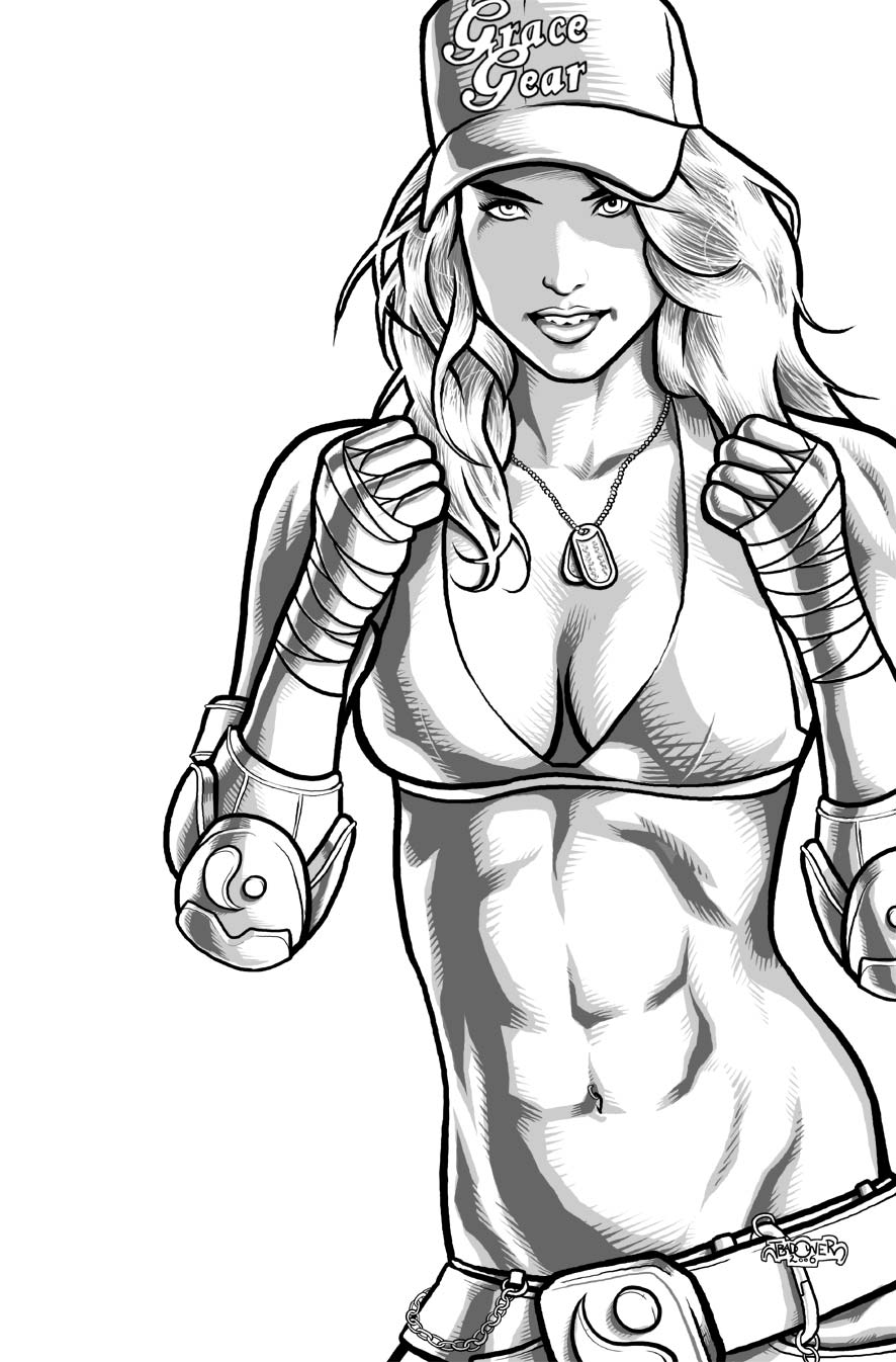
INNOCENTS COVER 1B: Lineart take 2


Here's the revised ab linework.

Much cooler and much sexier. Serves me right for going with some annorexic chick anyway. As I commented to Annette, if she's that ripped and her boobs are that big, then it means they're fake... and I don't think Grace (the chick on the left) would have fake boobs.

Annette's done a stunning job on the colouring and batted it in well ahead of deadline. I can't wait to show you all!

I'm just waiting to hear back from David and Roger as to which layout they liked. While Annette and I have created a really nice picture, I'm finding that it's when you doing all the laying out that you create a really nice cover.

I guess the problem I have with most comic book cover art is that it looks like comic book cover art.

"What an idiot." you're probably thinking.

No, seriously. That's fine for most superhero comics, but I think the spectrum of people who read comics these days are a little broader in scope and experience than they ever used to be. With multiple competing second tier genres (first tier is superheroes) we can offer a wider variety of product than ever before. Comics outside of the superhero genre should try and reflect the design, tropes and ideas from these genres to attract those interested in such things. In no other type of design do we have such a narrow design brief. The artwork is incredible, but the way that the artwork is presented is really limited.

Currently my favourite cover designs are the Marvel CIVIL WAR stuff, Warren Ellis' NEXT WAVE & DOWN (Like him or hate him, Warren has been onto this for ages and produces some really interesting cover concepts), the Alex Maleev DARE DEVIL stuff had some real highlights too.

Sunday, June 18, 2006

INNOCENTS COVER 1B: Sketches


"Ripped off!" I hear you cry.

Where's Annette's colouring?

Sometimes the nature of what we do is really last minute. I received the brief wednesday week ago. I sent off these sketches and only just got their feedback finalised by friday. The feedback was while they liked Sketch 3 (the farthest on the right - which was also my favourite) they wanted more movement in the figure. Was there some sort of hand signal unique to the subculture that I could include. I have *no* idea where to find something like that. Xtreme sports championship galleries didn't yield anything, so I went with the gloves up.

The problem was that they needed it (fully coloured) by the wednesday! So friday night (on the long weekend) I got drawing and got it to Annette sometime sunday afternoon. She coloured like a demon and we made the wednesday deadline (despite some technical issues).

A couple days later David gets back to us commenting that there's something wrong with her abs and torso. Perhaps it's a bit long? It was all my fault. I'd used some stupidly annorexic chick and exaggerated it even more. When Annette sent me the first proof back I realised what a mistake I'd made. I asked Annette to do what she could to soften the abs and under the time constraints she did a really good job. But to be fair it wasn't good enough - and it was all my fault.

So right now I've sent off the redrawn torso linework to Annette and she's working her magic under intense pressure. You will see it as soon as it's approved.

Friday, June 16, 2006

INNOCENTS COVER 1B: Lineart

I got a very cool email from David Wohl last week.

Subject: Next Innocents Cover.

Content: "It's time."

They wanted me back!

So what you saw last was the San Diego exclusive cover. I will be pocketing many of these babies when I head over there. What they're looking for this time is the world-wide distribution cover.

With that in mind I wanted something that really tied in with the last cover. I wanted those at San Diego to recognise the colours, imagery, character and design.

This time I wanted something a little bit more close up to Grace. Something a little more "in-your-face".

Roger had been commenting that he wanted to get away from the sword. While the sword was a nice gesture to her being a fighter, she doesn't use a sword at all in the first issue. So I decided to give her boxing wraps instead (any of my clients reading this can gape appreciatively at the perfection of her wraps). I really liked the Ying-Yang elbow pads which I hope lend her a slightly X-games feel. I kept the cap to keep her fashion designer branding.

Next up: Annette's colouring magic!

Saturday, May 27, 2006

Behind the Scenes


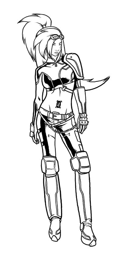
So I'm going to show you some of the smaller pics that made up the cover. Here is EARTH. Probably my favourite pic of the Harajuku girls that I did for the cover. A deceptive amount of work went into that cover. Fire and Water are nothing to write home about so you will just have to squint at them or buy the book for a closer look.

Got a real treat for you next post! Some hilarious stuff that JAn and I did ages ago...

Thursday, May 25, 2006

San Diego Here We Come!


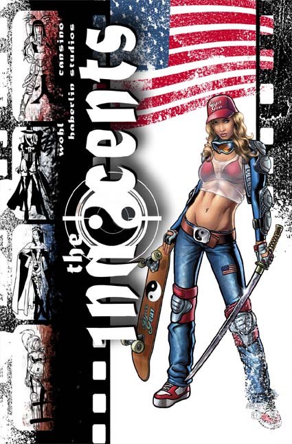
Ta daaa!

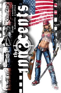
I'm hoping it's a little different to most of the comic covers you will see. It really has to stand out as this is one of Image's major releases for San Diego. It's been sent off and they've got a really good feeling that it will make the con booklet! (Comicbookresources.com link and San Diego Con booklet - can I bat 2 for 2?!! *crosses fingers*)

Roger was blown away (and I got the impression he cc'd his reply to everyone which was just the coolest). David loved it. Apparently there's some thumbs up over at Top Cow too. I'm one step closer to living my dream of having an army of devoted fanboys lining up lines of coke on the bellies and butts of booth babes while I snort them with a rolled up copy of Detective Comics 27 (first appearance of Batman worth about US$45k).

Hey, whatever crumbles your cookie, you know?

Ok, now the commentary. If you hold it up the sketch you can see there are some changes:

1. Not as much colour on the left: It just became too distracting. It was like this muted rainbow and had too much weight on the eye. Your eye was drawn to the left not the logo nor the figure.

2. Got rid of all the pink/red crap in the background. Did we need a third Ying Yang (one on her skateboard one on the logo)? I didn't think so. The splotches of Japan were unnecessary also. I did like how I turned the circle on the Ying Yang into the Japanese flag but I'm sure I will use that idea in the future if they want another cover out of me.

3. The black scratches became film edges. I just liked this look. Helped break up the organic lines and scratchy whites over everything. It also helped popped the logo forward.

I will try and post the other sketches of the girls. AIR/WIND (last post) is my favourite design, but now that I look at her, not the best picture.

Now, for those who care... Here is what happened.

So I'm done by about 2am last night. I'm showered in my pajams ready to upload this baby and head to bed. I check worldclock.com and it's 9am in LA. Perfect. I start uploading when I realise I've forgotten an integral step to colour work (for me). I ALWAYS print out colour work before I approve it. I've been working with Annette for so long that I'd gotten out of the habit. When you see a hard copy there's so much stuff you notice that you can't see digitally. I upload what I've got and rush out the door.

Cut to me at 2:20am standing outside Kinkos in South Melbourne. I'm reading a sign on the window saying they're closed. It's 8 degrees outside.

Cut again to 2:35am I'm at the Kinkos on Exhibition St. The poor graveyard shift dude is subjected to an onslaught of ignorance from me. 20minutes later I have a print out in hand and smiling. Amazingly, it's all good. But I'm hungry.

3am I'm leaving Stalactites (this is on a freaking wednesday night!) giro in hand. I'm spitting chunks of fat into nearby bins. Out of the entire souvlaki I think I got a portion of meat that made servings in American Psycho look like a buffet table.

330am I'm home and get an email from David. I messed up the credits. One quick fix later and the piece is uploaded. I retire to bed and read about 4000 Preachers before my eyes fall down.

I'm such an idiot.

Wednesday, May 24, 2006

AIR headz


Heh. So a friend of mine (Hi Simbo) sent around the pic of Grace that Annette coloured (cover incoming!). He sent it to a girl we both know and the only reply she got was, "Artists should draw more realistic women."

I looked at the picture and replied, "The only unrealistic about that picture is that a chick is into Xtreme sports AND knows how to use a katana."

I'm not saying she's right. In fact I don't think she is. I will draw realistic women when the story requires it. A character like Grace is not meant to be realistic. She's meant to be symbolic or an idol.

Take the picture of Air to the left. As a model I used a popular supermodel. Won't say which, but there's not a person on the planet who wouldn't deny that this supermodel has extraordinary proportions. The amount of messing about that I had to do to not make her look dumpy is incredible. Her legs are about 25% longer and the head about 10% smaller. That was the only way that I could get her into "heroic" proportions.

Proportions in art are measured by how many of a figure's head will fit end on end into the entire figure. Off the top of my head, I think normal is about 7.5 heads, an idealistic is 9.5, a heroic is about 11. Whether those numbers are correct is irrelevant, the rough ratios are indicative of the sorts of numbers I'm talking about.

And in case women get all upity that they're being singled out by my artistic/stylistic wrath... well I spend half my life drawing abs on guys that I will NEVER have... and I guarantee I've probably done as many situps as all the chicks who read this damn thing.

Sunday, May 21, 2006

INNOCENTS COVER TAKE 2 part 3: Annette is a genius


Right, so you know you're living in 2006 when a dvd night consists of guys bringing around dvds of stuff they found off the web, whacking it in a lap top and hooking it up to your tv.

Treated to everything from Robot Chicken, Vin Diesel interviews, Japanese Spiderman, My Name Is Earl, John Saffran: Mster Chef, the Global Frequency pilot (some of the best cinematography I've seen - my comics need to look like that! And why the hell didn't this get picked up?!!). Didn't get around to the pro-wrestling (Ring of Honour 2005 Samoa Joe vs some talented Japanese dude).

Finish time: 7am when Scott Stuart finally declares a ceasefire on my toilet and we bundle his comatose and vodka soaked form on my couch - bucket included.

7am. Yeah. I'm an idiot.

3pm I'm having breakfast with the guys when I get a sms from Annette that she's done with the image! Ok, get this. I uploaded it 3pm the day before. She mentioned she wouldn't get to it til that night. 24 hours later THIS arrives.

To say I'm not worthy of Annette Kwok is a statement whose basis in being obvious is only rivalled by fellow statements such as, "Jason is an idiot." and "Scott drank too much."

Now you guys probably can't see it completely but the texture on the jeans and the mesh top is incredible. Scroll up and down so you can see what I did and what she did.

I suggested she take a look at Ex Machina and look how the colourist there seems to colour the linework. I have no idea how they do that. Everytime I've tried that it ends up looking like Scott's weapons of mass destruction against my porcelain throne. She took that on board and blew it out of a cannon. The skin and hair are textured to the point of photographic. Anyway. As the name of this blog says, "A picture says..."

Cut to now. 545pm on sunday afternoon. I've been blogging for the last hour or so wasting time. (Got an email from a friend who is in LA at the moment at E3. He's started a blog to chronicle his endeavours. I had to sign up to post my stupid comment, and now here we are.)

I have 4 Harajuku girls to draw, a cover to design and a Mazda ad featuring 2 new characters and Aphrodite IX and Witchblade all hanging around an RX8. I'm pumped I finally get to draw some Top Cow characters... but oh God. Look at the time...

INNOCENTS COVER TAKE 2 part 2:Linework


So I'm an idiot.

How do we know this? Well my deadline is tighter than a fish's ass and I'm out playing poker with the boys til midnight. Been ages since I played poker and I kicked some ass (if I might say so myself. Texas hold em for anyone who asks. First time I played it. It rocks!). So I'm home at 12am wondering what they're going to say. I've chucked all my eggs in one basket.

They loved it!

The crazy textures, the ying yang symbol merged with the Japanese flag. The seeming splashes (actually maps of Japan). The Harajuku girls all down the side with their names in Japanese.

Thank god!

Ok. Finished email. Had something to eat... Logged my Everquest 2 character to check my broker (made another plat! yay!) 1am.

Bollocks.

Now I normally prefer to work from my own photos. I love photo reference. Models create something unique to each of my pieces of work. An unusual pose or balance to the body. But it's 1am on a friday night and if I call in a favour from a model the earliest would be saturday afternoon sometime. Waaay too late.

So I start trawling my emergency archives. Old photos I've taken. Images I've captured off the web and stuff I've scanned in from magazines (no, I haven't gone the Paul Jenkins route and claimed porn as a tax deduction). I cobble together a figure from about four different images and off I go. It's 4:15am when I get an email from David. He's affirming a brief I got for a Mazda RX8/Top Cow ad that I have to have done by monday (oh yeah did I mention I knew about this too, and I was still out with the boys playing poker? Like I said. Idiot.)

I ask him if he's going to be on and email him the linework. He gives me the thumbs up and I continue to do some finishing touches. In bed by 5:30am read Pattern Recognition by William Gibson til I hit the light at 6am.

12pm cup of joe in hand I'm sitting in front of the computer again. I take a look at the linework, flip it a couple of times to see that I'm happy and proceed to work on my render layers. Now for those who don't know, I work ENTIRELY digitally. No paper no pen. I was joking the other day that when I was doing convention sketches at Supanova I had to relearn how to use a pencil again! Once I finish my linework layer I create two more layers, one at 50% opacity and the next at 20% opacity. I then draw the darker rendering in the 50% layer and the lighter rendering in the 20% layer. The effect is something that gives me a degree of control over the colouring. It also allows me to do soft rendering which is perfect for women. Solid black rendering can be too harsh.

All done I upload this to the ftp server for Annette. Time: 3pm.

I have 3 hours to clean my place up before all the guys come round for a dvd night.

What the hell? Yeah. I'm an idiot.

INNOCENTS COVER TAKE 2 part 1: Redesign


So friday afternoon David gets back to me. There's a problem with the cover. Roger Mincheff (head of Spacedog and the guy who discovered me a couple years ago and all round super-cool dude) has made the point that the problem is she doesn't use a gun. At no point does a gun feature in the story. It's kinda like Batman having a gun. It's inaccurate and misleading.

Can we lose the gun?

Let me tell you why David's a kick ass editor and give you an art lesson at the same time. All figures and images have an impetus or focus. It's the main thing that gives the figure purpose. Sometimes it's an action sometimes it's a mood.

The focus of the previous cover was the gun. David is savvy enough to know that if you take the gun away you basically gut the figure. He knew we needed more than just a redraw.

"Can you give us a new cover? You have til wednesday."

I looked at the clock. Friday afternoon now. I won't get home from work til at least 9pm. Hmm, if I draw it tonight. Check it saturday and send it to Annette, that will give her 2 days to colour it, and me another 2 days to draw it. That's doable. If we move quick we might even be able to get some edits in from David and Roger.

But drawing is easy, designing is not. By this stage I'd had the chance to have a look at some of the artwork that had been produced for the comic. While the artist is a solid storyteller with an excellent grasp of anatomy, I just felt that he hadn't quite captured the true cool of our Xtreme sports champion/fashion designer protagonist. I realised that this cover's job was to add to the feel and mood of the book as well as contribute to the story and her character. We needed people who read comics who also dig extreme sports to pick this baby up.

I was looking around for ideas when I saw what Stuart Immonen had been doing on Nextwave. Incredibly innovative design work. I took a big helping of that and mixed it with some of the design elements I see on skate magazines.

I whacked in the new logo I designed for the book on it's side as something extra to make this book stand out.

I waited with bated (baited?) breath for the response.

INNOCENTS COVER part 3: Cover!

Then I get this incredibly exciting email from David. He wants to use Annette's and my pinup as the cover for the issue!

All he needs is the Harajuku girls updated.

No problem we say, and here we go (eyes left).

It's a bit hard to see at this res, but the leaps and bounds that Annette and I have made in this time are incredible. The Harajuku girls just blow the rest of the image away for pure technical skill and personality.

The book was solicited with this cover. Andy Finlayson (next Aussie superstar artist and Top Cow dude) saw that CBR used this cover as the link to the Image solicitations that month!

My first ever cover and it made the CBR main page link! I was pretty happy. Definite career highlight. My good friend Alex PDF'd the pages for me. Given the links are down now, you're just going to have to take my word that it was ever there in the first place.

INNOCENTS COVER part 2: Enter Harajuku


Then I get an email early this year, and David Wohl has run into a bit of problem. Down the bottom of the last post's image, you will notice four Harajuku girls who are supposed to act as Grace's (the big red chick) spirit guides. It seems that the artist (a talented storyteller) is having trouble finding the look for the girls. His attempts keep looking a little dated and uncool or too martial and aggressive.

Enter Jas.

My mission (should I choose to accept it) is to design 4 Harajuku girls in the form of a pinup that they can use as reference and to publish in the book. Two birds with one stone. Make my job a bit harder, but that's ok. I like a challenge.

The only problem is the short deadline means I have to colour it myself. Without my genius colourist I was all alone.

The main problem I believe that artists fail on is research. Most people are pretty good at the brief, but have trouble extrapolating it in a truly orginal or innovative area. I struggle with that too, but in this day and age with Google, there's no excuse for not doing research. So each of the four girls has to represent an element (from left to right): Fire, water, earth and air. I also wanted each of the girls to represent a different facet of the Harajuku imagery that I'd been looking at. I picked school girl, elegance, manga and goth. the colour pallettes were obvious. Then I began to trawl through the research looking for accessories. Chains, pads, piercings, hair pieces and extensions, jewellry, gloves, bands, buckles, boots, corsets, textures, hair styles, bullet belts, tattoos, goggles, coats, hand cuffs etc etc. Then was the effort of trying not to repeat myself and give each girl a unique look.

I pictured fire and earth as being the two down and dirty fighters. They would be the front line. Air was more of a Castlevania/Yoshitako Amano slim leaping sword mistress. Meanwhile water would just appear behind you.

David seemed to like it, and Fire makes an appearance in issue 1.

INNOCENTS COVER part 1

Ok, so late last year I was blown away when David Wohl (my editor) asked me to do a pinup for his new project called THE INNOCENTS.

I hammered out the pinup and along with the help (ok, more than help - genius) of Annette Kwok came up with what you see to your left.

A nice piece for it's time. The money comes in and it goes off to the achive to maybe see print one day.