Showing posts with label Lucy. Show all posts

Sunday, June 25, 2006

LOOKING FOR FUTURE TOKYOPOP ARTIST


As some of you may know I am the Art Director for Spacedog, an LA based studio that develops Intellectual Property in comics and other media. We work mainly with Top Cow but recently we’ve cemented a publishing deal with TokyoPop for several projects.

One of the projects TokyoPop is interested in is called LUCY, which is to be written by JAn and art directed by myself. The hunt is on for a professional, fast manga artist. Ideally JAn and I are looking for a more scratchy, kinetic, noisy sort of manga similar to Hiroaki Samura (Blade of the Immortal) or Goseki Kojima (Lone Wolf and Cub).

We’d love to give an Aussie a break (also being able to drive around to your house and kick your ass if your deadlines are slipping is helpful too). =)

FAQ:

1. PAY: This is a fully funded project according to a standard Tokyopop budget.

2. SIZE: Lucy will be a 160 page graphic novel. Tokyopop are encouraging a second and third graphic novel from the idea.

3. FORMAT: 160pages black and white. If you do your own toning then that will be included in your budget also. Lettering too. Basically, the more you can do, the more you get paid.

4. RESUME: Please enclose a resume of your printed and unprinted work. Any links to any websites you have artwork up at. This will provide additional information about you if we’re really interested.

5. EMAIL: Please enclose all 8 pages of art (5 sequential and 3 character designs, see below) and a word document of links and resume as a ZIP or RAR file and email them to:

jbadower@bigpond.net.au


6. DEADLINE: You have until Friday the 30th to get this to me.

7. SPECS: Here’s what you will need to do if you are interested:

1. Provide 5 pages of sequential art in the style that you intend to draw the book in.

The content of the art is up to you. But it must be 5 consecutive pages of a story. We will lean towards modern day, gritty urban settings in helping to make our evaluation.

I want fully INKED work. If you choose to team up with an inker then the budget is simply accorded to your team and you divide it up as you see fit. I will NOT be pairing pencillers with inkers. If you can pencil and ink, even better… more money for you.

Those of you complaining that you only have a week to draw 5 pages can consider these two things: 1. I want someone fast. 2. I want someone who has already work. If you don’t have 5 pages lying around that you’re happy with then you might not be our ideal artist. If this is your case and can’t hammer ‘em out in a week then you also might not be our ideal artist. This is a professional deadline driven project for someone who’s ready for the break.


2. Three character sketches/designs from the following descriptions. I’m looking for a headshot (exploring character) and then a full body shot of the character (exploring their wardrobe).

LUCY:

20 years old. Cute and perky. Quite short and petite with short
blonde hair. More often than not she is smiling, but it's knowing
smile not a goofy one. Her wardrobe is whatever 20yo around you are
wearing: skirts, pants, t-shirts, blouses. Nothing too trendy so as
not to date it, but nothing really bland either. Apart from being
cute, Lucy is actually quite generic for obvious reasons.

A pretty young girl in her early 20s. Upbeat and always
cheerful, she’s the sort of girl who’d run out of water in the desert
and make a joke about it. Given a choice she will always look on the
bright side of any situation, and with no choice she’ll do her
hardest to find the bright side anyway. Lucy is also Lucifer, the
Lord of Hell; tired of ruling Hell, she is seeking redemption and her
rightful place back at God’s side.

MICHELLE:

Tall, brunette, severe. Long hair tied black. Michelle is
stylish without being either outrageous or old-fashioned. She is
striking and people do not forget her presence - unless she wants
them to. She dresses in dark colours, long coats - not leather or
PVC, use wool, linen, etc instead. She is always wearing stylish,
thin leather gloves. (All of the angels wear gloves, whether it's
because they don't want to or cannot touch the Earth is not known.)

Beautiful, competent and completely devoted to performing
God’s will, Michelle is the Archangel Michael. Almost completely
inscrutable, she will let nothing stand in the way of her performing
her assigned duty. As an archangel she is also God’s last resort,
once unleashed she has no subtlety or finesse; she is the
sledgehammer that brings down the house in order to kill a fly.

GABRIEL:

Late 20s. Imagine every cool mafia guy, every cool hitman
you've ever seen and that's what Gabriel looks like. Slick suits,
slick hair, slick car. Under the suits he's covered in Enochian
tattoos, which show beneath his wife-beater singlet. Give him a
goatee if it suits the look you're going for. He's brash, he's cocky
and it reflects in the way he stands and handles himself.

Another of God’s favourites, Gabriel has been assigned to
look after Hell in Lucy’s absence. He wants Lucifer to take her
rightful place back in Hell as much as anyone and has the powers of
Hell to help him realise that goal.


Please note that JAn and I DO NOT have final say over who is accepted by Tokyopop. Our goal is to take the submissions that we like from the artists that we want to work with, pitch them at Tokyopop and let them make the final decision.

Good luck!

Jason Badower
Art Director
Spacedog

Wednesday, June 14, 2006

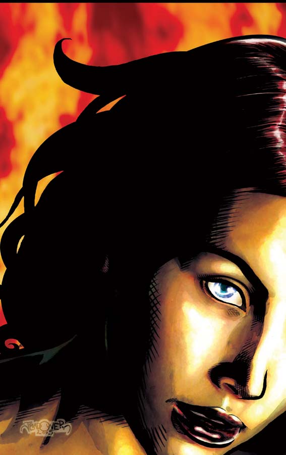
LUCY - credits page pinup


I'm procrastinating.

In a matter of minutes I will have the latest piece of brilliance from Annette. If I was any more excited, they'd have to hose me down.

I would be procrastinating playing EQ but my mouse batteries have died. It's actually really hard to try and play with your graphics tablet as a mouse. I gave it a good 15 minutes before I threw in the towel.

Then I thought I'd get ahead and finish off presenting Lucy. Actually blog in advance.

So here's the final piece. I'm actually really sad having to say good bye to this piece. It's not often you hear about and then get the chance to draw a story that you think will really make you. The next project I'm doing will be fun, but Lucy would have been ground breaking. Ahh well.

Heh, was at JAn's party on sunday night and the common response to, "So, how are you?" was "Haven't you read my blog?"

I couldn't help but laugh.

That's funny, right?

Tell me that's funny.

Next up: Linework for the next INNOCENTS cover! More Unrealistic women for people to get angry at! Yay!

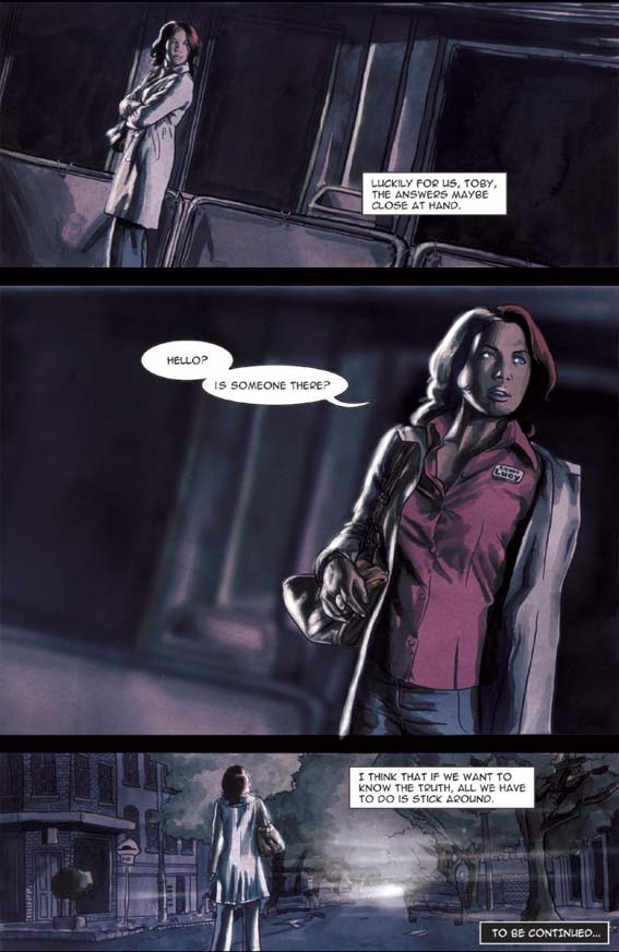
LUCY - page 5

Here we are.

The last page.

No tears ok? No crying.

There will be more.

So yeah, Ashleigh (one of my clients) kindly modelled for Lucy. She's much prettier than these pictures, but she still smiled kindly when I showed her the work.

Something I find of endless amusement is the cross-media language slang we use for things. I remember saying to someone that I asked the model to do pose for a couple of "pinups". The confusion came when I mean full page pictures with no panels rather than a Playboy pinup spread.

Yeah, so I had fun on Lucy. But I really should have painted it properly...

I've got one more pinup from Lucy to show you (insert former rather than latter definition). Then I have some linework for the new INNOCENTS cover and then... ta da! More Annette colouring!

Monday, June 12, 2006

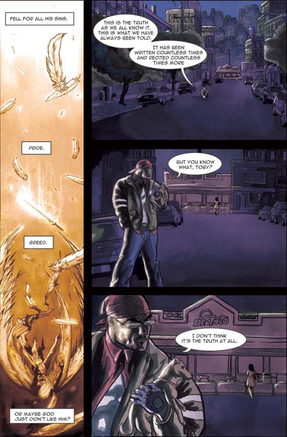
LUCY - page 4

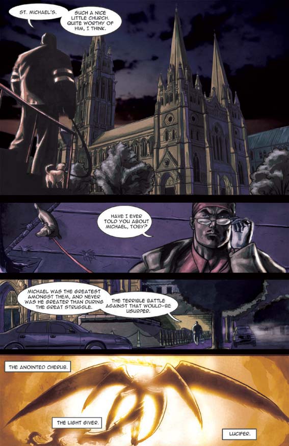
As some of you might have realised, I'm a real stickler for reference. JAn (inspired by Mickey Rourke in "Once Upon a Time in Mexico" and Mickey's real life antics) decided that Raphael should have a little dog. A jack russell to be exact. I scoured the web looking for damn reference. I hate it when my shot composition is limited by my reference - which is why I like to shoot my own stuff. I couldn't find anything so I started to do some sketches by myself and the result was the mating of a furry sausage and a double jointed crocodile. I was really beginning to despair.

Then it was Alex to the rescue again. I can't believe that I forgot that my best mate owns a super cute little jack russell called Fling. So after chasing Fling around for an hour I got my shots.

Thanks Fling. Thanks Alex.

MANGA ART DIRECTION: I've received a real swell of interest about this, and I thought I should make an announcement. It appears I misunderstood at what stage this project is at. It's a little bit further back than I originally believed. To be honest, I shouldn't have even have made an announcement about it. But suffice to say, I will contact every person who contacted me about this gig when it does come to light. In the meantime, please move along with your lives and get drawing... But just be ready when the Bat-signal hits the night skies.

ps Happy Birthday JAn, you old, old bastard.

Sunday, June 11, 2006

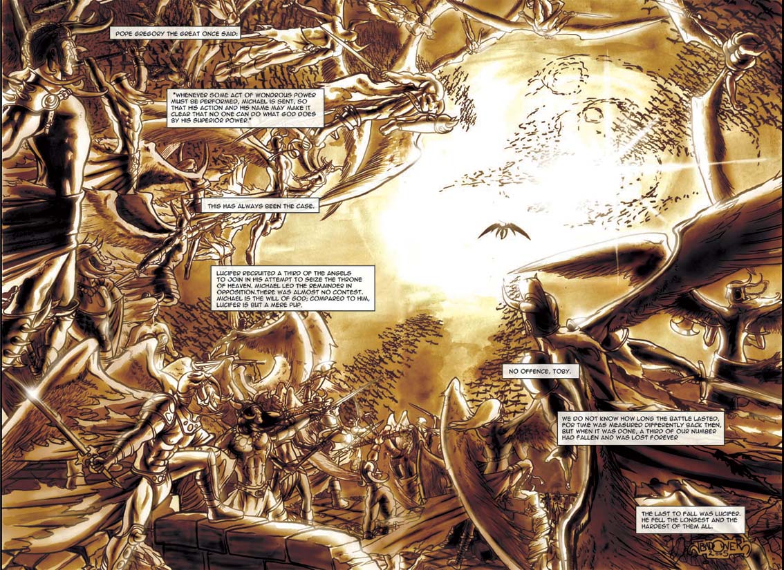
LUCY - page 2 & 3


As I mentioned I had about a week to draw this damn thing, right?

So JAn in his infinite wisdown goes, "Dude, I'm gonna make your life easier and give you a double page spread. They're easier to draw, right?"

Good thing we were on the phone and he couldn't see me beginning to get a little skittish, "Uh, I guess dude. Depends what it is."

Oh man, it will be easy. Really easy trust me.

Let me now cut to JAn's script:

"A great battle in the heavens. Let’s go for really classical representations of the angels, since Raphael is telling a story. Huge wings, flowing locks, flaming swords, piecemeal armour. Clear figures in the foreground, fading to silhouettes in the background. Have the forces of good on the right and the forces of evil on the left.

The angels of the left grimace in determination, driven as they are by greed. The angels on the right weep, for they are driven by mercy and their love for God."

It's basically two armies clashing. Basically the only thing that was weeping was me. I basically drew the other 3 pages in half the time it took me to draw this spread. Unfortunately it suffers from the emotional energy it takes to draw something like this. There's a LOT of figures here. A LOT. It was really draining. The figures and technical drawing aint perfect, but I still like the composition.

Thanks JAn. Anytime you have a bright idea to make my life easier... drop it.

Friday, June 09, 2006

LUCY page 1


I just knew that this story had to be painted.

Painted comics get a different reception to normal comics. They're treated as a higher form of the artform. They're easier to give to non-comic readers. And I'm still convinced that this book would sell bucket loads as it would be the perfect present for non-comic readers.

Now I actually had taught myself how to watercolour when I got chronic RSI and couldn't hold a pencil many, many years ago.

The only consideration to the painting was that Roger has given me some great advice. He'd noticed that I had been changing my style from piece to piece. Not in an evolutionary sense, but rather in an adaptive sense. I believe that your style should change to best promote the piece you are working on. Integrate dark shadows if it's a mature, night based piece. Work on open expressionism if it's a younger-targeted more carefree piece. While he respected this artistic principle, he told me I needed to create a definitive style for myself. People needed to be able to pick up a book and instantly know that I drew it. A Jason Badower comic book should have a style and recognisability. I needed to brand myself as an artist before constantly pulling the rug out from people's feet.

So my painting had to look like my style also!

I did some research into quick and effective painting styles. Alex Ross. Adi Ganov.

Here's what I ended up doing:

1. I would do my layouts then shoot my photo reference.

2. Then I would draw the linework in Photoshop. On a seperate layer I drew a 20% black layer as tonal reference for my watercolour work.

3. I printed out the linework onto watercolour paper and painted in my tones. This means I only used black paint to create a spectrum of greys.

4. I scanned the painted art back in and coloured it in Photoshop using Adi Ganov's technique of wrapping your flat colour layer over your toned artwork using the "Color" layer effect. I then touched this up to bring in more colour and enhance lighting effects.

The final effect is more organic than a straight digital piece. But it is a little muddy.

I have a ways to go before I perfect a painted style. This was too hard and fast. Again, the only thing I like about my colouring is my lighting (placement and emphasis of lights on the characters - very little to do with colour itself)

It's really hard to motivate yourself to do anything in colour when you have someone like Annette Kwok working with you.

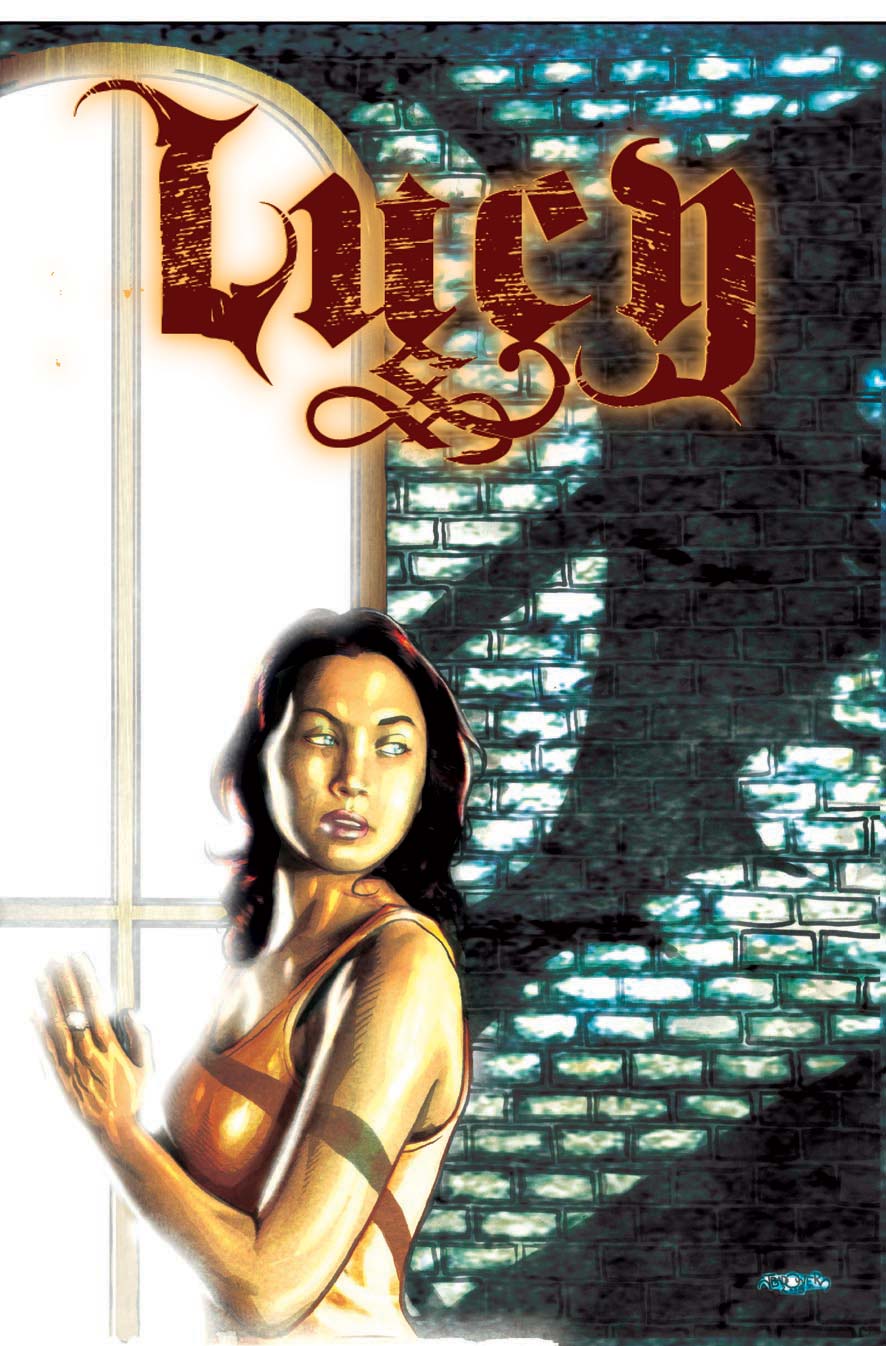
LUCY - Cover


Ok so one of the exciting projects I might get to art direct is the new manga, "Lucy". It's written by JAn Napiorkowski and the brainchild of Roger Mincheff. Now way back when, I was actually gonna draw this baby. Truth be told, I'm still smitten by the story. I think it's one I could really knock out of the park.

Anyway, it's out of my hands now.

But for Supanova last year Roger was kind enough to fly JAn and I up. Two reasons:

1. We had a million meetings to get through.

2. He really wanted to raise our profile on the Aussie scene as a part of Top Cow.

Then he realised that we didn't have anything to sign! So he commissioned us to write and draw this preview which he published for us especially for the convention. We had about 3 weeks to do this. JAn took about a week and a bit to write it. It's JAn at his best. Minimal. Evocative. Powerful.

That left me a week and bit-more-than-a-bit to layout, shoot, create a visual style (I'd mouthed off that I wanted to paint this but didn't know how!), draw, paint, colour, letter and print 5 pages, a cover and an inside cover. Take that you 24 hour comic heads! =)

I'm still incredibly proud of what I was able to achieve in that time. The only thing that ruined it for me were the spelling mistakes. Anyway, I think I caught them all for you guys, now.

The logo was designed by Alex Hammond, my oldest and best friend and an incredible writer and designer in his own right. I just didn't have time to do the logo and needed someone talented whom I could trust. He brought something so fresh and bold to the logo, that even if I had a year I couldn't have done anything as good.

The model is one of my clients, Ashleigh. She was just perfect casting and both her and her mother loved the likenesses that I did of her. That reminds me... I've still got to get these printed out for them.