Tuesday, June 27, 2006
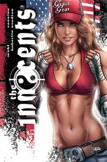
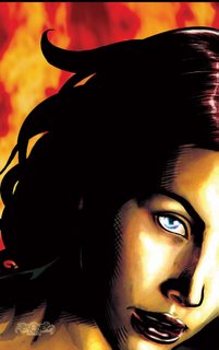
INNOCENTS COVER 1B: CLOSEUP
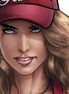
I really hope Annette doesn't mind me doing this, but I thought I'd show you guys what only I seem to get to see.
I don't know if this is a "How-to" more a "behind the scenes". Believe me, I've been staring at her work and still can't figure out how she does it!
But look at these eyes! look at the eliptical highlights, they're incredible. They bring such like on such a subtle level it's incredible. Look also at how much of the actual colouring is impressionistic. It's so simple in some areas yet sells so much!
I've had people raving about her hair and dying for a closeup. Well there you go. She's taken my tonal layers, colourised them and then gone in and created airbrush selections in keeping with the linework.
My favourite things about it:
1. The shine in the eyes.
2. The highlight above the left lip.
3. The fill light from the character's right.
4. The glow from the background on the inner areas of the eyes
5. The lipstick colour.
6. The coloured linework (inspired from Ex Machina and then cranked up to Annettian proportions).
Got some more stuff incoming. It's just gotta be cleared first.
Sunday, June 25, 2006
LOOKING FOR FUTURE TOKYOPOP ARTIST
As some of you may know I am the Art Director for Spacedog, an LA based studio that develops Intellectual Property in comics and other media. We work mainly with Top Cow but recently we’ve cemented a publishing deal with TokyoPop for several projects.
One of the projects TokyoPop is interested in is called LUCY, which is to be written by JAn and art directed by myself. The hunt is on for a professional, fast manga artist. Ideally JAn and I are looking for a more scratchy, kinetic, noisy sort of manga similar to Hiroaki Samura (Blade of the Immortal) or Goseki Kojima (Lone Wolf and Cub).
We’d love to give an Aussie a break (also being able to drive around to your house and kick your ass if your deadlines are slipping is helpful too). =)
FAQ:
1. PAY: This is a fully funded project according to a standard Tokyopop budget.
2. SIZE: Lucy will be a 160 page graphic novel. Tokyopop are encouraging a second and third graphic novel from the idea.
3. FORMAT: 160pages black and white. If you do your own toning then that will be included in your budget also. Lettering too. Basically, the more you can do, the more you get paid.
4. RESUME: Please enclose a resume of your printed and unprinted work. Any links to any websites you have artwork up at. This will provide additional information about you if we’re really interested.
5. EMAIL: Please enclose all 8 pages of art (5 sequential and 3 character designs, see below) and a word document of links and resume as a ZIP or RAR file and email them to:
jbadower@bigpond.net.au
6. DEADLINE: You have until Friday the 30th to get this to me.
7. SPECS: Here’s what you will need to do if you are interested:
1. Provide 5 pages of sequential art in the style that you intend to draw the book in.
The content of the art is up to you. But it must be 5 consecutive pages of a story. We will lean towards modern day, gritty urban settings in helping to make our evaluation.
I want fully INKED work. If you choose to team up with an inker then the budget is simply accorded to your team and you divide it up as you see fit. I will NOT be pairing pencillers with inkers. If you can pencil and ink, even better… more money for you.
Those of you complaining that you only have a week to draw 5 pages can consider these two things: 1. I want someone fast. 2. I want someone who has already work. If you don’t have 5 pages lying around that you’re happy with then you might not be our ideal artist. If this is your case and can’t hammer ‘em out in a week then you also might not be our ideal artist. This is a professional deadline driven project for someone who’s ready for the break.
2. Three character sketches/designs from the following descriptions. I’m looking for a headshot (exploring character) and then a full body shot of the character (exploring their wardrobe).
LUCY:
20 years old. Cute and perky. Quite short and petite with short
blonde hair. More often than not she is smiling, but it's knowing
smile not a goofy one. Her wardrobe is whatever 20yo around you are
wearing: skirts, pants, t-shirts, blouses. Nothing too trendy so as
not to date it, but nothing really bland either. Apart from being
cute, Lucy is actually quite generic for obvious reasons.
A pretty young girl in her early 20s. Upbeat and always
cheerful, she’s the sort of girl who’d run out of water in the desert
and make a joke about it. Given a choice she will always look on the
bright side of any situation, and with no choice she’ll do her
hardest to find the bright side anyway. Lucy is also Lucifer, the
Lord of Hell; tired of ruling Hell, she is seeking redemption and her
rightful place back at God’s side.
MICHELLE:
Tall, brunette, severe. Long hair tied black. Michelle is
stylish without being either outrageous or old-fashioned. She is
striking and people do not forget her presence - unless she wants
them to. She dresses in dark colours, long coats - not leather or
PVC, use wool, linen, etc instead. She is always wearing stylish,
thin leather gloves. (All of the angels wear gloves, whether it's
because they don't want to or cannot touch the Earth is not known.)
Beautiful, competent and completely devoted to performing
God’s will, Michelle is the Archangel Michael. Almost completely
inscrutable, she will let nothing stand in the way of her performing
her assigned duty. As an archangel she is also God’s last resort,
once unleashed she has no subtlety or finesse; she is the
sledgehammer that brings down the house in order to kill a fly.
GABRIEL:
Late 20s. Imagine every cool mafia guy, every cool hitman
you've ever seen and that's what Gabriel looks like. Slick suits,
slick hair, slick car. Under the suits he's covered in Enochian
tattoos, which show beneath his wife-beater singlet. Give him a
goatee if it suits the look you're going for. He's brash, he's cocky
and it reflects in the way he stands and handles himself.
Another of God’s favourites, Gabriel has been assigned to
look after Hell in Lucy’s absence. He wants Lucifer to take her
rightful place back in Hell as much as anyone and has the powers of
Hell to help him realise that goal.
Please note that JAn and I DO NOT have final say over who is accepted by Tokyopop. Our goal is to take the submissions that we like from the artists that we want to work with, pitch them at Tokyopop and let them make the final decision.
Good luck!
Jason Badower
Art Director
Spacedog
Friday, June 23, 2006
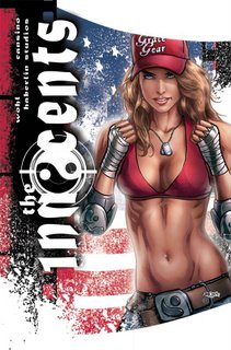
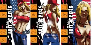
INNOCENTS COVER 1B: design 2
And we have our winner. Not quite as much breathing space as on the first design, but much closer to the original sketch. I wanted a strong powerful figure to attract attention from a distance. The beauty of what Annette does is that it attracts your attention from a distance then keeps on giving as you go closer and closer to it. On some levels there's an incredible amount of closure required making the piece almost impressionistic. On some other parts it's incredibly literal... pore for pore, stitch for stitch.
Seeing how I feel, I might do an extreme closeup of the eyes just to show you the sort of detail that Annette puts in. It's quite incredible.
My next job is to go through the interiors of the book and offer some constructive insights to make them better under the deadline we already have. Unfortunately it's been drawn and coloured already making changes really hard to do.
For those of you interested in the Tokyopop project, we just got a fascinating email from them placing Lucy at the top of the list of the projects they like. Keep your eyes and ears peeled. While I'm not asking for any formal submissions, those of you who read my blog can have a little heads up. Here's the first thing we're going to need to get you sold as a Tokyopop artist:
- 5 pages of sequential art featuring the style you're going to use for the series. It must contain figures and background. The darker, more urban and gritty it is, the better. JAn and I would love to have a Hiroaki Samura or Kazuo Koike sorta look and feel. That line-heavy manic intricate manga. We're inundated with clean line manga and we want a more organic, rougher feel.
So those of you who are interested start putting together 5 pages of good, solid storytelling. Inked. If a penciller and an inker pitch as a duo that's fine, but I'm not putting together inkers and pencillers. And no, you won't get paid more if there's two of you. One flat rate to divide between you (or keep for yourself). No figures yet, but a standard Tokyopop budget will apply.
Don't send it to me yet, and don't blame me if you've drawn your ass off to send me something and it all falls through. Way I figure, is if you don't have 5 good pages lying around or aren't in a position to hammer out 5 pages anytime soon, then you're not up for the gig. It will have a manic timeline so an artist with a high page turn around will be smiled upon.
Thursday, June 22, 2006
INNOCENTS COVER 1B: design 1
That's ok. I'm not emotionally attached to any of them. I just want the piece that makes Roger and David the happiest.
I hope you can start to see what I mean how a picture becomes a cover. It's about space, design, placement and position. It's about what you emphasize and what you cover up.
For those of you wondering about the white sprays there, it's a black ink spray that I scanned in, grabbed in a selection created a new layer coloured it in white and then copied that onto the image. There's a couple different spatters, some just linear (straight on) and others with some movement to them.
You can start to see the amount of post production work that goes into one of my covers too. Having the pretty picture just isn't enough. I need layers, depth, texture and focus.
And it was hella fun.
Obviously the tie in to the San Diego cover is obvious for anyone who saw the first cover. Similar but different. I felt it was important to create a design that would be immediately obvious that it's the same cover. If they ask me back to do the next one, I can't wait to take the design a step forward rather than sideways.
Wednesday, June 21, 2006
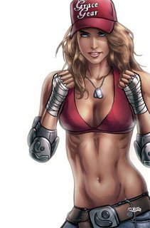
INNOCENTS COVER 1B: Colour
I’m a huge fan of Adam Hughes and his artwork has been an incredible influence on me. His women are just incredibly sexy. It was only when I got to drawing Grace (chick on the left) that I really started to think about the habits that I have when I draw a chick Hughes style. Thick, thick mascara and blood red lips. But I figured that Grace isn't that sorta chick. She wouldn’t be caking on the makeup. She's a more natural looking girl. So I figured that would be a really exciting direction to go in. I left the lips more open and not so dark. I went easier on the eyes.
The thing that really sold me on it was what Annette did. You see there are some things about makeup that a heterosexual non-crossdressing guy will never, ever know about makeup. The stuff that Annette did... wow. I learnt so much. One of the great learning curves for me was back on the Harajuku girls for the first Innocents cover. She drew them with blue eyeshadow. Now I would NEVER think to do that, but being a girl Annette did it and it worked big time!There's just some things women do better than guys...
Next up: The rejected design for the cover.
Monday, June 19, 2006
INNOCENTS COVER 1B: Lineart take 2
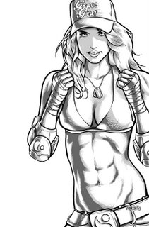
Here's the revised ab linework.
Much cooler and much sexier. Serves me right for going with some annorexic chick anyway. As I commented to Annette, if she's that ripped and her boobs are that big, then it means they're fake... and I don't think Grace (the chick on the left) would have fake boobs.
Annette's done a stunning job on the colouring and batted it in well ahead of deadline. I can't wait to show you all!
I'm just waiting to hear back from David and Roger as to which layout they liked. While Annette and I have created a really nice picture, I'm finding that it's when you doing all the laying out that you create a really nice cover.
I guess the problem I have with most comic book cover art is that it looks like comic book cover art.
"What an idiot." you're probably thinking.
No, seriously. That's fine for most superhero comics, but I think the spectrum of people who read comics these days are a little broader in scope and experience than they ever used to be. With multiple competing second tier genres (first tier is superheroes) we can offer a wider variety of product than ever before. Comics outside of the superhero genre should try and reflect the design, tropes and ideas from these genres to attract those interested in such things. In no other type of design do we have such a narrow design brief. The artwork is incredible, but the way that the artwork is presented is really limited.
Currently my favourite cover designs are the Marvel CIVIL WAR stuff, Warren Ellis' NEXT WAVE & DOWN (Like him or hate him, Warren has been onto this for ages and produces some really interesting cover concepts), the Alex Maleev DARE DEVIL stuff had some real highlights too.
Sunday, June 18, 2006
INNOCENTS COVER 1B: Sketches
"Ripped off!" I hear you cry.
Where's Annette's colouring?
Sometimes the nature of what we do is really last minute. I received the brief wednesday week ago. I sent off these sketches and only just got their feedback finalised by friday. The feedback was while they liked Sketch 3 (the farthest on the right - which was also my favourite) they wanted more movement in the figure. Was there some sort of hand signal unique to the subculture that I could include. I have *no* idea where to find something like that. Xtreme sports championship galleries didn't yield anything, so I went with the gloves up.
The problem was that they needed it (fully coloured) by the wednesday! So friday night (on the long weekend) I got drawing and got it to Annette sometime sunday afternoon. She coloured like a demon and we made the wednesday deadline (despite some technical issues).
A couple days later David gets back to us commenting that there's something wrong with her abs and torso. Perhaps it's a bit long? It was all my fault. I'd used some stupidly annorexic chick and exaggerated it even more. When Annette sent me the first proof back I realised what a mistake I'd made. I asked Annette to do what she could to soften the abs and under the time constraints she did a really good job. But to be fair it wasn't good enough - and it was all my fault.
So right now I've sent off the redrawn torso linework to Annette and she's working her magic under intense pressure. You will see it as soon as it's approved.
Friday, June 16, 2006
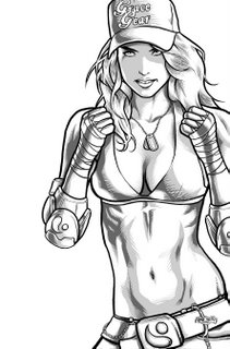
INNOCENTS COVER 1B: Lineart
Subject: Next Innocents Cover.
Content: "It's time."
They wanted me back!
So what you saw last was the San Diego exclusive cover. I will be pocketing many of these babies when I head over there. What they're looking for this time is the world-wide distribution cover.
With that in mind I wanted something that really tied in with the last cover. I wanted those at San Diego to recognise the colours, imagery, character and design.
This time I wanted something a little bit more close up to Grace. Something a little more "in-your-face".
Roger had been commenting that he wanted to get away from the sword. While the sword was a nice gesture to her being a fighter, she doesn't use a sword at all in the first issue. So I decided to give her boxing wraps instead (any of my clients reading this can gape appreciatively at the perfection of her wraps). I really liked the Ying-Yang elbow pads which I hope lend her a slightly X-games feel. I kept the cap to keep her fashion designer branding.
Next up: Annette's colouring magic!
Wednesday, June 14, 2006
LUCY - credits page pinup
I'm procrastinating.
In a matter of minutes I will have the latest piece of brilliance from Annette. If I was any more excited, they'd have to hose me down.
I would be procrastinating playing EQ but my mouse batteries have died. It's actually really hard to try and play with your graphics tablet as a mouse. I gave it a good 15 minutes before I threw in the towel.
Then I thought I'd get ahead and finish off presenting Lucy. Actually blog in advance.
So here's the final piece. I'm actually really sad having to say good bye to this piece. It's not often you hear about and then get the chance to draw a story that you think will really make you. The next project I'm doing will be fun, but Lucy would have been ground breaking. Ahh well.
Heh, was at JAn's party on sunday night and the common response to, "So, how are you?" was "Haven't you read my blog?"
I couldn't help but laugh.
That's funny, right?
Tell me that's funny.
Next up: Linework for the next INNOCENTS cover! More Unrealistic women for people to get angry at! Yay!
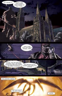
LUCY - page 5
The last page.
No tears ok? No crying.
There will be more.
So yeah, Ashleigh (one of my clients) kindly modelled for Lucy. She's much prettier than these pictures, but she still smiled kindly when I showed her the work.
Something I find of endless amusement is the cross-media language slang we use for things. I remember saying to someone that I asked the model to do pose for a couple of "pinups". The confusion came when I mean full page pictures with no panels rather than a Playboy pinup spread.
Yeah, so I had fun on Lucy. But I really should have painted it properly...
I've got one more pinup from Lucy to show you (insert former rather than latter definition). Then I have some linework for the new INNOCENTS cover and then... ta da! More Annette colouring!
Monday, June 12, 2006
LUCY - page 4
Then it was Alex to the rescue again. I can't believe that I forgot that my best mate owns a super cute little jack russell called Fling. So after chasing Fling around for an hour I got my shots.
Thanks Fling. Thanks Alex.
MANGA ART DIRECTION: I've received a real swell of interest about this, and I thought I should make an announcement. It appears I misunderstood at what stage this project is at. It's a little bit further back than I originally believed. To be honest, I shouldn't have even have made an announcement about it. But suffice to say, I will contact every person who contacted me about this gig when it does come to light. In the meantime, please move along with your lives and get drawing... But just be ready when the Bat-signal hits the night skies.
ps Happy Birthday JAn, you old, old bastard.
Sunday, June 11, 2006
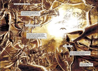
LUCY - page 2 & 3
As I mentioned I had about a week to draw this damn thing, right?
So JAn in his infinite wisdown goes, "Dude, I'm gonna make your life easier and give you a double page spread. They're easier to draw, right?"
Good thing we were on the phone and he couldn't see me beginning to get a little skittish, "Uh, I guess dude. Depends what it is."
Oh man, it will be easy. Really easy trust me.
Let me now cut to JAn's script:
"A great battle in the heavens. Let’s go for really classical representations of the angels, since Raphael is telling a story. Huge wings, flowing locks, flaming swords, piecemeal armour. Clear figures in the foreground, fading to silhouettes in the background. Have the forces of good on the right and the forces of evil on the left.
It's basically two armies clashing. Basically the only thing that was weeping was me. I basically drew the other 3 pages in half the time it took me to draw this spread. Unfortunately it suffers from the emotional energy it takes to draw something like this. There's a LOT of figures here. A LOT. It was really draining. The figures and technical drawing aint perfect, but I still like the composition.
Thanks JAn. Anytime you have a bright idea to make my life easier... drop it.Friday, June 09, 2006
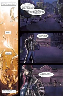
LUCY page 1
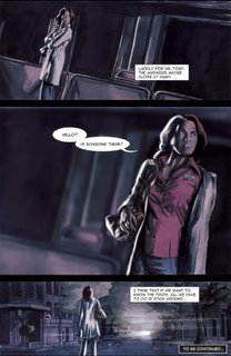
I just knew that this story had to be painted.
Painted comics get a different reception to normal comics. They're treated as a higher form of the artform. They're easier to give to non-comic readers. And I'm still convinced that this book would sell bucket loads as it would be the perfect present for non-comic readers.
Now I actually had taught myself how to watercolour when I got chronic RSI and couldn't hold a pencil many, many years ago.
The only consideration to the painting was that Roger has given me some great advice. He'd noticed that I had been changing my style from piece to piece. Not in an evolutionary sense, but rather in an adaptive sense. I believe that your style should change to best promote the piece you are working on. Integrate dark shadows if it's a mature, night based piece. Work on open expressionism if it's a younger-targeted more carefree piece. While he respected this artistic principle, he told me I needed to create a definitive style for myself. People needed to be able to pick up a book and instantly know that I drew it. A Jason Badower comic book should have a style and recognisability. I needed to brand myself as an artist before constantly pulling the rug out from people's feet.
So my painting had to look like my style also!
I did some research into quick and effective painting styles. Alex Ross. Adi Ganov.
Here's what I ended up doing:
1. I would do my layouts then shoot my photo reference.
2. Then I would draw the linework in Photoshop. On a seperate layer I drew a 20% black layer as tonal reference for my watercolour work.
3. I printed out the linework onto watercolour paper and painted in my tones. This means I only used black paint to create a spectrum of greys.
4. I scanned the painted art back in and coloured it in Photoshop using Adi Ganov's technique of wrapping your flat colour layer over your toned artwork using the "Color" layer effect. I then touched this up to bring in more colour and enhance lighting effects.
The final effect is more organic than a straight digital piece. But it is a little muddy.
I have a ways to go before I perfect a painted style. This was too hard and fast. Again, the only thing I like about my colouring is my lighting (placement and emphasis of lights on the characters - very little to do with colour itself)
It's really hard to motivate yourself to do anything in colour when you have someone like Annette Kwok working with you.
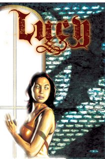
LUCY - Cover
Ok so one of the exciting projects I might get to art direct is the new manga, "Lucy". It's written by JAn Napiorkowski and the brainchild of Roger Mincheff. Now way back when, I was actually gonna draw this baby. Truth be told, I'm still smitten by the story. I think it's one I could really knock out of the park.
Anyway, it's out of my hands now.
But for Supanova last year Roger was kind enough to fly JAn and I up. Two reasons:
1. We had a million meetings to get through.
2. He really wanted to raise our profile on the Aussie scene as a part of Top Cow.
Then he realised that we didn't have anything to sign! So he commissioned us to write and draw this preview which he published for us especially for the convention. We had about 3 weeks to do this. JAn took about a week and a bit to write it. It's JAn at his best. Minimal. Evocative. Powerful.
That left me a week and bit-more-than-a-bit to layout, shoot, create a visual style (I'd mouthed off that I wanted to paint this but didn't know how!), draw, paint, colour, letter and print 5 pages, a cover and an inside cover. Take that you 24 hour comic heads! =)
I'm still incredibly proud of what I was able to achieve in that time. The only thing that ruined it for me were the spelling mistakes. Anyway, I think I caught them all for you guys, now.
The logo was designed by Alex Hammond, my oldest and best friend and an incredible writer and designer in his own right. I just didn't have time to do the logo and needed someone talented whom I could trust. He brought something so fresh and bold to the logo, that even if I had a year I couldn't have done anything as good.
The model is one of my clients, Ashleigh. She was just perfect casting and both her and her mother loved the likenesses that I did of her. That reminds me... I've still got to get these printed out for them.
Thursday, June 08, 2006
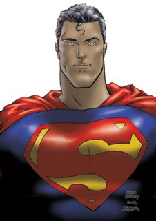
Quitely/Badower - Superman *faint*
These guys are the party hard central, and incredibly cool dudes.
Highlights included:
1. Heading back to Mark Millar's hotel room for post pub drinks til the wee hours in the morning. Him buying the hotel out of overpriced beer to get us all drunk.
2. Rocking up at the hotel room to find Frank Quitely chatting to some nondescript dude in a suit and glasses. The guy had just closed his art folder and was leaving. I remember catching his eye and smiling as he left. Frank (Vincent) welcomed us into Mark's room as this gentleman smiled politely and quietly (no pun intended) left. I decided to pluck up my courage, "Vincent, that guy who just left? Who was he? Some art director?"
"No, aye. That was Brendan McCarthy. Grant (Morrison) said he'd come say hi and we should meet up."
I promptly crapped myself. I am a HUGE fan of Brendan McCarthy. (http://www.brendanmccarthy.co.uk/) Skin. Shade The Changing Man covers. Rogan Josh. To give you a scale of Brendan's talent, Jamie Hewlett (Tank Girl and designer/creator/illustrator of the Gorillaz) is a massive fan of Brendan's work. I politely excused myself and rushed to the elevator to find Brendan had already gone. I returned to the room bewildered but jazzed at my brush with genius. McCarthy, Quitely, Millar. Hot damn!
3. Pulling an excited JAn off a terrified Mark Millar (who is a lovely guy but about 5'9 to JAn's 6'1 of massive polish farm boy genetic stock). It appears Mr. Millar doesn't have the same defence against the JAn arts as Mr. Morrison.
4. This picture. By the end of the weekend I finally gave into my fanboy urges and asked my favourite artist in the world for a sketch of Superman. I asked for a pencilled version so I could ink it myself. He drew a beautiful Superman that even Millar commented looked better than anything he'd done in JLA: Earth 2. I inked and coloured (ie. ruined) this baby and made prints and framed it for a couple of close friends for their last year Xmas presents.
Quitely and Badower. Man, I'd love to see those name in lights again together.
ps. Coloured it during my Luna Brothers phase. Was heavily into ULTRA at the time. http://www.lunabrothers.com/
Tuesday, June 06, 2006
More Kwokian Goodness
When I get things like this in my Inbox, they just make my day.
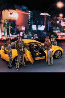
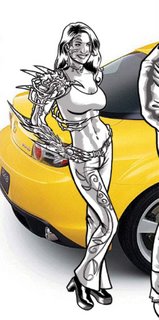
Here's the base artwork for the Mazda ad from Annette and I. Again Annette's done a stunning, stunning job. The way she's matched the lighting from the background on the characters and the car is incredible. If you look closely you will see that she has also put shadows from the characters on the car and the ground - incredible attention to detail.
She's also used the skin-linework softening technique to great effect once again.
Ok, now it's up to me to do some logo and copy placement and you should see the thing as an ad in all Top Cow comics in a month or two. And you can say you saw that being put together.
Monday, June 05, 2006
More old(ish) stuff
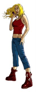
A friend of mine tutors in singing and asked me for an illustration piece to advertise her work. She had previously been using a Jo Chen piece (http://www.jo-chen.com/ - who is a genius!) and being a respectful artist in her own right wanted an original piece of art.
She wanted something simple, streetwise and cool that was sexy but not slutty. She also wanted something that kinda looked like her. Something that the Brittney and Hillary kids would dig also.
Again a fun two-toning anime sorta colouring endeavour.
Coming up I have a bunch of character concept sketches I'm doing for an upcoming series of manga graphic novels for Tokyopop. They're all manga so that's kinda interesting.
Saturday, June 03, 2006
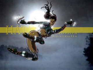
HATE!
As a card carrying uber nerd there is a certain minimum of nerdly things I have to do to maintain my nerdship.
One of the ways that I keep my nerdship is by playing online computer games. Everquest 2 to be exact. Why not World of Warcraft? Cos I can't be bothered with dealing with armies of 13 year old phat lewt idiots.
So playing Eq2 I've met a group of people who call themselves "Aurora Australis" (the online, ingame term is a "guild"). They welcomed me in, and one of their more powerful members, a guy by the name of HATE who plays a lady monk took a week of his time to watch over my character so that I could progress at a rate far beyond what I could do myself. The week of his help ended with his birthday. I asked him what I could do to repay him. He joked that a picture of HATE in a bikini would do.
I wouldn't do that, but I did say I would do what I could.
In game she normally wears full pants and a top as the clothing design is refreshingly conservative. So I decided that she needed some "creative tearing" of her costume so that HATE could enjoy the feminine wiles of his character.
So thanks for all your help HATE, and happy birthday buddy!
I could kill me
Ok, so when I do a piece, I compress it in Photoshop, and then email it off for approval. Generally what I do is then uncompress it and resave it at full quality. The word of note here is "generally". Not this time. I compressed it, saved it then closed Photoshop completely losing the hi-res art quality image that Photoshop stores in its memory. I now have to redraw this completely. The most help I'm going to get is that I can trace over the blurry crappy compressed lines of the older image. >sigh<
It was going to be such a nice and quiet weekend.
So I have to redraw this, three character sketches for Lucy (this is the story of stories and perfect for me, but it's decided it's going to be a manga. At least JAn gets to still write it). I have to do these in manga style. Should be interesting... In the Chinese sense.
I will be announcing a huge art drive on Pulp Faction soon. If any of you are or know a skilled manga artist who is professional and reliable, they could have a huge 160 page Tokyopop graphic novel coming out if they can impress me. Details soon.
In the meantime you can have a looksie at the previously finished and now forever lost and approved new clothed Witchblade (she looks so much better in clothes!).