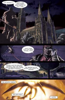
I just knew that this story had to be painted.
Painted comics get a different reception to normal comics. They're treated as a higher form of the artform. They're easier to give to non-comic readers. And I'm still convinced that this book would sell bucket loads as it would be the perfect present for non-comic readers.
Now I actually had taught myself how to watercolour when I got chronic RSI and couldn't hold a pencil many, many years ago.
The only consideration to the painting was that Roger has given me some great advice. He'd noticed that I had been changing my style from piece to piece. Not in an evolutionary sense, but rather in an adaptive sense. I believe that your style should change to best promote the piece you are working on. Integrate dark shadows if it's a mature, night based piece. Work on open expressionism if it's a younger-targeted more carefree piece. While he respected this artistic principle, he told me I needed to create a definitive style for myself. People needed to be able to pick up a book and instantly know that I drew it. A Jason Badower comic book should have a style and recognisability. I needed to brand myself as an artist before constantly pulling the rug out from people's feet.
So my painting had to look like my style also!
I did some research into quick and effective painting styles. Alex Ross. Adi Ganov.
Here's what I ended up doing:
1. I would do my layouts then shoot my photo reference.
2. Then I would draw the linework in Photoshop. On a seperate layer I drew a 20% black layer as tonal reference for my watercolour work.
3. I printed out the linework onto watercolour paper and painted in my tones. This means I only used black paint to create a spectrum of greys.
4. I scanned the painted art back in and coloured it in Photoshop using Adi Ganov's technique of wrapping your flat colour layer over your toned artwork using the "Color" layer effect. I then touched this up to bring in more colour and enhance lighting effects.
The final effect is more organic than a straight digital piece. But it is a little muddy.
I have a ways to go before I perfect a painted style. This was too hard and fast. Again, the only thing I like about my colouring is my lighting (placement and emphasis of lights on the characters - very little to do with colour itself)
It's really hard to motivate yourself to do anything in colour when you have someone like Annette Kwok working with you.


3 comments:
Send me an email and let's do the link thang.
Now as for painted comics, I feel that Muth and DeMatteis' work is perhaps a tad too experimental to properly elicit a mass media reaction. It's almost like a David Lynch film in a comic. Genius but largely inaccessible.
Show them Muth's TALES OF AN ABANDONED CITY or M and you get a different story. Linear, simple narrative and beautiful artwork make for a compelling and timeless piece.
It's also hard to compare what I feel is the peak of contemporary linework (Frank Quitely) whose imagery is outside of date or artistic trends or movements.
The problem with most linework is that it becomes dated by the linework style and colouring techniques.
Paint is timeless. We have traditionally accepted paint as "art" and I feel that preconception carries across to comics.
Ahhh... Busted. I'm not actually a fan of Lynch. I was just looking for someone who does alternative stuff within the mass media.
I guess the hardest thing is that we're comparing apples with oranges. Can line work of artist A be compared to the painted work of artist B?
I guess a good example is Duncan Fegredo. Gifted painter and linework artist. I still think that his painted work is far more timeless than his linework. Both have his same frenetic spontaneous style, but the painted work has a sense of weight to it that the linework lacks.
It seems less disposable.
And in writing this I've realised that I wanted something that could sit on the shelves for decades and still hold its visual relevance.
I feel that linework styles in comics is just too transient.
Yeah I can see your point Andy. But I'm not talking about better or worse or emotional or evocative or gripping or real or less real.
I'm talking about what is more accepted by a mass-non-comic-reading audience.
With the stigma that still clings to comics (that it's a retarded superhero ridden pseudo-art form) I feel that you can win people over with, "Look it's painted! It must be for mature, smart people!"
Funnily enough, Alex Ross is the perfect example. No other artist I know has captured the mass appeal of the non-comic reading audience as much as he has. Stand outside the WB shop in crown and watch families, old people, kids, couples... everyone stop and look at his stuff. Then look at his Spiderman 2 credits! If you don't believe me, believe Sam Raimi.
It's one of the goals of my art. Artistically innovative, appropriate or even evocative aside... I want the appeal and charisma of his work. I believe his chosen medium plays a huge part in that.
ps. And if we are to compare an artist's linework to his painted work, there's simply NO comparing Simon Bisley's painted work to his linework. His Slaine destroys his Lobo anyday.
Post a Comment