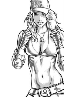
Here's the revised ab linework.
Much cooler and much sexier. Serves me right for going with some annorexic chick anyway. As I commented to Annette, if she's that ripped and her boobs are that big, then it means they're fake... and I don't think Grace (the chick on the left) would have fake boobs.
Annette's done a stunning job on the colouring and batted it in well ahead of deadline. I can't wait to show you all!
I'm just waiting to hear back from David and Roger as to which layout they liked. While Annette and I have created a really nice picture, I'm finding that it's when you doing all the laying out that you create a really nice cover.
I guess the problem I have with most comic book cover art is that it looks like comic book cover art.
"What an idiot." you're probably thinking.
No, seriously. That's fine for most superhero comics, but I think the spectrum of people who read comics these days are a little broader in scope and experience than they ever used to be. With multiple competing second tier genres (first tier is superheroes) we can offer a wider variety of product than ever before. Comics outside of the superhero genre should try and reflect the design, tropes and ideas from these genres to attract those interested in such things. In no other type of design do we have such a narrow design brief. The artwork is incredible, but the way that the artwork is presented is really limited.
Currently my favourite cover designs are the Marvel CIVIL WAR stuff, Warren Ellis' NEXT WAVE & DOWN (Like him or hate him, Warren has been onto this for ages and produces some really interesting cover concepts), the Alex Maleev DARE DEVIL stuff had some real highlights too.


2 comments:
Oh that whole cover was insanely over the top. But at least I can't be blamed for the big boob issue on that cover. *wink wink* *nudge nudge*
jas
Just want to burn the covers. The rest of it I'm quite proud of. I've moved on from it skill-wise, but I'm really proud of that step in the developmental processs.
I'm just really pissed off at all those pesky word balloons covering my art.
Post a Comment