
 Technically, it's actually design 2, as I designed the one that made the grade first. It's my fav but it got the big knock back.
That's ok. I'm not emotionally attached to any of them. I just want the piece that makes Roger and David the happiest.
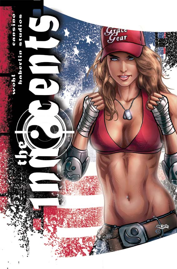
I hope you can start to see what I mean how a picture becomes a cover. It's about space, design, placement and position. It's about what you emphasize and what you cover up.
For those of you wondering about the white sprays there, it's a black ink spray that I scanned in, grabbed in a selection created a new layer coloured it in white and then copied that onto the image. There's a couple different spatters, some just linear (straight on) and others with some movement to them.
You can start to see the amount of post production work that goes into one of my covers too. Having the pretty picture just isn't enough. I need layers, depth, texture and focus.
And it was hella fun.
Obviously the tie in to the San Diego cover is obvious for anyone who saw the first cover. Similar but different. I felt it was important to create a design that would be immediately obvious that it's the same cover. If they ask me back to do the next one, I can't wait to take the design a step forward rather than sideways.

No comments:
Post a Comment