
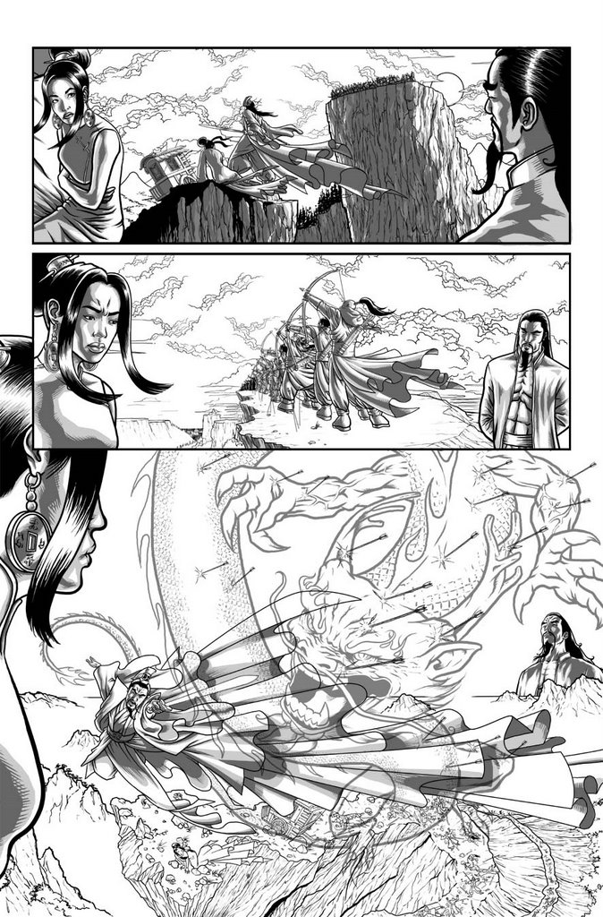
Yay! Page 4. Still one of my favourite pages. I would have loved the bottom panel to stretch across two pages. I'd love mountains disappearing away on both sides into the mist and the horizon.
Still, what you're really missing here is JAn's script. If this ever gets published, we will definitely let you know when and where. It's such an elegant story.
I feel hungover. It's my third day that's more than 12 hours long this week (13.5 today, 14.5 yesterday). I'm so tired I can barely pick up my pen, and blogging is hurting my eyeballs. I just want to sleep and I have to get up at 6am again. But I promised I'd finish the page tonight...

4 comments:
empage03v2 is my personal vave of these pages 'cause of the interior designs (please tell me these are refferanced and not from your imagination, I don't think I could handel it if youcould just invent this stuff...) hmm, hang on a second, those things haning of her face the "bangs" or whatever you call them, they look familiar...
I can see why you like the page with the dragon (remonds me of the Final Fantasy movie). It's good to see the pages in b&w/tones, you get to see the designing of the page before everything is covered ion computer colouring.
I have a question though about your overall style. Are you aware of the style shift in your work?
was it delibaraite or just a case of "this is what I have time for , so be it" (and by that I'm not suggesting a drip on quality).Just an observation that your work seems more, well, workman like....if that makes sence, more design oriented than before.
A natureal progretion or something you've had time to consider?
sorry dude, I really should check my posts for errors first, huh?
OK, I'll stop messing up your blog with my usless post's!
go to:
http://mikenasonart.blogspot.com/
there, you made me do it (and a good thing to..)
Hahahaha. Mike, Mike, Mike.
Ok.
Yeah, my style has definitely made a shift based on my influences and my tools. I'm a lot more capable of having stronger design sense since working on Photoshop. I can move and resize elements around so they fit together perfectly. I really like that control.
My linework is not what it was or is comparable to yours. I just (to be honest) can't be bothered. =)
As for reference... I LURVE reference. My main issue with movies is that you have an entire production team working on each set. As a comic book artist, there's me and maybe a couple of images from the writer.
THE SIDELINE BACKSTORY: Is all furnished from different windows, sculptures and furniture found on Google images (my new best friend).
PANEL 1: Is the top floor of the bar scene from Crouching Tiger Hidden Dragon. I've repatterned the ballustrade and added the lanterns in though.
PANEL 2: Is from the top floor of a lighthouse. I've added the pattern from the ballustrade and the beams above.
PANEL 3: Another Google images find. I think i added the tree, though.
Post a Comment