
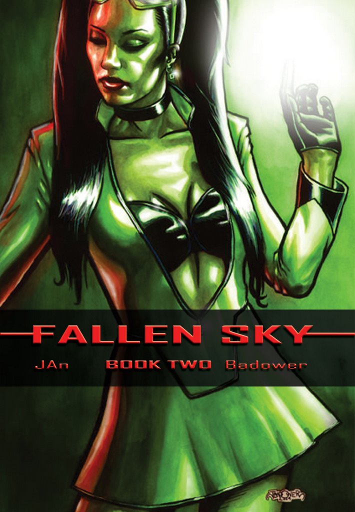
Don't worry, I don't count this as a "real" post. This is basically in response to Mike Nason's comment on my choice of colour. This is the artwork with the typeset for the cover. I like the layout and I think the choice of pallette draws the eye - especially on the noisy comic book racks. On a nice shiny paper stock it would look really nice.
I especially like the placement of the logo.

4 comments:
well I disagree...
um, I'm not sure about what, but I still don't like it!
so there.
sure, now the design makes good sence, but the colors still suck...
again, it's just personal tast, I hope the book sells really well all the same.
I'd probably look at it 'cause there's a chick on the cover...just like so many other guys I allways flip through the books with ckicks on the cover.
so sue me, it's only natural.
later.
And so my target demographic speaks...
But.. on the good side I guess your comments are keeping Annette in business. =)
jas
I was doing a Killeroo sketch (as ya do) and I for some reason thought of this little discusion...
this isn 't ever going to be the cover for the thoird issue, I just did it for fun...
http://geocities.com/tuffhelmet/kkk/roo32.jpg
now I've got two colour designs on the brain, here's another one I doid yesterday as a mock CD cover for my band "Fleshweapon"....
http://geocities.com/tuffhelmet/IMAGES/bestblister23.jpg
sorry, I really should get my own blog...
Mate, there's enough room here for both of us.
KILLEROO: Damn. I love the composition... and this is gonna kill you laughing... But i hate the colours! LOL!! I think the blue works great as a fill light, but I'm not big on it as a main light. Technically, it's nice tho. Rufus' hand holding the cigar is brilliant.
FLESHWEAPON: Cool name! Lurve that cover!
Post a Comment