

While I was over in San Diego, I got shown Marc Silvestri's cover for the Innocents graphic novel. I really liked it, and was excited about the possibility of what I could do with it. I asked if they could send me a high quality version of it so I could paint it.
Included above is the artwork as done by the Top Cow team. Totally slick.
This is the artwork that I did using Marc's pencils:
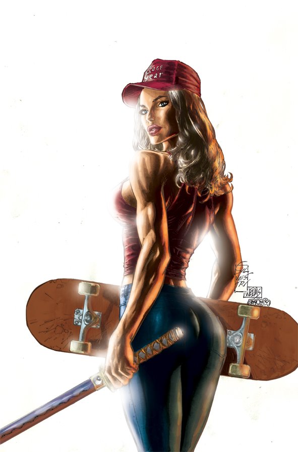
The main art note that we got from AOL Red (the teenage division of AOL who we did this in partnership with) was that it was too sexy. Her ass was too prominent and her boobs too full on. So taking that on board I tried a lighting scheme that would tone both of the elements down. The other main challenge was that I had never painted over anyone's artwork before. It was important to me that it still look like a Marc Silvestri piece. It's watercoloured with the pencils overlayed over the top.
It was definitely something fun to pass the time. Reminds me of the Quitely Superman that I did. It is such a buzz seeing my sig next to Marc's.
NEXT: More posters and pinup work...

2 comments:
that's an interesting test to do. Did you show/ask for any responce from "them". It's a typical Sylvestri pic but the pose is unusualy stiff for him, wht up wit that?...Your's looks very differant from the original which makes sence. I like the lighting on the museled up arms and on the skate deck but the "spraipaint glear" (I don't know what you'd call that) looks a bit random, but I have now particular solution to that choice though...the only thing that bugs me (and I have to point it out 'cause that's mu job!) is the pointy, angular look of the left shoulder. It's a problem with the original anatomy that has become a bit more obvious under your stronger lighting. I guess when you really think about it the whole pose is unatural and that realy doesent have anything to do with your contribution to the pic, so maybe I should just shut up....anyway, I like your re-interpritation of the anatomy of the arms, good your lighting solution works well enough....I'll go look at something else now...all these buts and boobs....I don't know...
M.
Totally appreciate the feedback man.
I don't think it's Marc's best work. He used my stuff as sole reference, which is really flattering.
My main problem with it is Grace as an overt sex symbol: all boobs and butt here. I think she should have a strong, powerful sexuality, but not an "in your face" men's magazine sorta pose. It's not really her.
Post a Comment