
I figured I'd been rambling on about Zero-G for long enough that I should post some of the work that Annette and I have done for it. I also realised that there's so much of it, that if I posted it all at once you'd just be stuck with it for months.
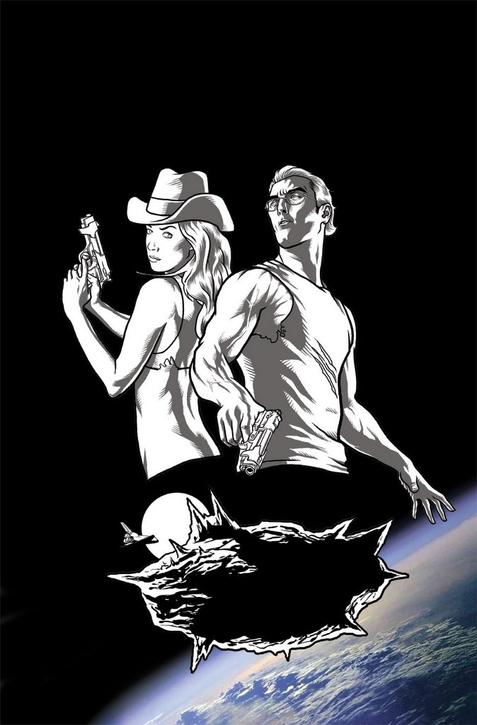
This image was done for a one-sheet for the comic. A one-sheet is a single sheet with a blurb and image to promote the book/idea. This was done for San Diego earlier this year. I think I drew it in a night (if I recall correctly.
What's funny is the comments I've had in the past about my (and the general) depiction of the female body. That it's "unrealistic", "exaggerated" and "destructive". All fair and reasonable comments. But I'd like to think that I aim my target at both the sexes. The brief for the guy is that he is a NASA geologist. He has to be athletic but not huge. Matthew McConaughey was the guideline here. So being rushed for time I used myself as a model - as I kinda fit that build. I basically just lightboxed myself and changed the head. When I removed the photo I was shocked.
The guy looked weedier than Dr. Banner. He was a bean-pole that might blow over in the wind. He was nowhere near athletic.
Now let's get something straight. I'm not a weed by any means. I'm 6'1, 90kg and can hammer out five reps of a 100kg benchpress. But I looked TINY in comic-book land. And unlike a lot of the women who complain about my depiction of the female form, I put a LOT more time into my fitness that 99% of them. I tell you this because of the crushing horror that overtook me when I had to beef this guy up just to make him look "athletic" in comic world.
Back to the benchpress...

5 comments:
" And unlike a lot of the women who complain about my depiction of the female form, I put a LOT more time into my fitness that 99% of them."
How do you know that?
But at least you have a sense of how they feel now.
Better you than me, that's for sure!
I don't get the comments of critisisums about how characters look. These are fantasies and like you've discovered even a um, buff guy like yourself won't nessisaraly loke the part on paper...
of course, I'd have no problem there...seeing as how I look like Arnold and all...
but that is after a LOT of photoshop re-touching though...
whatever, this is one of your best as far as line quality goes, and getting those feathering lines to do what you want is never eazy!
Have you looked at my blog yet?
later.
Cowgirls in Space! In their underwear!
Seriously though... it's a great piece. But the geologist's arm is so sculpted it makes Michaelangelo's David look flabby.
I guess it comes down to genre expectations - put a guy that muscled into a Ross Campbell or Adrian Tomine comic and he would be Hercules. Put him into X-Men and he's Joe Normal.
As for unrealistic female comic characters: Mischa Barton's proportions are no more realistic than Witchblade's. The difference is Barton doesn't dress and pose like a teenager's wank fantasy.
oops! Deleted my own post. Here it is again:
How do I know that I put more effort in than 99% of them?
I know this because my body fat and strength levels are in the upper 10% of average people for my age. Taking into account that most people who read comics are geeks, and that most geeks are unathletic, i have judiciously upped that stat placing myself in the 99th percentile of geeks.
I'm talking SO much crap. =)
No, I don't really know how they feel. I don't feel threatened nor intimidated by the depiction of men in comics. It's fantasy. It's fun. It's an exaggeration making a clumsy, innocent and amusing point.
Reading Ross Campbell's "The Abandoned" (thank you David W!) and there is some incredibly refreshing body types in that. And he still manages to make them attractive...
Post a Comment